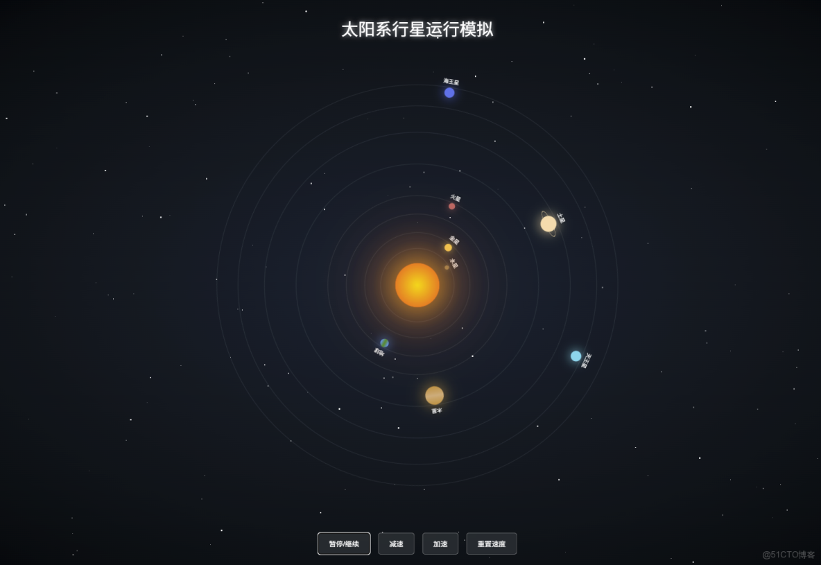
已經為你創建了一個炫酷的太陽系行星運行動畫HTML文件!
主要特點:
- 中心太陽:帶有發光脈動效果
- 8大行星:水星、金星、地球、火星、木星、土星、天王星、海王星,各有特色顏色和大小
- 真實軌道運行:每個行星按不同速度運行(距離太陽越遠速度越慢)
- 星空背景:閃爍的星星效果
- 土星光環:土星帶有獨特的光環效果
控制方式:
- 按鈕控制:暫停/繼續、加速、減速、重置速度
- 鍵盤快捷鍵:
- 空格鍵:暫停/繼續
- ↑ 鍵:加速
- ↓ 鍵:減速
- R 鍵:重置速度
現在你可以直接在瀏覽器中打開 E:\source\m-apps\codex\solar-system.html 文件查看效果了!
<!DOCTYPE html>
<html lang="zh-CN">
<head>
    <meta charset="UTF-8">
    <meta name="viewport" content="width=device-width, initial-scale=1.0">
    <title>炫酷太陽系</title>
    <style>
        * {
            margin: 0;
            padding: 0;
            box-sizing: border-box;
        }

        body {
            background: radial-gradient(ellipse at center, #0d1b2a 0%, #000000 100%);
            overflow: hidden;
            font-family: Arial, sans-serif;
        }

        .container {
            position: relative;
            width: 100vw;
            height: 100vh;
            display: flex;
            justify-content: center;
            align-items: center;
        }

        /* 星空背景 */
        .stars {
            position: absolute;
            width: 100%;
            height: 100%;
            overflow: hidden;
        }

        .star {
            position: absolute;
            background: white;
            border-radius: 50%;
            animation: twinkle 3s infinite;
        }

        @keyframes twinkle {
            0%, 100% { opacity: 0.3; }
            50% { opacity: 1; }
        }

        /* 太陽 */
        .sun {
            position: absolute;
            width: 80px;
            height: 80px;
            background: radial-gradient(circle, #ffd000 0%, #ff8c00 50%, #ff4500 100%);
            border-radius: 50%;
            box-shadow: 0 0 60px #ffa500, 0 0 100px #ff6347, 0 0 140px #ff4500;
            z-index: 10;
            animation: pulse 2s ease-in-out infinite;
        }

        @keyframes pulse {
            0%, 100% { transform: scale(1); }
            50% { transform: scale(1.05); }
        }

        /* 行星軌道 */
        .orbit {
            position: absolute;
            border: 1px solid rgba(255, 255, 255, 0.1);
            border-radius: 50%;
            animation: rotate linear infinite;
        }

        @keyframes rotate {
            from { transform: rotate(0deg); }
            to { transform: rotate(360deg); }
        }

        /* 行星 */
        .planet {
            position: absolute;
            border-radius: 50%;
            top: 0;
            left: 50%;
            transform: translateX(-50%);
        }

        .planet-name {
            position: absolute;
            color: white;
            font-size: 10px;
            white-space: nowrap;
            top: -20px;
            left: 50%;
            transform: translateX(-50%);
            text-shadow: 0 0 5px rgba(0, 0, 0, 0.8);
        }

        /* 水星 */
        .mercury-orbit {
            width: 140px;
            height: 140px;
            animation-duration: 8s;
        }

        .mercury {
            width: 8px;
            height: 8px;
            background: #8c7853;
            box-shadow: 0 0 10px #8c7853;
        }

        /* 金星 */
        .venus-orbit {
            width: 200px;
            height: 200px;
            animation-duration: 12s;
        }

        .venus {
            width: 14px;
            height: 14px;
            background: #ffc649;
            box-shadow: 0 0 15px #ffc649;
        }

        /* 地球 */
        .earth-orbit {
            width: 270px;
            height: 270px;
            animation-duration: 16s;
        }

        .earth {
            width: 16px;
            height: 16px;
            background: linear-gradient(to right, #1e90ff 0%, #228b22 50%, #1e90ff 100%);
            box-shadow: 0 0 20px #1e90ff;
        }

        /* 火星 */
        .mars-orbit {
            width: 340px;
            height: 340px;
            animation-duration: 20s;
        }

        .mars {
            width: 12px;
            height: 12px;
            background: #cd5c5c;
            box-shadow: 0 0 15px #cd5c5c;
        }

        /* 木星 */
        .jupiter-orbit {
            width: 460px;
            height: 460px;
            animation-duration: 28s;
        }

        .jupiter {
            width: 35px;
            height: 35px;
            background: linear-gradient(to bottom, #c88b3a 0%, #d4a574 50%, #c88b3a 100%);
            box-shadow: 0 0 30px #c88b3a;
        }

        /* 土星 */
        .saturn-orbit {
            width: 580px;
            height: 580px;
            animation-duration: 35s;
        }

        .saturn {
            width: 30px;
            height: 30px;
            background: #fad5a5;
            box-shadow: 0 0 25px #fad5a5;
            position: relative;
        }

        .saturn::after {
            content: '';
            position: absolute;
            width: 50px;
            height: 50px;
            border: 2px solid rgba(250, 213, 165, 0.6);
            border-radius: 50%;
            top: 50%;
            left: 50%;
            transform: translate(-50%, -50%) rotateX(75deg);
        }

        /* 天王星 */
        .uranus-orbit {
            width: 680px;
            height: 680px;
            animation-duration: 42s;
        }

        .uranus {
            width: 20px;
            height: 20px;
            background: #4fd0e7;
            box-shadow: 0 0 20px #4fd0e7;
        }

        /* 海王星 */
        .neptune-orbit {
            width: 760px;
            height: 760px;
            animation-duration: 50s;
        }

        .neptune {
            width: 19px;
            height: 19px;
            background: #4169e1;
            box-shadow: 0 0 20px #4169e1;
        }

        /* 標題 */
        .title {
            position: absolute;
            top: 30px;
            left: 50%;
            transform: translateX(-50%);
            color: white;
            font-size: 32px;
            text-shadow: 0 0 10px rgba(255, 255, 255, 0.8);
            z-index: 100;
        }

        /* 控制面板 */
        .controls {
            position: absolute;
            bottom: 30px;
            left: 50%;
            transform: translateX(-50%);
            z-index: 100;
            display: flex;
            gap: 15px;
        }

        .control-btn {
            padding: 10px 20px;
            background: rgba(255, 255, 255, 0.1);
            border: 1px solid rgba(255, 255, 255, 0.3);
            color: white;
            border-radius: 5px;
            cursor: pointer;
            backdrop-filter: blur(10px);
            transition: all 0.3s;
        }

        .control-btn:hover {
            background: rgba(255, 255, 255, 0.2);
            box-shadow: 0 0 15px rgba(255, 255, 255, 0.5);
        }

        .paused .orbit {
            animation-play-state: paused !important;
        }
    </style>
</head>
<body>
    <div class="stars" id="stars"></div>

    <div class="title">太陽系行星運行模擬</div>

    <div class="container" id="solarSystem">
        <!-- 太陽 -->
        <div class="sun"></div>

        <!-- 水星 -->
        <div class="orbit mercury-orbit">
            <div class="planet mercury">
                <div class="planet-name">水星</div>
            </div>
        </div>

        <!-- 金星 -->
        <div class="orbit venus-orbit">
            <div class="planet venus">
                <div class="planet-name">金星</div>
            </div>
        </div>

        <!-- 地球 -->
        <div class="orbit earth-orbit">
            <div class="planet earth">
                <div class="planet-name">地球</div>
            </div>
        </div>

        <!-- 火星 -->
        <div class="orbit mars-orbit">
            <div class="planet mars">
                <div class="planet-name">火星</div>
            </div>
        </div>

        <!-- 木星 -->
        <div class="orbit jupiter-orbit">
            <div class="planet jupiter">
                <div class="planet-name">木星</div>
            </div>
        </div>

        <!-- 土星 -->
        <div class="orbit saturn-orbit">
            <div class="planet saturn">
                <div class="planet-name">土星</div>
            </div>
        </div>

        <!-- 天王星 -->
        <div class="orbit uranus-orbit">
            <div class="planet uranus">
                <div class="planet-name">天王星</div>
            </div>
        </div>

        <!-- 海王星 -->
        <div class="orbit neptune-orbit">
            <div class="planet neptune">
                <div class="planet-name">海王星</div>
            </div>
        </div>
    </div>

    <div class="controls">
        <button class="control-btn" onclick="togglePause()">暫停/繼續</button>
        <button class="control-btn" onclick="changeSpeed('slow')">減速</button>
        <button class="control-btn" onclick="changeSpeed('fast')">加速</button>
        <button class="control-btn" onclick="resetSpeed()">重置速度</button>
    </div>

    <script>
        // 生成星空背景
        const starsContainer = document.getElementById('stars');
        for (let i = 0; i < 200; i++) {
            const star = document.createElement('div');
            star.className = 'star';
            star.style.width = Math.random() * 3 + 'px';
            star.style.height = star.style.width;
            star.style.left = Math.random() * 100 + '%';
            star.style.top = Math.random() * 100 + '%';
            star.style.animationDelay = Math.random() * 3 + 's';
            starsContainer.appendChild(star);
        }

        // 控制功能
        const solarSystem = document.getElementById('solarSystem');
        let isPaused = false;
        let currentSpeed = 1;

        function togglePause() {
            isPaused = !isPaused;
            if (isPaused) {
                solarSystem.classList.add('paused');
            } else {
                solarSystem.classList.remove('paused');
            }
        }

        function changeSpeed(direction) {
            const orbits = document.querySelectorAll('.orbit');
            orbits.forEach(orbit => {
                const currentDuration = parseFloat(getComputedStyle(orbit).animationDuration);
                if (direction === 'fast') {
                    currentSpeed *= 0.7;
                    orbit.style.animationDuration = (currentDuration * 0.7) + 's';
                } else if (direction === 'slow') {
                    currentSpeed *= 1.3;
                    orbit.style.animationDuration = (currentDuration * 1.3) + 's';
                }
            });
        }

        function resetSpeed() {
            const orbits = document.querySelectorAll('.orbit');
            const durations = [8, 12, 16, 20, 28, 35, 42, 50];
            orbits.forEach((orbit, index) => {
                orbit.style.animationDuration = durations[index] + 's';
            });
            currentSpeed = 1;
        }

        // 添加鍵盤控制
        document.addEventListener('keydown', (e) => {
            if (e.code === 'Space') {
                e.preventDefault();
                togglePause();
            } else if (e.code === 'ArrowUp') {
                changeSpeed('fast');
            } else if (e.code === 'ArrowDown') {
                changeSpeed('slow');
            } else if (e.code === 'KeyR') {
                resetSpeed();
            }
        });
    </script>
</body>
</html>