


背景
我的強項是後端開發,很少涉及前端開發,一個很重要的原因是前端佈局太妖,要實現一個居中需要各種奇技淫巧,而且每個瀏覽器實現還不一樣,前端的佈局就像謎一樣,你都不知道為啥就可以了,也不知道為啥就不行。直到Flex佈局的出現前端的佈局終於有點章法了,第一次接觸Flex佈局是從阮一峯的博客Flex 佈局教程,阮一峯寫博客的能力確實厲害,通俗易懂又直擊要害,建議想要入門Flex都去拜讀一下。那麼寫這篇文章的目的是從一個後端的角度去看Flex佈局,如果你看完阮一峯的博客後仍然有一些疑問,那麼可以讀一讀這篇文章。
Flex基本概念
- 容器和項目
Flex佈局包括容器(flex container)和項目(flex item),比如下面這段代碼
<div class="content">
    <div class="block"></div>
    <div class="block"></div>
</div>
content這個div就是容器,block的div就是項目
- 兩軸兩個方向
Flex核心就是靠兩根軸進行佈局的調整,其實就是水平和垂直兩個方向,只不過在Flex中水平方向稱為主軸,垂直方向稱為交叉軸,每個方向各有start center end三個方位,其實就是左邊中間和右邊三個方位。
容器屬性
flex有以下幾個屬性可以作用於容器上
- flex-direction
- justify-content
- align-items
- flex-wrap
- flex-flow
- align-content
我們一個個來
flex-direction
flex-direction指定了Flex佈局的方向,其實最核心就是指定了是橫向排列還是縱向排列,flex-direction有以下取值
- row(默認值):橫向排列
- row-reverse:反向橫向排列
- column:縱向排列
- column-reverse:反向縱向排列
如下代碼
<html>
<head>
    <style>

        .container {
            display: flex;
            background-color: aliceblue;
        }

        .box1 {
            width: 80px;
            height: 80px;
            margin: 5px;
            background-color: orange;
        }

        .box2 {
            width: 40px;
            height: 100px;
            margin: 5px;
            background-color: orange;
        }

        .box3 {
            width: 100px;
            height: 30px;
            margin: 5px;
            background-color: orange;
        }
    </style>
</head>

<body>
<div class="container" style="flex-direction: row">
    <div class="box1"></div>
    <div class="box2"></div>
    <div class="box3"></div>
</div>
</body>
</html>
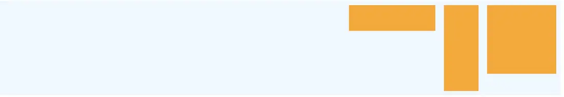
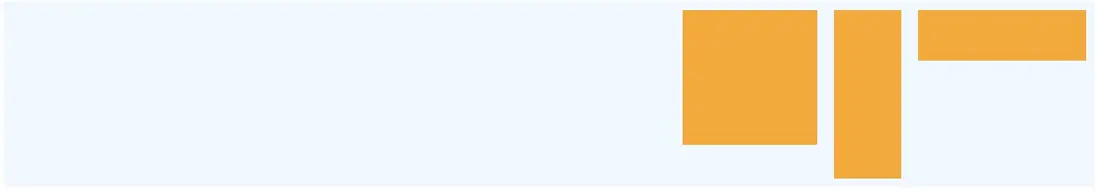
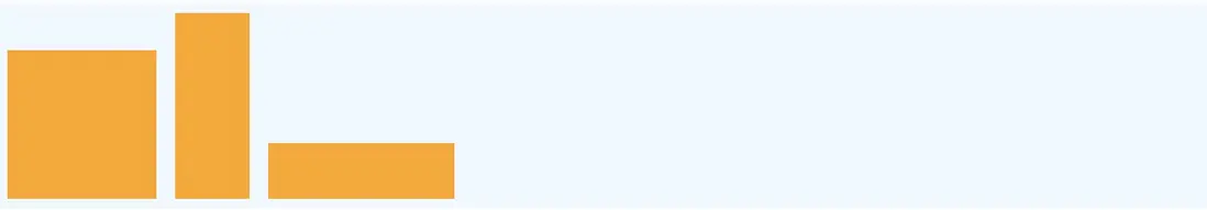
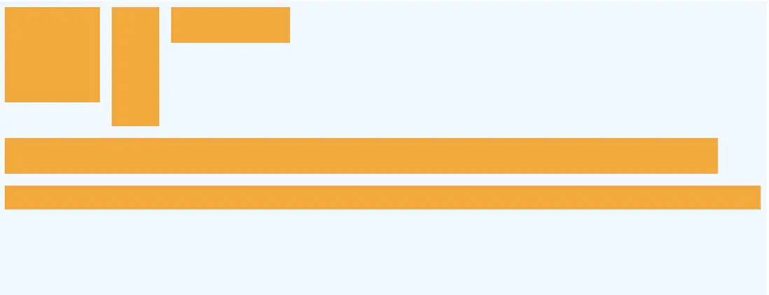
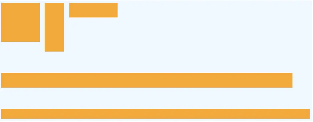
flex-direction: row效果

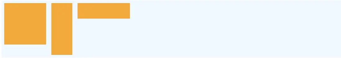
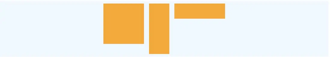
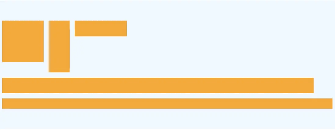
flex-direction: row-reverse效果
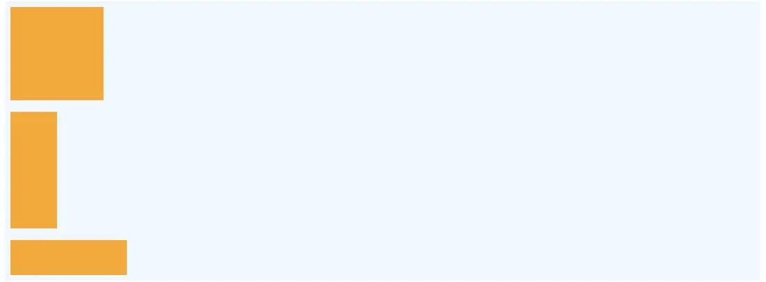
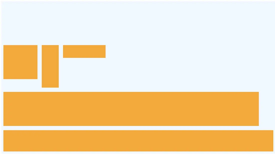
flex-direction: column效果
flex-direction: column-reverse效果
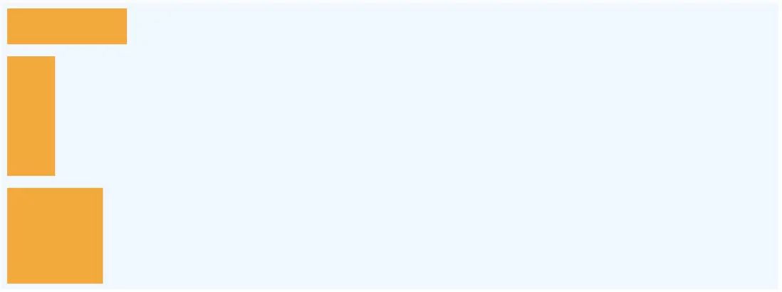
注意到無論是橫向對齊(row)垂直方向默認頂部對齊,垂直對齊(column)默認對齊方式是左對齊
justify-content
justify-content指定了水平方向的排列方式,注意這裏我用的是排列方式不是其他地方説的對齊方式,因為我覺得排列這個詞更適合描述justify-content,justify-content可以取以下值:
- flex-start(默認值):從左向右排列
- flex-end:從右向左排列
- center: 居中排列
- space-between:兩端對齊,項目之間的間隔都相等。
- space-around:每個項目兩側的間隔相等。所以,項目之間的間隔比項目與邊框的間隔大一倍。
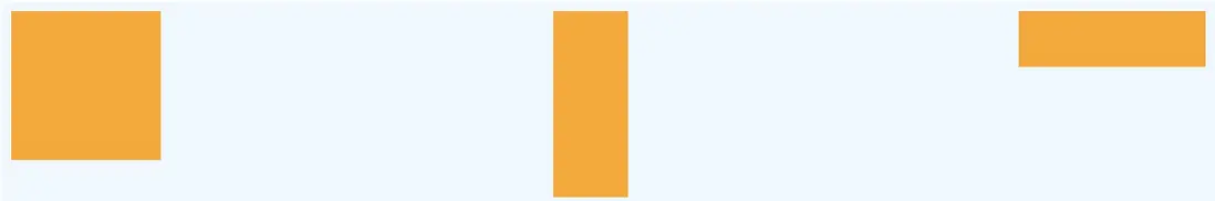
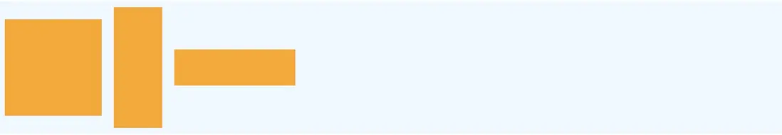
flex-start 從左向右排列
flex-end 從右向左排列
注意和flex-direction: row-reverse不同,row-reverse對排列順序進行了反向
center 居中排列
space-between 兩端對齊
space-around 每個項目兩側的間隔相等
通過以上實例可以看出,用對齊來描述缺少直觀印象,用排列比較適合描述
align-items
align-items指定了垂直方向的對齊方式,注意這裏用的是對齊這個詞,align-items可取以下值:
- flex-start:頂部對齊
- flex-end:底部對齊
- center:居中對齊
- baseline: 項目的第一行文字的基線對齊。
- stretch(默認值):如果項目未設置高度或設為auto,將佔滿整個容器的高度。
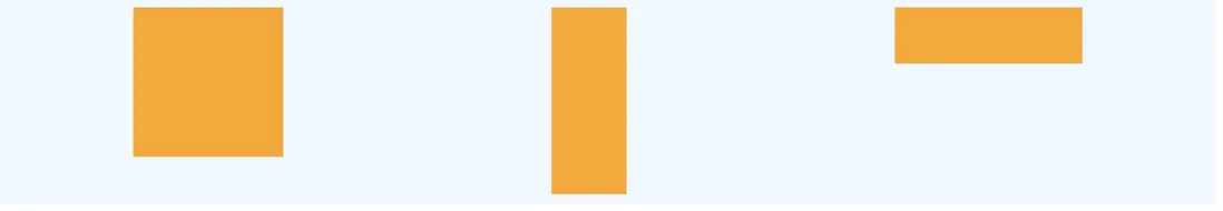
flex-start 頂部對齊

flex-end 底部對齊
center 居中對齊
baseline 項目的第一行文字的基線對齊
為了展示baseline效果,我們修改下代碼
<div class="container" style="flex-direction:row;align-items: baseline;">
  <div class="box1" style="font-size: 50px">1</div>
  <div class="box2">2</div>
  <div class="box3" style="font-size: 30px">3</div>
</div>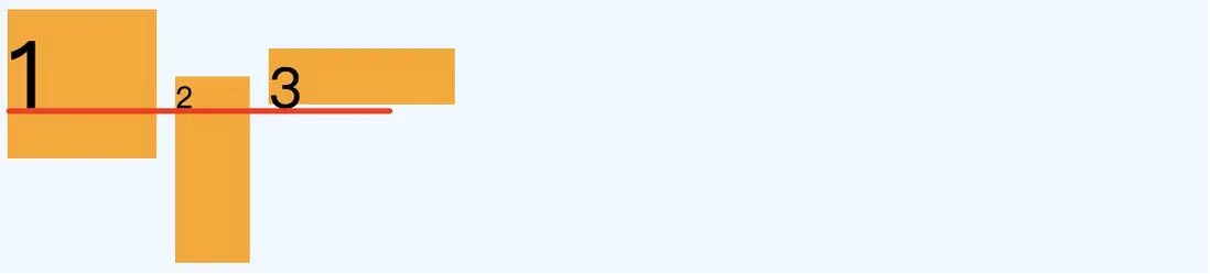
stretch 佔滿容器高度
如果未設置高度,將佔滿屏幕,我們將box的height屬性去掉
.container{
  display: flex;
  height: 100px;
  background-color: aliceblue;
}

.box1 {
    width: 80px;
    margin: 5px;
    background-color: orange;
}

.box2 {
    width: 40px;
    margin: 5px;
    background-color: orange;
}

.box3 {
    width: 100px;
    margin: 5px;
    background-color: orange;
}
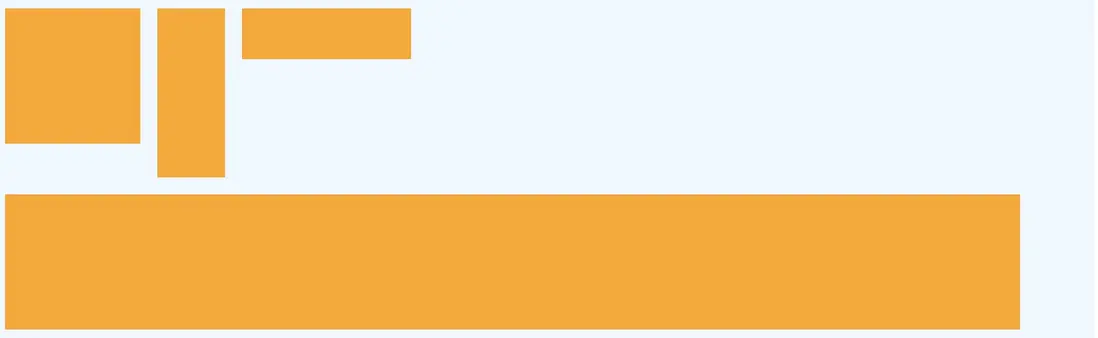
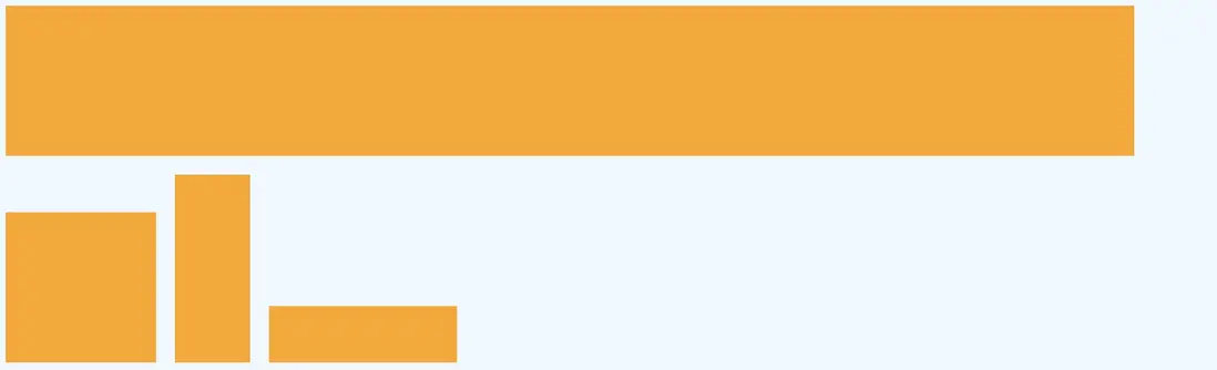
flex-wrap
flex-wrap指定了如果一行放不下該如何處理,取值如下:
- nowrap(默認):不換行
- wrap:換行,接在第一行下面
- wrap-reverse:換行,接在第一行上面
我們在上面的代碼加入一個box4
.box4{
  width:600px;
  height: 80px;
  margin: 5px;
  background-color: orange;
}
....
<div class="container" style="flex-direction:row;flex-wrap: wrap-reverse;">
  <div class="box1"></div>
  <div class="box2"></div>
  <div class="box3"></div>
  <div class="box4"></div>
</div>
nowrap:不換行
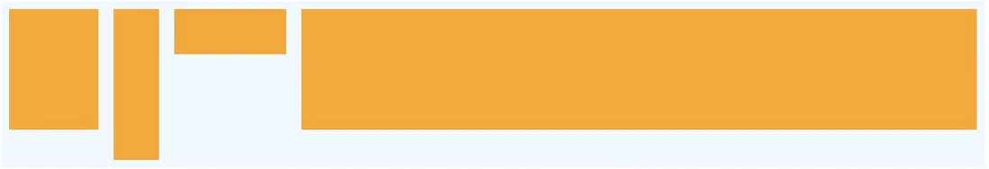
flex會強行放在一行,並且如果長度不夠會壓縮其他內容
wrap:換行,接在第一行下面
wrap-reverse:換行,接在第一行上面
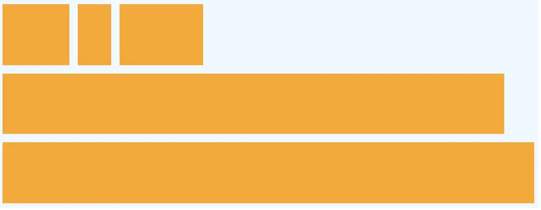
flex-flow
flex-flow屬性是flex-direction屬性和flex-wrap屬性的簡寫形式,默認值為row nowrap。
.box {
  flex-flow: <flex-direction> || <flex-wrap>;
}
align-content
align-content定義了當有多行的時候,每行之間該如何排列,取值如下
- stretch(默認值):在垂直方向佔滿空間
- flex-start:每行排列在垂直方向頂部
- flex-end:每行排列在垂直方向底部
- center:每行排列在垂直方向中間
- space-between:每行在垂直方向兩端對齊
- space-around:每行在垂直方向間隔相等
stretch(默認值):在垂直方向佔滿空間
我們去掉每個box的高度,並且加入了一個新的box5
<html>
<head>
<style>

.container{
  display: flex;
  height: 100%;
  background-color: aliceblue;
}
.box1{
  width:80px;
/*  height: 80px;
*/  margin: 5px;
  background-color: orange;
}
.box2{
  width:40px;
/*  height: 100px;
*/  margin: 5px;
  background-color: orange;
}
.box3{
  width:100px;
/*  height: 30px;
*/  margin: 5px;
  background-color: orange;
}
.box4{
  width:600px;
/*  height: 80px;
*/  margin: 5px;
  background-color: orange;
}
.box5{
  width:800px;
  /*height: 50px;*/
  margin: 5px;
  background-color: orange;
}
</style>
</head>

<body>
<div class="container" style="flex-direction:row;flex-wrap: wrap;">
  <div class="box1"></div>
  <div class="box2"></div>
  <div class="box3"></div>
  <div class="box4"></div>
  <div class="box5"></div>
</div>
</body>
</html>
一定要用flex-wrap: wrap;不然無法形成多行
flex-start:每行排列在垂直方向頂部
把高度加回去
可以看到容器底部還是留了一部分空間,高度按照配置的高度顯示
flex-end:每行排列在垂直方向底部
center:每行排列在垂直方向中間
space-between:每行在垂直方向兩端對齊
space-around:每行在垂直方向間隔相等
項目屬性
項目屬性包含以下6項
- flex-grow
- flex-shrink
- order
- flex-basis
- flex
- align-self
flex-grow
flex-grow定義了當容器長度增長時容器內的項目應當如何變化,這裏定義的是一個變化的權值,比如有兩個項目,一個flex-grow=4一個flex-grow=6那麼當容器長度增長10個像素時,第一個項目增長4個像素,第二個增長6個像素,這樣當長度增長時能夠填滿整個空間。當然如果所有的項目flex-flow都一樣那麼將平分剩餘的空間。
<div class="container" style="flex-direction:row;">
  <div class="box1" style="flex-grow: 1"></div>
  <div class="box2" style="flex-grow: 2"></div>
  <div class="box3" style="flex-grow: 3"></div>
</div>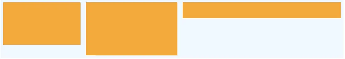
如果flex-flow設置為0(默認值)則不會自動增長
flex-shrink
flex-shrink和flex-grow相反,flex-shrink是當長度減少時該如何壓縮項目空間,也是定義權值
order
order可以設置顯示順序,如以下代碼
<div class="container" style="flex-direction:row;">
  <div class="box1" style="order: 3">1</div>
  <div class="box2" style="order: 2">2</div>
  <div class="box3" style="order: 1">3</div>
</div>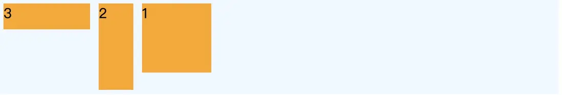
指定了order就按order指定的順序顯示(這個屬性的應用場景在哪?)
flex-basis
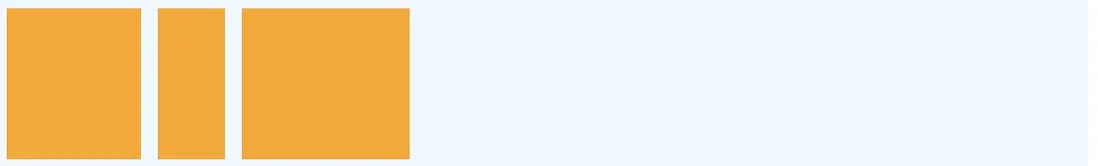
flex-basis定義了項目在容器中的初始值,如果是水平方向那麼就是長度,如果是垂直方向那麼就是高度,默認是auto就是項目原大小,這個屬性可以覆蓋本身的width和height
<div class="container" style="flex-direction:row;">
  <div class="box1" style="flex-basis:400px"></div>
  <div class="box2"></div>
  <div class="box3"></div>
</div>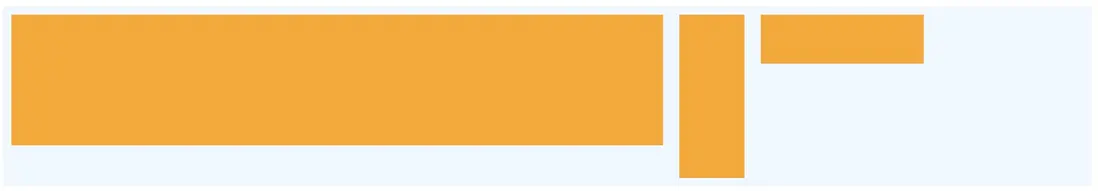
flex
flex屬性是flex-grow, flex-shrink 和 flex-basis的簡寫,默認值為0 1 auto。
align-self
align-self允許單個項目不一樣的排列方式,可以覆蓋align-items屬性,前面提到過,align-items定義了垂直方向的對齊方式
<div class="container" style="flex-direction:row;align-items: flex-start;">
  <div class="box1"></div>
  <div class="box2" style="align-self: flex-end;"></div>
  <div class="box3"></div>
</div>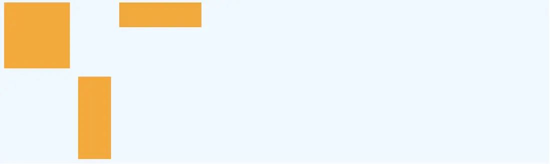
參考
這裏有一個Flex遊戲的站點,通過24個小遊戲讓你學會使用Flex相關屬性


