


第一題
- 佈局介紹
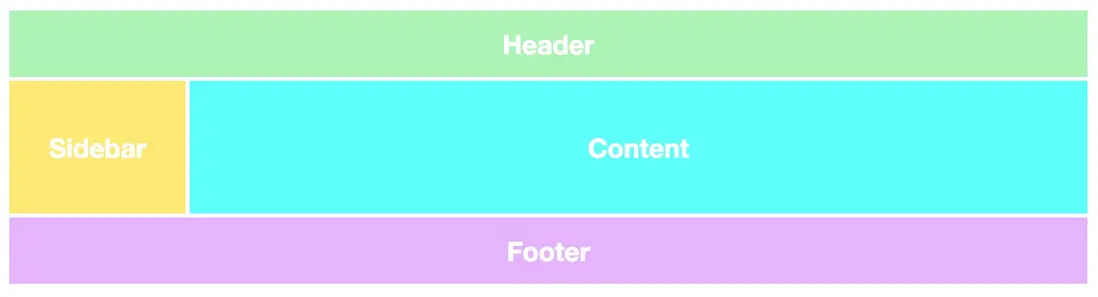
這個是經典的首頁佈局,垂直方向分為頭,內容,尾組成,內容又分為導航和展示,其中展示內容需要自適應,需要隨着窗口的大小發生變化
- 分析
垂直方向可以使用flex方向為column,因為中間內容項需要自適應,可以使用flex-grow指定增長自適應,內容裏面又包含了導航和內容展示,其中內容展示是自適應,因此佈局代碼參考如下:
<div class="container">
  <div class="head"></div>
  <div class="main">
    <div class="nav"></div>
    <div class="content"></div>
  </div>
  <div class="footer"></div>
</div>
加上樣式後
<html>
<head>
<style>

.container{
  width: 100%;
  height: 100%;
  display: flex;
  flex-direction: column;
}
.head{
  height: 80px;
  background-color: green;
  margin: 5px;
}
.main{
  flex-grow: 1;
  background-color: blue;
  margin: 5px;
}
.footer{
  height:80px;
  background-color: purple;
  margin: 5px;
}
</style>
</head>

<body>
<div class="container">
  <div class="head"></div>
  <div class="main">
    <div class="nav"></div>
    <div class="content"></div>
  </div>
  <div class="footer"></div>
</div>
</body>
</html>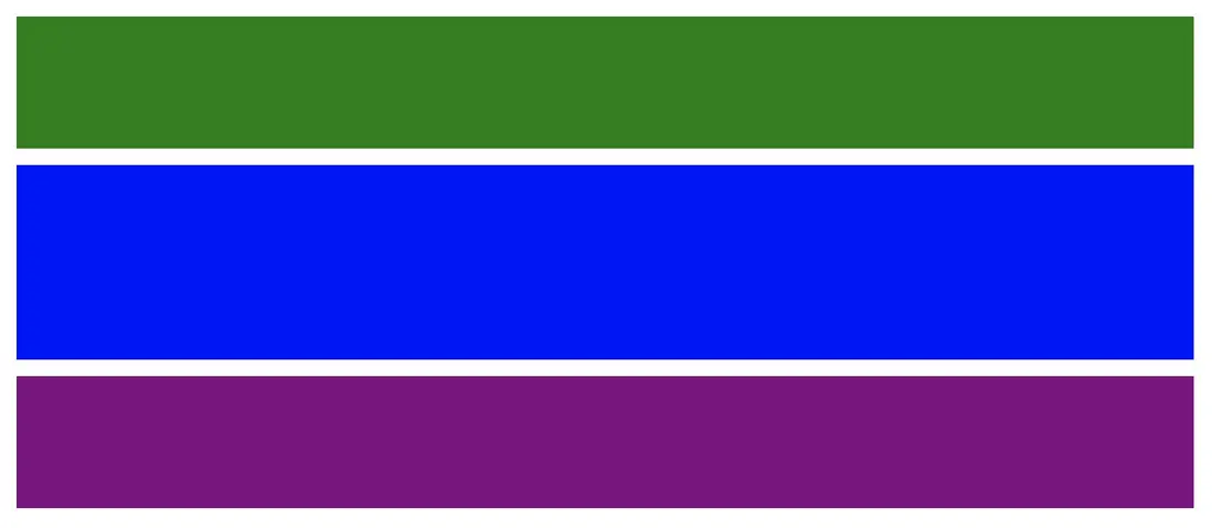
有了上中下三層,並且中間層依靠flex-grow: 1能夠隨着高度增長增長,上和下保持高度不變,添加nav和content樣式
<html>
<head>
<style>

.container{
  width: 100%;
  height: 100%;
  display: flex;
  flex-direction: column;
}

.head{
  height: 80px;
  background-color: green;
  margin:5px;
}

.main{
  flex-grow: 1;
  display: flex;
  flex-direction: row;
}

.nav{
  width: 100px;
  background-color: yellow;
  margin:5px;
}

.content{
  flex-grow: 1;
  background-color: blue;
  margin:5px;
}

.footer{
  height:80px;
  background-color: purple;
  margin:5px;
}
</style>
</head>

<body>
<div class="container">
  <div class="head"></div>
  <div class="main">
    <div class="nav"></div>
    <div class="content"></div>
  </div>
  <div class="footer"></div>
</div>
</body>
</html>
中間層右邊content會隨着高度增加而增加
第二題
- 佈局
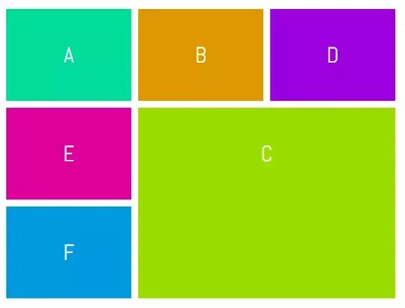
- 實現
<html>
<head>
<style>

.container{
  width: 100%;
  height: 100%;
  display: flex;
  flex-direction: column;
}
.box{
  width: 150px;
  background-color: orange;
  margin: 5px;
  flex-grow: 1;
}
</style>
</head>

<body>
<div class="container">
 <div style="display: flex;flex-direction: row;flex-grow: 1;">
   <div class="box"></div>
   <div class="box"></div>
   <div class="box"></div>
 </div>
 <div style="display: flex;flex-direction: row;flex-grow: 1">
   <div style="display: flex;flex-direction: column;">
     <div class="box"></div>
     <div class="box"></div>
   </div>
   <div style="margin:5px;background-color: orange;flex-grow: 1;"></div>
 </div>
</div>
</body>
</html>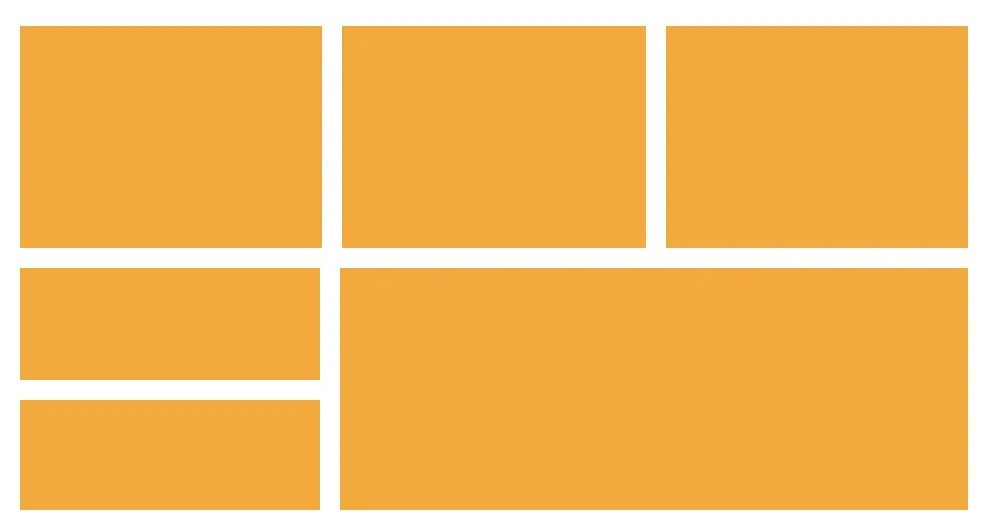
所有元素都是響應式的