
本文流程:
1.安裝插件→2.引入Echarts→3.創建圖表→4.修改樣式→5.接入數據
一.安裝插件
方法一:npm安裝Echarts
npm install echarts -S

方法二:cnpm安裝Echarts
1.首先我們需要安裝cnpm

npm install -g cnpm --registry=https://registry.npm.taobao.org

2.然後

cnpm install echarts -S
二.引入Echarts
方法一:全局引入
打開main.js文件引入Echarts
import echarts from 'echarts'

然後將echart添加到vue的原型上,這樣就可以全局使用了

Vue.prototype.$echarts = echarts
方法二:局部引入
全局引入會將所有的echarts圖表打包,導致體積過大,所以我覺得最好還是按需要來局部引入,比如我們需要引入一個柱狀圖
// 引入基本模板
let echarts = require('echarts/lib/echarts')
// 引入柱狀圖組件
require('echarts/lib/chart/bar')
// 引入提示框和title組件
require('echarts/lib/component/tooltip')
require('echarts/lib/component/title')
這裏require直接從 node_modules 中查找文件位置進行引入
三.創建圖表
當你安裝完插件和在頁面裏面引入圖表之後,那麼恭喜你可以創建圖表了~
第一步:你首先得創造一個圖表的容器,寬高必須是行內樣式,單位必須是px
<template>
       <div id="myChart" :style="{width: '1000px', height: '600px'}"></div>
</template>
注意:這樣會出現一個問題,因為由於必須固定好寬高,你縮小屏幕的時候,圖表不會隨之適應的縮小,刷新頁面才能適應,解決方法的實現請接着往下看
第二步:繪製圖表,這裏我們要注意,echarts初始化應在鈎子函數mounted()中,掛載之後調用
<script>
        export default {
             data() {
                    return {

                   }
              },
             //鈎子函數
             mounted(){
                   this.draw();
             },
             methods: {
                   draw(){
                       // 初始化echarts實例
                        let myChart = this.$echarts.init(document.getElementById('myChart'))
                       // 繪製圖表
                       var option = {
                            //此處佔用篇幅過大,先省略等下會進行解釋
                       }
                       //防止越界,重繪canvas
                       window.onresize = myChart.resize;
                       myChart.setOption(option);//設置option
                   }
              }
         }
</script>
解釋:
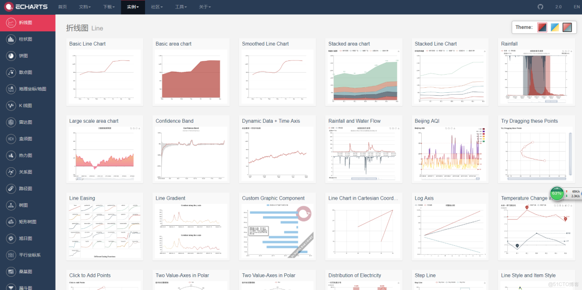
第一點:省略處為繪製圖表的代碼,首先,你打開Echarts官網,找到實例,選取你項目裏面需要用到的圖表模板(樣式差不多就行,下文會教你如何修改圖表樣式),點進去,然後你可以看到左側的代碼,把option = {}括號裏面的內容放置到我上方省略的代碼處,運行,你頁面即可以看到你所需要的圖表;
第二點:下方代碼防止越界,重匯canvas處,即為可以解決掉屏幕縮小,圖表不會隨之適應的縮小的方法,原理為當瀏覽器發生resize事件的時候,讓其觸發echart的resize事件,重繪canvas
//防止越界,重繪canvas
window.onresize = myChart.resize;
myChart.setOption(option);//設置option
四.修改樣式
當你創建完圖表之後,你會發現你的圖表和UI給的樣式差距太大,這樣寫肯定是不能過關的,所以你得修改圖表樣式,現在我從圖表的左上角説到右下角,如何去更改圖表樣式,首先先上兩張圖表的差異圖:
圖一為Echarts未修改過的柱形圖:
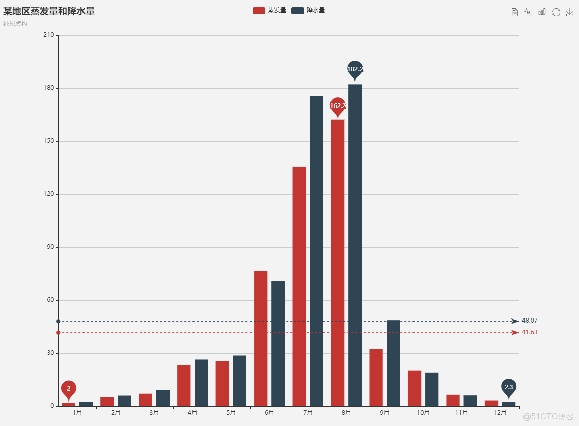
圖二為修改樣式之後的柱形圖:
樣式修改方法:
1.左上角圖例處:
//圖例
legend: {
      data: ['降水量'],//與series的name對應
       left: '75%',//圖例的離左邊位置,可以用像素,可以用百分比,也可以用center,right等
       top: 12px,//圖例離頂部的位置
       itemWidth: 10,//圖例圖標的寬
       itemHeight: 10,//圖例圖標的高
       textStyle: {
             color: '#878787',//文字的具體的顏色
        }
},
2.右上角切換圖形處:
toolbox: {
       show : true,//顯示
       feature : {
              magicType : {show: true, type: ['line', 'bar']},
       },//柱形圖和折線圖切換
       right: '6%',//離右邊的距離
},

3.中部圖表X軸修改:

//x軸
xAxis: {
        type: 'category',
        data: ['1月', '2月', '3月', '4月', '5月'],//x軸的數據
        splitLine: {show: false},//去除網格分割線
        // splitArea: {show: true},//保留網格區域
        axisLine: {//座標線
               lineStyle: {
                     type: 'solid',
                     color: '#d8d8d8',//軸線的顏色
                     width:'1'//座標線的寬度
               }
        },
        axisTick: {//刻度
              show: false//不顯示刻度線
        },
        axisLabel: {
              textStyle: {
                    color: '#878787',//座標值的具體的顏色
              }
        },
        splitLine: {
              show: false//去掉分割線
        },
 },
4.中部圖表Y軸修改:
yAxis: {
name: '單位:次',//軸的名字,默認位置在y軸上方顯示,也可不寫
max: 30,//最大刻度
type: 'value',
axisLine: {//線
show: false
},
axisTick: {//刻度
show: false
},
axisLabel: {
textStyle: {
color: '#878787',//座標值得具體的顏色
}
},
minInterval: 5,//標值的最小間隔
splitLine: {
lineStyle: {
color: ['#f6f6f6'],//分割線的顏色
}
}
},
5.柱狀圖形修改:
series: [{
name: '數量',//每組數據的名字,與圖例對應
data: [200, 300, 400, 350, 100],//數據
type: 'bar',//柱狀圖
itemStyle: {
normal: {
color: '#FD6B71',//設置柱子顏色
abel: {
show: true,//柱子上顯示值
position: 'top',//值在柱子上方顯示
textStyle: {
color: '#FD6B71'//值得顏色
}
}
}
},
barWidth: 15//設置柱子寬度,單位為px
}],
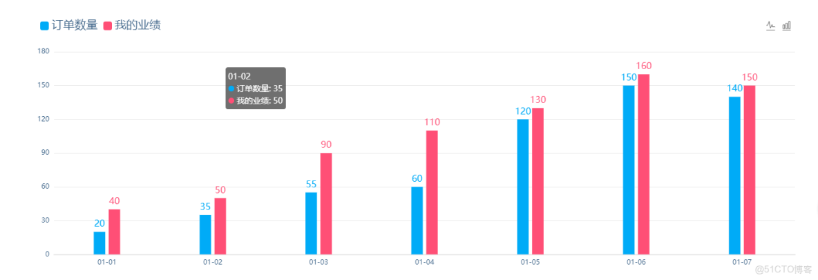
好吧!整體代碼我也發一份,當你安裝好插件和全局引入後,你可以用以下代碼進行測試有沒有成功,代碼如下:
<template>
<div class="MyAchievement">
<div class="MyAchievement-echart">
<div class="echart-title">我的業績</div>
<div class="echart-content">
<div id="myChart" :style="{width: '1500px', height: '460px'}"></div>
</div>
</div>
</div>
</template>
<script>
export default {
data() {
return {
}
},
mounted(){
this.drawLine();
},
methods: {
drawLine(){
var myChart = this.$echarts.init(document.getElementById('myChart'));//獲取容器元素
var option = {
tooltip : {
trigger: 'axis'
},
grid: {
left: '6%',
right: '6%',
bottom: '6%',
containLabel: true
},
legend: {
data:['訂單數量','我的業績'],
left: '6%',
top: 'top',
itemWidth: 15,//圖例圖標的寬
itemHeight: 15,//圖例圖標的高
textStyle: {
color: '#3a6186',
fontSize:20,
}
},
toolbox: {
show : true,
feature : {
magicType : {show: true, type: ['line', 'bar']},
},
right: '6%',
},
calculable : true,
xAxis : [
{
type : 'category',
data : ['01-01','01-02','01-03','01-04','01-05','01-06','01-07'],
splitLine: {show: false},//去除網格分割線
axisTick: {//刻度
show: false//不顯示刻度線
},
axisLine: {//座標線
lineStyle: {
type: 'solid',
color: '#e7e7e7',//軸線的顏色
width:'2'//座標線的寬度
}
},
axisLabel: {
textStyle: {
color: '#3a6186',//座標值的具體的顏色
}
},
splitLine: {
show: false//去掉分割線
},
}
],
yAxis : [
{
type : 'value',
axisLine: {//線
show: false
},
axisTick: {//刻度
show: false
},
axisLabel: {
textStyle: {
color: '#3a6186',//座標值的具體的顏色
}
},
splitLine: {
lineStyle: {
color: ['#e7e7e7'],//分割線的顏色
}
}
}
],
series : [
{
name:'訂單數量',
type:'bar',
barWidth: 20,
data:[20, 35, 55, 60, 120, 150, 140],
itemStyle: {
normal: {
color: '#00abf7',//設置柱子顏色
label: {
show: true,//柱子上顯示值
position: 'top',//值在柱子上方顯示
textStyle: {
color: '#00abf7',//值的顏色
fontSize:16,
}
}
}
},
},
{
name:'我的業績',
type:'bar',
barWidth: 20,
data:[40, 50, 90, 110, 130, 160, 150],
itemStyle: {
normal: {
color: '#ff4f76',//設置柱子顏色
label: {
show: true,//柱子上顯示值
position: 'top',//值在柱子上方顯示
textStyle: {
color: '#ff4f76',//值的顏色
fontSize:16,
}
}
}
},
}
]
};
//防止越界,重繪canvas
window.onresize = myChart.resize;
myChart.setOption(option);//設置option
}
}
}
</script>
<style lang="scss" scoped>
.MyAchievement{
display: flex;
flex-direction: column;
padding:0px 90px;
}
.MyAchievement .MyAchievement-echart{
width: 100%;
height: 570px;
border-radius: 10px;
border:1px solid #d3d9e9;
box-shadow: 4px 6px 10px -2px #d3d9e9;
background-color: #fff;
display: flex;
flex-direction: column;
}
.MyAchievement-echart .echart-title{
width: 100%;
height: 70px;
background-color: #00abf7;
border-top-left-radius: 10px;
border-top-right-radius: 10px;
font-size: 26px;
color: #fff;
text-align: center;
line-height: 75px;
}
.MyAchievement-echart .echart-content{
width: 100%;
height: 500px;
display: flex;
// align-items: center;
justify-content: center;
}
.echart-content #myChart{
margin-top: 35px;
}
</style>五.接入數據
就比如上方柱形圖,數據為data: [200, 300, 400, 350, 100],我們通過調用接口,把接口數據替換掉之前寫死的數據即可,比如:
axios({
       method:'POST',
       url:this.API.drawline,
}).then(response => {
       //獲取數據
       this.draw= response.data;
       //把原先寫死的數據替換為接口數據即可
       //......
}).catch(err => {
       console.log(err);
})