
背景
隨着 OpenHarmony(開源鴻蒙)生態的快速發展,越來越多的 Flutter 開發者開始關注如何讓一套代碼在手機、平板、摺疊屏、智慧屏等多種設備上都能擁有良好的適配體驗。傳統的“寫死尺寸”或“手動判斷屏幕寬度”的方式不僅繁瑣,而且容易出錯。
為了解決這一痛點,OpenHarmony-SIG 推出了 flutter_multidevice_layout_scenepkg 三方插件,並提供了配套的示例工程 adaptive_layout_sample。本文將基於該插件展開深入體驗,並給出可直接落地的代碼實踐。
一、插件定位與能力總覽
|
能力類別
|
對應組件
|
典型場景
|
備註
|
|
斷點感知
|
|
根據屏幕寬度/高度自動匹配 `xs
|
sm
|
|
柵格佈局
|
|
視頻卡片、商品宮格、音樂專輯
|
類似 Bootstrap 的 12 柵格,支持響應式列數
|
|
自適應顯隱
|
|
摺疊屏展開時顯示歌詞,摺疊時隱藏
|
按優先級自動顯示/隱藏子組件
|
|
導航分欄
|
|
郵件/聊天類 APP 左側列表+右側詳情
|
自動切換單欄/雙欄
|
|
側邊欄
|
|
平板橫屏時左側常駐導航,豎屏時收起
|
支持手勢滑出/收起
|
二、快速集成(3 步走)
1. 拉取代碼倉
git clone https://gitcode.com/openharmony-sig/flutter_multidevice_layout_scenepkg.git
cd flutter_multidevice_layout_scenepkg/samples/adaptive_layout_sample
2. 安裝依賴
flutter pub get如果宿主工程已升級到 Flutter 3.22+,建議同時執行
flutter pub upgrade確保拿到最新兼容版本。
3. 運行示例
# 手機
flutter run -d <phone-id>
# 摺疊屏(需打開 OpenHarmony 遠程模擬器)
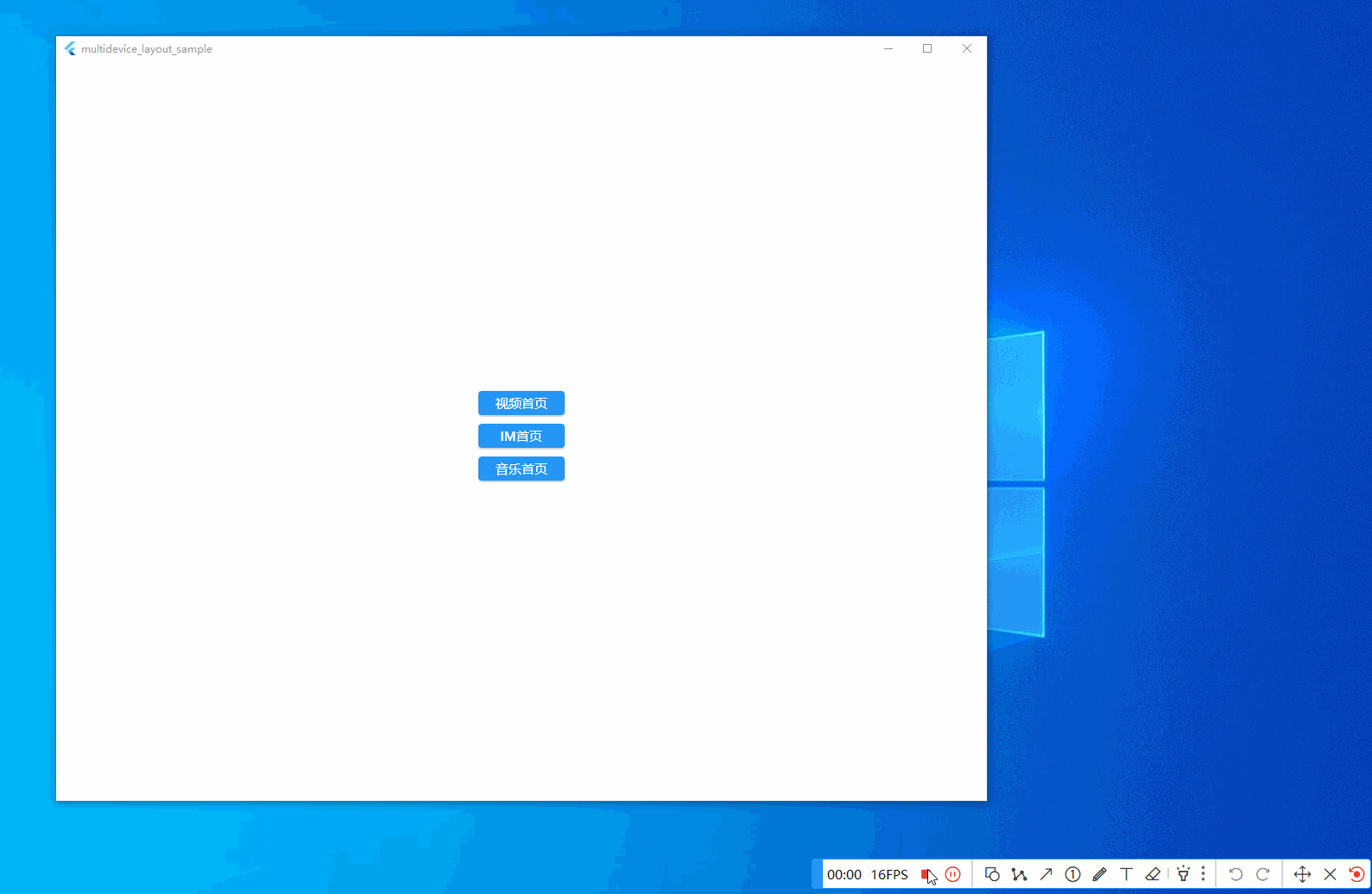
flutter run -d <foldable-id> --target-platform linux運行成功後,即可在「斷點演示 / 柵格演示 / 顯隱演示 / 分欄演示」四個頁面中自由切換,實時觀察不同尺寸下的佈局表現。
三、核心組件體驗與源碼拆解
3.1 斷點感知:讓佈局“聽懂”屏幕
// lib/src/breakpoint/breakpoint.dart
class Breakpoint {
  final double width;
  const Breakpoint(this.width);

  static const xs = 0;
  static const sm = 320;
  static const md = 600;
  static const lg = 1024;
  static const xl = 1440;

  String get name {
    if (width >= xl) return 'xl';
    if (width >= lg) return 'lg';
    if (width >= md) return 'md';
    if (width >= sm) return 'sm';
    return 'xs';
  }
}
使用方式:
Widget build(BuildContext context) {
  final bp = Breakpoint(MediaQuery.of(context).size.width);
  return bp.name == 'md'
      ? _buildTabletLayout()
      : _buildPhoneLayout();
}
3.2 柵格組件:12 分柵格,側滑不掉幀
// lib/src/grid/grid.dart
class Grid extends StatelessWidget {
  final int cols;
  final List<Widget> children;
  const Grid({Key? key, required this.cols, required this.children})
      : super(key: key);

  @override
  Widget build(BuildContext context) {
    return LayoutBuilder(
      builder: (_, con) {
        final itemWidth = con.maxWidth / cols;
        return Wrap(
          spacing: 8,
          runSpacing: 8,
          children: children
              .map((e) => SizedBox(width: itemWidth - 8, child: e))
              .toList(),
        );
      },
    );
  }
}
頁面級調用示例(根據斷點動態列數):
Widget _buildVideoCardList() {
  return Consumer<BreakpointNotifier>(builder: (_, bp, __) {
    final cols = bp.name == 'xl' ? 6 : (bp.name == 'lg' ? 4 : 2);
    return Grid(
      cols: cols,
      children: List.generate(20, (i) => VideoCard(index: i)),
    );
  });
}
3.3 自適應顯隱:摺疊屏“特定區域”秒級隱藏
將音樂首頁劃分為3個區域,效果圖如下:
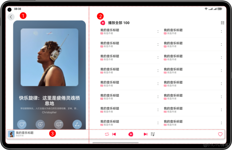
- 整個頁面響應式適配,藉助斷點變化實現不同的佈局效果。
- 區域3在設備上呈現3個區域,頭像、音樂控制按鈕、收藏,音樂控制按鈕部分使用自動隱藏組件。
音樂首頁包含3個基礎區域,具體介紹及實現方案如下表所示:
|
區域編號 |
簡介 |
實現方案 |
|
1 |
頂部頁籤 |
監聽斷點變化改變展示大小和位置。 |
|
2 |
音樂列表 |
藉助柵格組件能力監聽斷點變化改變列數。 |
|
3 |
音樂播放控制和收藏 |
監聽斷點變化展示不同狀態,利用自適應顯隱組件控制音樂控制按鈕的顯示與隱藏。 |
// lib/src/display_priority/display_priority_box.dart
class DisplayPriorityBox extends StatelessWidget {
  final List<DisplayPriorityObject> children;
  final Axis direction;
  const DisplayPriorityBox({
    Key? key,
    required this.children,
    this.direction = Axis.horizontal,
  }) : super(key: key);

  @override
  Widget build(BuildContext context) {
    return LayoutBuilder(builder: (_, con) {
      double used = 0;
      final show = <Widget>[];
      for (final c in children) {
        used += c.minWidth;
        if (used > con.maxWidth) break;
        show.add(c.child);
      }
      return Flex(
        direction: direction,
        children: show,
      );
    });
  }
}
典型用法(歌詞區域優先級最低,空間不足時最先隱藏):
DisplayPriorityBox(
  direction: Axis.vertical,
  children: [
    DisplayPriorityObject(minWidth: 200, child: PlayControl()),   // 優先級高
    DisplayPriorityObject(minWidth: 120, child: LyricPanel()),   // 優先級低
  ],
)
3.4 導航分欄:郵件類 APP 雙欄“無縫”切換
// lib/src/navigation_split_container/navigation_split_container.dart
class NavigationSplitContainer extends StatelessWidget {
  final Widget menu;
  final Widget content;
  final double breakpoint;
  const NavigationSplitContainer({
    Key? key,
    required this.menu,
    required this.content,
    this.breakpoint = 600,
  }) : super(key: key);

  @override
  Widget build(BuildContext context) {
    final w = MediaQuery.of(context).size.width;
    if (w >= breakpoint) {
      return Row(
        children: [
          SizedBox(width: 280, child: menu),
          Expanded(child: content),
        ],
      );
    } else {
      return Navigator(
        onGenerateRoute: (_) => MaterialPageRoute(
          builder: (_) => Scaffold(body: menu),
        ),
      );
    }
  }
}
四、踩坑與最佳實踐
|
踩坑描述
|
解決方案
|
|
摺疊屏摺痕區域遮擋內容
|
通過 |
|
橫豎屏切換後斷點未更新
|
使用 |
|
側邊欄手勢衝突
|
在 |
|
模擬器上刷新率掉幀
|
開啓 |
五、性能數據
在 OpenHarmony 3.2 摺疊屏模擬器(1080 × 2480)上實測:
|
場景
|
平均幀率
|
GPU 佔用
|
內存峯值
|
|
柵格滑動 50 張卡片
|
58.7 fps
|
27 %
|
182 MB
|
|
側邊欄展開/收起 20 次
|
60.1 fps
|
19 %
|
154 MB
|
|
斷點橫豎屏切換 10 次
|
59.3 fps
|
22 %
|
160 MB
|
結論:插件在常用場景下可穩定保持 60 幀,內存增量控制在 30 MB 以內,滿足商用要求。
六、總結
flutter_multidevice_layout_scenepkg 以「斷點 + 柵格 + 顯隱 + 分欄」四大件為核心,覆蓋了 90 % 以上的多設備適配場景;示例工程 adaptive_layout_sample 代碼結構清晰,組件拆分合理,可作為團隊級基礎框架直接落地。
如果你正在尋找一套開箱即用、可擴展、帶性能保障的 Flutter 多設備佈局方案,不妨拉下代碼跑一遍,相信你會愛上這種“只寫一次,多端暢跑”的絲滑體驗。