
‼️ 自適應佈局的侷限性
自適應佈局可以保證窗口尺寸在一定範圍內變化時,頁面的顯示是正常的。但是將窗口尺寸變化較大時(如窗口寬度從400vp變化為1000vp),僅僅依靠自適應佈局可能出現圖片異常放大或頁面內容稀疏、留白過多等問題。
如下圖所示,大屏設備上採用拉伸的自適應佈局,就會導致留白過大的問題。

為了解決上述問題,響應式佈局應運而生。
🔔 響應式佈局簡介
由於自適應佈局能力有限,無法適應較大的頁面尺寸調整,此時就需要藉助響應式佈局能力調整頁面結構。
響應式佈局中最常使用的特徵是,可以將窗口寬度劃分為不同的斷點,當窗口寬度從一個斷點變化到另一個斷點時,改變頁面佈局以獲得更好的顯示效果。
🎯 斷點
斷點是將應用窗口在寬度維度上分成了幾個不同的區間(即不同的斷點),在不同的區間下,開發者可根據需要實現不同的頁面佈局效果。具體的斷點如下所示。
|
斷點名稱 |
取值範圍(vp) |
|
xs
|
[0, 320)
|
|
sm
|
[320, 600)
|
|
md
|
[600, 840)
|
|
lg
|
[840, +∞)
|
説明
- 開發者可以根據實際使用場景決定適配哪些斷點。如xs斷點對應的一般是智能穿戴類設備,如果確定某頁面不會在智能穿戴設備上顯示,則可以不適配xs斷點。
- 可以根據實際需要在lg斷點後面新增xl、xxl等斷點,但注意新增斷點會同時增加UX設計師及應用開發者的工作量,除非必要否則不建議盲目新增斷點。
🔍 監聽斷點變化方式
理解了斷點含義之後,還有一件事情非常重要就是要監聽斷點的變化,判斷應用當前處於何種斷點,進而可以調整應用的佈局。常見的監聽斷點變化的方法如下所示: ● 獲取窗口對象並監聽窗口尺寸變化 ● 通過媒體查詢監聽應用窗口尺寸變化 ● 藉助柵格組件能力監聽不同斷點的變化
🔴 窗口對象監聽斷點變化
- 在UIAbility的onWindowStageCreate生命週期回調中,通過窗口對象獲取啓動時的應用窗口寬度並註冊回調函數監聽窗口尺寸變化。將窗口尺寸的長度單位由px換算為vp後,即可基於前文中介紹的規則得到當前斷點值,此時可以使用狀態變量記錄當前的斷點值方便後續使用。
// MainAbility.ts
import { window, display } from '@kit.ArkUI';
import { UIAbility } from '@kit.AbilityKit';


export default class MainAbility extends UIAbility {
  private windowObj?: window.Window;
  private curBp: string = '';
  //...
  // 根據當前窗口尺寸更新斷點
  private updateBreakpoint(windowWidth: number) :void{
    // 將長度的單位由px換算為vp
    let windowWidthVp = windowWidth / display.getDefaultDisplaySync().densityPixels;
    let newBp: string = '';
    if (windowWidthVp < 320) {
      newBp = 'xs';
    } else if (windowWidthVp < 600) {
      newBp = 'sm';
    } else if (windowWidthVp < 840) {
      newBp = 'md';
    } else {
      newBp = 'lg';
    }
    if (this.curBp !== newBp) {
      this.curBp = newBp;
      // 使用狀態變量記錄當前斷點值
      AppStorage.setOrCreate('currentBreakpoint', this.curBp);
    }
  }


  onWindowStageCreate(windowStage: window.WindowStage) :void{
    windowStage.getMainWindow().then((windowObj) => {
      this.windowObj = windowObj;
      // 獲取應用啓動時的窗口尺寸
      this.updateBreakpoint(windowObj.getWindowProperties().windowRect.width);
      // 註冊回調函數,監聽窗口尺寸變化
      windowObj.on('windowSizeChange', (windowSize)=>{
        this.updateBreakpoint(windowSize.width);
      })
    });
   // ...
  }

  //...
}- 在頁面中,獲取及使用當前的斷點。
@Entry
@Component
struct Index {
  @StorageProp('currentBreakpoint') curBp: string = 'sm';


  build() {
    Flex({justifyContent: FlexAlign.Center, alignItems: ItemAlign.Center}) {
      Text(this.curBp)
        .fontSize(50)
        .fontWeight(FontWeight.Medium)
    }
    .width('100%')
      .height('100%')
  }
}- 運行及驗證效果。
|
** **
|
** **
|
** **
|
🟠 媒體查詢監聽斷點變化
媒體查詢提供了豐富的媒體特徵監聽能力,可以監聽應用顯示區域變化、橫豎屏、深淺色、設備類型等等,因此在應用開發過程中使用的非常廣泛。
本小節僅介紹媒體查詢跟斷點的結合,即如何藉助媒體查詢能力,監聽斷點的變化。
1.對通過媒體查詢監聽斷點的功能做簡單的封裝,方便後續使用
// common/breakpointsystem.ets
import { mediaquery } from '@kit.ArkUI';


export type BreakpointType = 'xs' | 'sm' | 'md' | 'lg' | 'xl' | 'xxl';


export interface Breakpoint {
  name: BreakpointType;
  size: number;
  mediaQueryListener?: mediaquery.MediaQueryListener;
}


export class BreakpointSystem {
  private static instance: BreakpointSystem;
  private readonly breakpoints: Breakpoint[] = [
    { name: 'xs', size: 0 },
    { name: 'sm', size: 320 },
    { name: 'md', size: 600 },
    { name: 'lg', size: 840 }
  ]
  private states: Set<BreakpointState<Object>>;


  private constructor() {
    this.states = new Set();
  }


  public static getInstance(): BreakpointSystem {
    if (!BreakpointSystem.instance) {
      BreakpointSystem.instance = new BreakpointSystem();
    }
    return BreakpointSystem.instance;
  }


  public attach(state: BreakpointState<Object>): void {
    this.states.add(state);
  }


  public detach(state: BreakpointState<Object>): void {
    this.states.delete(state);
  }


  public start() {
    this.breakpoints.forEach((breakpoint: Breakpoint, index) => {
      let condition: string;
      if (index === this.breakpoints.length - 1) {
        condition = `(${breakpoint.size}vp<=width)`;
      } else {
        condition = `(${breakpoint.size}vp<=width<${this.breakpoints[index + 1].size}vp)`;
      }
      breakpoint.mediaQueryListener = mediaquery.matchMediaSync(condition);
      if (breakpoint.mediaQueryListener.matches) {
        this.updateAllState(breakpoint.name);
      }
      breakpoint.mediaQueryListener.on('change', (mediaQueryResult) => {
        if (mediaQueryResult.matches) {
          this.updateAllState(breakpoint.name);
        }
      })
    })
  }


  private updateAllState(type: BreakpointType): void {
    this.states.forEach(state => state.update(type));
  }


  public stop() {
    this.breakpoints.forEach((breakpoint: Breakpoint, index) => {
      if (breakpoint.mediaQueryListener) {
        breakpoint.mediaQueryListener.off('change');
      }
    })
    this.states.clear();
  }
}


export interface BreakpointOptions<T> {
  xs?: T;
  sm?: T;
  md?: T;
  lg?: T;
  xl?: T;
  xxl?: T;
}


export class BreakpointState<T extends Object> {
  public value: T | undefined = undefined;
  private options: BreakpointOptions<T>;


  constructor(options: BreakpointOptions<T>) {
    this.options = options;
  }


  static of<T extends Object>(options: BreakpointOptions<T>): BreakpointState<T> {
    return new BreakpointState(options);
  }


  public update(type: BreakpointType): void {
    if (type === 'xs') {
      this.value = this.options.xs;
    } else if (type === 'sm') {
      this.value = this.options.sm;
    } else if (type === 'md') {
      this.value = this.options.md;
    } else if (type === 'lg') {
      this.value = this.options.lg;
    } else if (type === 'xl') {
      this.value = this.options.xl;
    } else if (type === 'xxl') {
      this.value = this.options.xxl;
    } else {
      this.value = undefined;
    }
  }
}
2.在頁面中,通過媒體查詢,監聽應用窗口寬度變化,獲取當前應用所處的斷點值。
// MediaQuerySample.ets
import { BreakpointSystem, BreakpointState } from '../common/breakpointsystem';


@Entry
@Component
struct MediaQuerySample {
  @State compStr: BreakpointState<string> = BreakpointState.of({ sm: "sm", md: "md", lg: "lg" });
  @State compImg: BreakpointState<Resource> = BreakpointState.of({
    sm: $r('app.media.sm'),
    md: $r('app.media.md'),
    lg: $r('app.media.lg')
  });

  aboutToAppear() {
    BreakpointSystem.getInstance().attach(this.compStr);
    BreakpointSystem.getInstance().attach(this.compImg);
    BreakpointSystem.getInstance().start();
  }


  aboutToDisappear() {
    BreakpointSystem.getInstance().detach(this.compStr);
    BreakpointSystem.getInstance().detach(this.compImg);
    BreakpointSystem.getInstance().stop();
  }


  build() {
    Flex({ direction: FlexDirection.Column, alignItems: ItemAlign.Center, justifyContent: FlexAlign.Center }) {
      Column()
        .height(100)
        .width(100)
        .backgroundImage(this.compImg.value)
        .backgroundImagePosition(Alignment.Center)
        .backgroundImageSize(ImageSize.Contain)


      Text(this.compStr.value)
        .fontSize(24)
        .margin(10)
    }
    .width('100%')
    .height('100%')
  }
}
🟢 柵格佈局監聽斷點變化
柵格佈局基於屏幕寬度將界面劃分為若干等寬列,通過控制元素橫跨的列數實現精準佈局,並能在不同斷點下動態調整元素佔比,確保響應式適配。
柵格佈局默認將屏幕寬度劃分為12個等寬列,在不同的斷點下,元素所佔列數,則可以有如下不同的顯示效果。
- 在sm斷點下,每一個元素佔3列,則可形成4個柵格
- 在md斷點下:每一個元素佔2列,則可形成6個柵格
|
sm斷點 |
md斷點 |
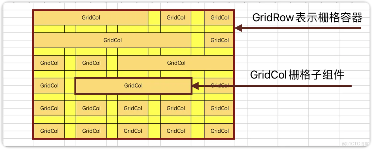
柵格組件介紹
- GridRow: 表示柵格容器組件
- GridCol: 必須使用在GridRow容器內,表示一個柵格子組件
默認柵格列數
柵格系統的總列數可以使用默認值(12列),也可以自己指定列數,還可以根據屏幕的寬度動態調整列數。
默認柵格列數。
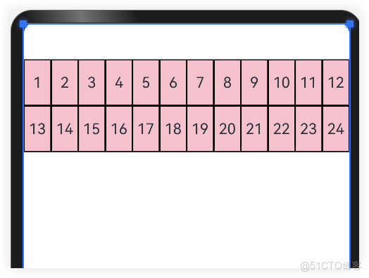
@Entry
@Component
struct Index {
@State items:number[] = [1,2,3,4,5,6,7,8,9,10,11,12,13,14,15,16,17,18,19,20,21,22,23,24]
build() {
GridRow() {
ForEach(this.items,(item:number)=>{
GridCol() {
Row() {
Text(`${item}`)
}
.width('100%')
.height(50)
.border({ width: 1, color: Color.Black, style: BorderStyle.Solid })
.justifyContent(FlexAlign.Center)
}
})
}.height(300).backgroundColor(Color.Pink)
}
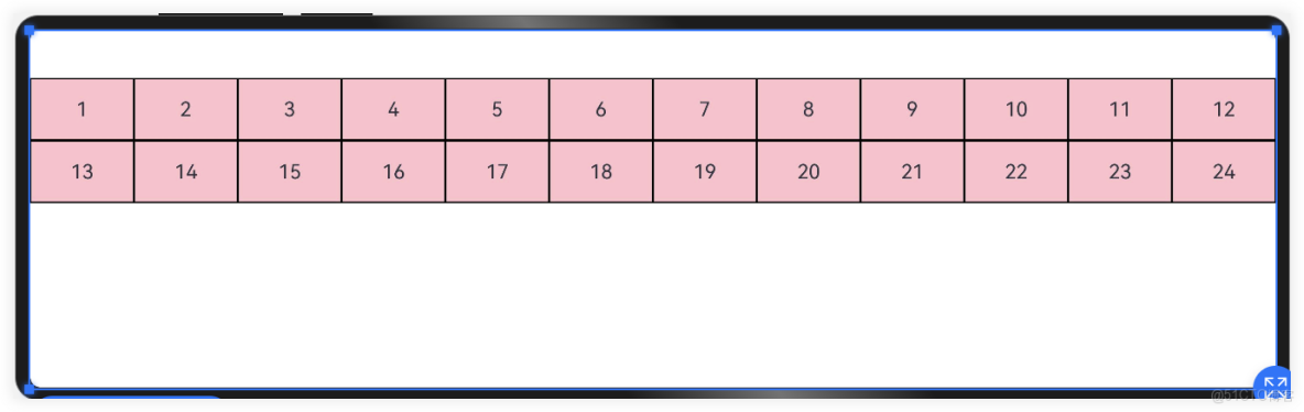
}指定柵格列數
通過GridRow{columns:6}參數可以指定柵格總列數。
- 比如下面案例中,柵格總列數為6,一共24個柵格,那麼一行就是6個,一共4行;超過一行的部分自動換行。
@Entry
@Component
struct Index {
  @State items: number[] = [1, 2, 3, 4, 5, 6, 7, 8, 9, 10, 11, 12, 13, 14, 15, 16, 17, 18, 19, 20, 21, 22, 23, 24]

  build() {
    //指定柵格容器的最大列數
    GridRow({ columns: 6 }) {
      ForEach(this.items, (item: number) => {
        GridCol() {
          Row() {
            Text(`${item}`)
          }
          .width('100%')
          .height(50)
          .border({ width: 1, color: Color.Black, style: BorderStyle.Solid })
          .justifyContent(FlexAlign.Center)
        }
      })
    }.backgroundColor(Color.Pink)
  }
}
動態柵格列數
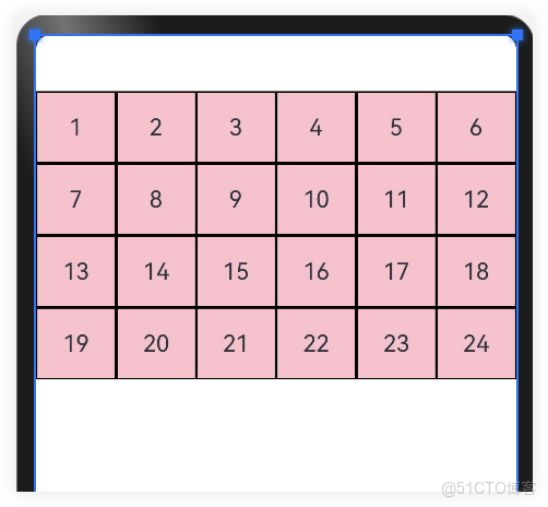
為了適應不同屏幕尺寸下的佈局,柵格系統的總列數可以根據不同的屏幕尺寸動態調整。不同屏幕尺寸的設備,依靠“斷點”進行區分,根據斷點的不同動態調整柵格列數。

|
斷點名稱 |
取值範圍(vp) |
設備描述 |
|
xs
|
[0, 320)
|
最小寬度類型設備
|
|
sm
|
[320, 520)
|
小寬度類型設備
|
|
md
|
[520, 840)
|
中等寬度類型設備
|
|
lg
|
[840, 1080)
|
大寬度類型設備
|
|
xl
|
[1080,1920)
|
特大寬度類型設備
|
|
xxl
|
[1920,+♾)
|
超大寬度類型設備
|
如下代碼:根據斷點設備設置柵格總列數
import { List } from '@kit.ArkTS'

@Entry
@Component
struct Index {
  @State items: number[] = [1, 2, 3, 4, 5, 6, 7, 8, 9, 10, 11, 12, 13, 14, 15, 16, 17, 18, 19, 20, 21, 22, 23, 24]

  build() {
    GridRow({
      //設置屏幕寬度各斷點區間值
      breakpoints: {
        value: ['320vp', '520vp', '840vp', '1080vp', '1920vp']
      },
      //設置對應斷點所佔列數
      columns: {
        xs: 3, //最小寬度型設備3列
        sm: 6, //小寬度設備6列
        md: 8, //中型寬度設備8列
        lg: 12    //大型寬度設備12列
      },
    }) {
      ForEach(this.items, (item: number) => {
        GridCol() {
          Row() {
            Text(`${item}`)
          }
          .width('100%')
          .height(50)
          .border({ width: 1, color: Color.Black, style: BorderStyle.Solid })
          .justifyContent(FlexAlign.Center)
        }
      })
    }.backgroundColor(Color.Pink)
  }
}
設置柵格樣式
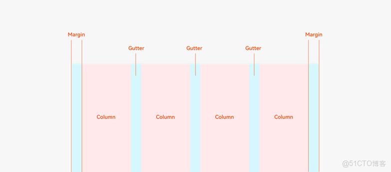
柵格的樣式由Margin、Gutter、Columns三個屬性決定。
- Margin是相對應用窗口、父容器的左右邊緣的距離,決定了內容可展示的整體寬度。
- Gutter是相鄰的兩個Column之間的距離,決定內容間的緊密程度。
- Columns是柵格中的列數,其數值決定了內容的佈局複雜度。
單個Column的寬度是系統結合Margin、Gutter和Columns自動計算的,不需要也不允許開發者手動配置。
- 通過
GridRow {gutter: 10}參數可以調整柵格子之間的間距,默認為0。 - 通過設置
GridCol{span:3}來設置柵格佔用的列數,GridRow採用默認列數12列;
- 在xs斷點時:一個柵格元素佔12列,一行可容納1個柵格
- 在sm斷點時,一個柵格元素佔6列,一行可容納2個柵格
- 在md斷點時:一個柵格元素佔4列,一行可容納3個柵格
- 在lg斷點時:一個柵格元素佔3列,一行可容納4個柵格

import { List } from '@kit.ArkTS'

@Entry
@Component
struct Index {
  @State items: number[] = [1, 2, 3, 4, 5, 6, 7, 8, 9, 10, 11, 12, 13, 14, 15, 16, 17, 18, 19, 20, 21, 22, 23, 24]
  //當前斷點
  @State currentBreakPoint: string = "sm"

  build() {
    GridRow({
      gutter: 10
    }) {
      ForEach(this.items, (item: number, index: number) => {
        GridCol() {
          Row() {
            Text(`${this.currentBreakPoint} #${item}`)
          }
          .width('100%')
          .height(50)
          .border({ width: 1, color: Color.Black, style: BorderStyle.Solid })
          .justifyContent(FlexAlign.Center)
        }.span({
          xs: 12,
          sm: 6,
          md: 4,
          lg: 3
        })
      })
    }.backgroundColor(Color.Pink)
    .padding(10)
    .onBreakpointChange((breakpoints: string) => {
      this.currentBreakPoint = breakpoints
    })
  }
}
若有收穫,就點個贊吧。有興趣的同學可以考取鴻蒙開發者認證