
鴻蒙學習實戰之路-線性佈局 Row_Column 全攻略
最近好多朋友問我:"鴻蒙開發的佈局咋這麼難?寫個頁面調來調去總是不對齊,是不是我沒天賦?" o(╯□╰)o
今天這篇,我就手把手帶你搞定鴻蒙最基礎也是最常用的線性佈局(Row/Column),相當於給你配齊鴻蒙佈局的"鍋碗瓢盆",以後寫頁面就像炒菜一樣順手!
一、啥是線性佈局?
線性佈局是鴻蒙開發中最常用的佈局方式,就像咱們排隊買奶茶,要麼豎排(Column)要麼橫排(Row),簡單直接!
- Column:子元素垂直排列,主軸是上下方向
- Row:子元素水平排列,主軸是左右方向
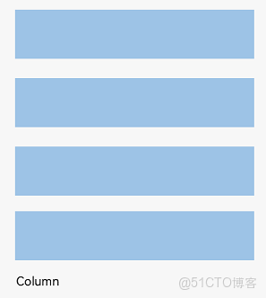
(Column 垂直排列示意圖)
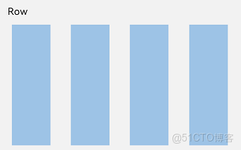
(Row 水平排列示意圖)
二、基礎概念先搞懂
在開始寫代碼之前,咱們先把幾個關鍵概念搞清楚,不然寫起來像無頭蒼蠅:
- 佈局容器:就是 Row/Column 這些能裝其他元素的"容器",負責計算子元素尺寸和排列
- 佈局子元素:容器裏面的各種元素,比如 Text、Image、Button 這些
- 主軸:佈局的主要方向,Row 的主軸是水平,Column 的主軸是垂直
- 交叉軸:和主軸垂直的方向,Row 的交叉軸是垂直,Column 的交叉軸是水平
🥦 西蘭花小貼士: 這些概念其實和 CSS 的 Flex 佈局很像,前端同學可以直接類比理解,學起來更快!
三、實戰演練:從簡單到複雜
1. 第一步:設置子元素間距
寫佈局第一件事,就是給子元素留點呼吸空間!鴻蒙提供了space屬性,一行代碼搞定等間距排列:
Column 垂直間距示例:
Column({ space: 20 }) {  // 設置子元素垂直間距為20
  Text('space: 20').fontSize(15).fontColor(Color.Gray).width('90%')
  Row().width('90%').height(50).backgroundColor(0xF5DEB3)  // 西蘭花色的方塊^_^
  Row().width('90%').height(50).backgroundColor(0xD2B48C)  // 花菜色的方塊^_^
  Row().width('90%').height(50).backgroundColor(0xF5DEB3)
}.width('100%')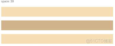
Row 水平間距示例:
Row({ space: 35 }) {  // 設置子元素水平間距為35
  Text('space: 35').fontSize(15).fontColor(Color.Gray)
  Row().width('10%').height(150).backgroundColor(0xF5DEB3)
  Row().width('10%').height(150).backgroundColor(0xD2B48C)
  Row().width('10%').height(150).backgroundColor(0xF5DEB3)
}.width('90%')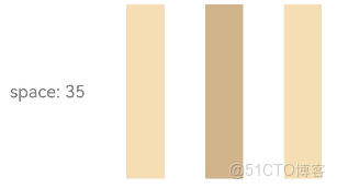
2. 第二步:主軸對齊方式
子元素在主軸上怎麼排列?是靠左還是靠右?還是均勻分佈?這就需要justifyContent屬性了:
Column 垂直排列示例:
// 居中對齊
Column({}) {
  Column() {}.width('80%').height(50).backgroundColor(0xF5DEB3)
  Column() {}.width('80%').height(50).backgroundColor(0xD2B48C)
  Column() {}.width('80%').height(50).backgroundColor(0xF5DEB3)
}.width('100%').height(300).backgroundColor('rgb(242,242,242)')
.justifyContent(FlexAlign.Center)  // 垂直居中
常見的主軸對齊值:
|
值
|
效果
|
|
|
主軸起始對齊(默認)
|
|
|
主軸居中對齊
|
|
|
主軸結束對齊
|
|
|
兩端對齊,中間均勻分佈
|
|
|
每個元素兩側間距相等
|
|
|
所有間距(包括首尾)都相等
|
3. 第三步:交叉軸對齊方式
主軸搞完了,交叉軸怎麼對齊?比如 Row 裏面的元素是頂部對齊還是垂直居中?這就需要alignItems屬性:
Row 垂直對齊示例:
// 垂直居中對齊
Row({}) {
  Column() {}.width('20%').height(30).backgroundColor(0xF5DEB3)
  Column() {}.width('20%').height(30).backgroundColor(0xD2B48C)
  Column() {}.width('20%').height(30).backgroundColor(0xF5DEB3)
}.width('100%').height(200).backgroundColor('rgb(242,242,242)')
.alignItems(VerticalAlign.Center)  // 垂直居中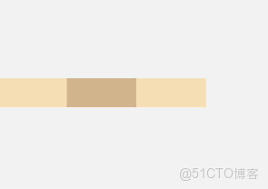
常見的交叉軸對齊值:
- Column 容器(交叉軸是水平):
HorizontalAlign.Start/Center/End - Row 容器(交叉軸是垂直):
VerticalAlign.Top/Center/Bottom
🥦 西蘭花警告: 別搞混主軸和交叉軸!很多新手一開始寫不對佈局,就是因為把這兩個軸的對齊屬性搞反了,一定要記住:justifyContent管主軸,alignItems管交叉軸!
4. 第四步:單個元素自定義對齊
如果想讓某個子元素和其他元素對齊方式不一樣怎麼辦?比如其他元素都左對齊,就它右對齊?
鴻蒙提供了alignSelf屬性,專門用來覆蓋單個元素的交叉軸對齊方式:
Column({}) {
  Column() {}.width('80%').height(50).backgroundColor(0xF5DEB3)
  Column() {}.width('80%').height(50).backgroundColor(0xD2B48C)
  .alignSelf(HorizontalAlign.End)  // 單獨設置這個元素右對齊
  Column() {}.width('80%').height(50).backgroundColor(0xF5DEB3)
}.width('100%').alignItems(HorizontalAlign.Start).backgroundColor('rgb(242,242,242)')
5. 第五步:自適應佈局
在不同尺寸的設備上,佈局要能自適應調整,鴻蒙提供了幾種常用的自適應方式:
自適應拉伸
使用flexGrow屬性,讓子元素自動拉伸填充剩餘空間:
Row({}) {
  Column() {}.width('20%').height(30).backgroundColor(0xF5DEB3)
  Column() {}.width('20%').height(30).backgroundColor(0xD2B48C)
  .flexGrow(1)  // 這個元素自動拉伸填充剩餘空間
  Column() {}.width('20%').height(30).backgroundColor(0xF5DEB3)
}.width('100%').height(100).backgroundColor('rgb(242,242,242)')
自適應延伸
當內容太多一屏放不下時,我們可以用滾動條來展示:
Column() {
  Text('自適應延伸示例').fontSize(20).margin({ bottom: 20 })
  Column({ space: 10 }) {
    // 假設有很多內容
    ForEach(new Array(20), (_, index) => {
      Row().width('100%').height(50).backgroundColor(index % 2 === 0 ? 0xF5DEB3 : 0xD2B48C)
    })
  }
  .width('100%')
  .height(200)
  .scrollable(true)  // 開啓滾動
}
.width('100%')
.padding(20)
四、常見佈局場景實戰
1. 登錄頁面佈局
Column() {
  Text('用户登錄').fontSize(30).margin({ bottom: 50 })

  Column({ space: 20 }) {
    TextInput({ placeholder: '請輸入用户名' })
      .width('80%')
      .height(50)
      .backgroundColor(Color.White)
      .borderRadius(8)

    TextInput({ placeholder: '請輸入密碼' })
      .width('80%')
      .height(50)
      .backgroundColor(Color.White)
      .borderRadius(8)
      .type(InputType.Password)

    Button('登錄')
      .width('80%')
      .height(50)
      .backgroundColor(0x3366FF)
      .fontColor(Color.White)
      .borderRadius(8)
  }
}
.width('100%')
.height('100%')
.backgroundColor('rgb(242,242,242)')
.justifyContent(FlexAlign.Center)
2. 底部導航欄佈局
Row() {
  Column({ space: 5 }) {
    Image($r('app.media.home')).width(24).height(24)
    Text('首頁').fontSize(12)
  }.flexGrow(1).alignItems(HorizontalAlign.Center)

  Column({ space: 5 }) {
    Image($r('app.media.category')).width(24).height(24)
    Text('分類').fontSize(12)
  }.flexGrow(1).alignItems(HorizontalAlign.Center)

  Column({ space: 5 }) {
    Image($r('app.media.cart')).width(24).height(24)
    Text('購物車').fontSize(12)
  }.flexGrow(1).alignItems(HorizontalAlign.Center)

  Column({ space: 5 }) {
    Image($r('app.media.mine')).width(24).height(24)
    Text('我的').fontSize(12)
  }.flexGrow(1).alignItems(HorizontalAlign.Center)
}
.width('100%')
.height(60)
.backgroundColor(Color.White)
.borderTop({ width: 1, color: 0xF0F0F0 })
五、性能優化小技巧
- 避免嵌套過深:佈局嵌套不要超過 3 層,不然渲染性能會下降
- 合理設置寬高:儘量使用百分比或固定值,避免不必要的計算
- 使用 flexGrow 代替固定寬度:在需要自適應的場景下,flexGrow 比計算百分比更高效
- 減少重排重繪:避免頻繁修改佈局屬性,儘量使用狀態管理來控制
🥦 西蘭花小貼士: DevEco Studio 有個佈局邊界工具,可以幫助你查看佈局的渲染邊界,優化性能!
六、總結與下一步
今天咱們學會了:
- 線性佈局的基本概念(Row/Column、主軸/交叉軸)
- 子元素間距設置(space 屬性)
- 主軸對齊(justifyContent)
- 交叉軸對齊(alignItems/alignSelf)
- 自適應佈局技巧
- 實際佈局場景應用
現在你已經掌握了鴻蒙佈局的基礎技能,就像學會了切菜、炒菜的基本動作,接下來可以開始做更復雜的"菜品"了!
👉 預告:《鴻蒙學習實戰之路-彈性佈局 Flex 全攻略》
📚 推薦資料:
- 官方文檔:線性佈局開發指南
- 視頻教程:開發者學堂-佈局開發
我是鹽焗西蘭花, 不教理論,只給你能跑的代碼和避坑指南。 下期見!🥦