
鴻蒙學習實戰之路-Tabs 標籤頁組件全攻略 🥦
最近好多朋友問我:"鴻蒙裏的頁面切換怎麼弄?就像微信底部那幾個標籤欄一樣的效果",別慌!今天咱們就來聊聊鴻蒙裏的 Tabs 組件,這個組件可是實現頁面分類切換的神器~ 😊
一、Tabs 組件是什麼?
Tabs 組件是鴻蒙裏的一個容器組件,當頁面內容比較多時,可以用它來分類展示。比如咱們手機裏常見的:
- 微信底部的"微信""通訊錄""發現""我"
- 淘寶首頁的各種分類標籤
- 新聞 App 頂部的"推薦""熱點""財經"等
這些效果,用 Tabs 組件都能輕鬆實現!
二、Tabs 組件基礎用法
咱們先從最簡單的 Tabs 用法開始,就像學炒菜先學會開火一樣~ 🔥
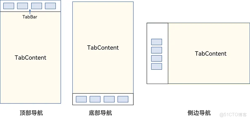
1. 核心結構
Tabs 組件的核心結構非常簡單,主要由兩部分組成:
Tabs():外層容器,包裹所有標籤頁TabContent():每個標籤頁的內容,需要配合.tabBar()設置標籤文字
基礎代碼示例:
@Entry
@Component
struct TabsBasicDemo {
build() {
Tabs() { // 外層容器
TabContent() { // 第一個標籤頁
Text('首頁內容')
.fontSize(30)
.textAlign(TextAlign.Center)
}
.tabBar('首頁') // 設置標籤文字
TabContent() { // 第二個標籤頁
Text('推薦內容')
.fontSize(30)
.textAlign(TextAlign.Center)
}
.tabBar('推薦')
TabContent() { // 第三個標籤頁
Text('發現內容')
.fontSize(30)
.textAlign(TextAlign.Center)
}
.tabBar('發現')
TabContent() { // 第四個標籤頁
Text('我的內容')
.fontSize(30)
.textAlign(TextAlign.Center)
}
.tabBar('我的')
}
}
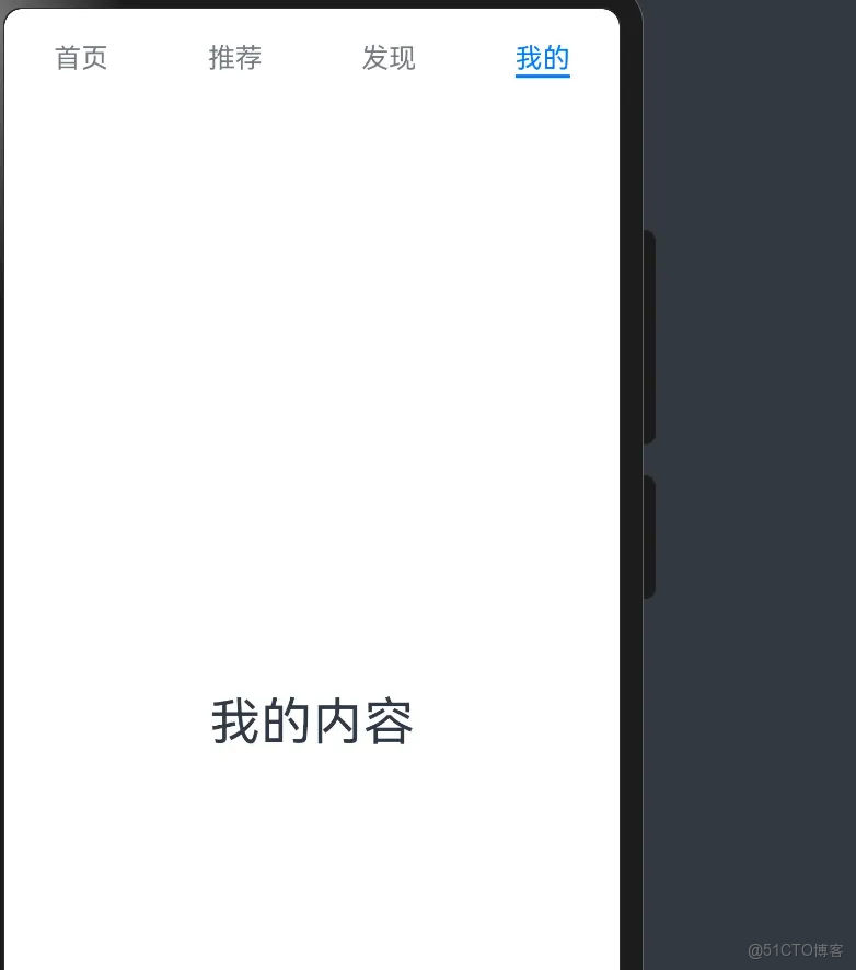
}運行這段代碼,你就能看到一個簡單的標籤頁切換效果啦!是不是超簡單?
效果預覽:
三、Tabs 組件常用屬性
默認的 Tabs 已經能用了,但咱們還可以通過一些屬性來調整它的外觀和行為,就像給菜調味一樣~ 😋
通過這些屬性,我們可以實現各種不同的導航效果:
1. 垂直導航 & 導航位置
默認的 Tabs 是水平導航欄在頂部,咱們可以調整:
vertical:設置導航方向為水平或垂直barPosition:設置導航欄位置(開頭/結尾)
代碼示例:
@Entry
@Component
struct TabsAttributeDemo {
  build() {
    Tabs() {
      TabContent() {
        Text('首頁內容')
          .fontSize(30)
      }
      .tabBar('首頁')

      TabContent() {
        Text('推薦內容')
          .fontSize(30)
      }
      .tabBar('推薦')

      TabContent() {
        Text('發現內容')
          .fontSize(30)
      }
      .tabBar('發現')

      TabContent() {
        Text('我的內容')
          .fontSize(30)
      }
      .tabBar('我的')
    }
    .vertical(true) // 設置為垂直導航
    .barPosition(BarPosition.End) // 導航欄在末尾
    .scrollable(false) // 禁用滑動切換
    .animationDuration(500) // 切換動畫時長
  }
}
2. 滾動導航欄
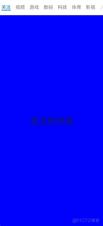
當標籤太多,屏幕放不下時,咱們可以把導航欄設置為滾動的,這樣就能容納更多標籤了~ 👇
效果預覽:
代碼示例:
@Entry
@Component
struct ScrollableTabsDemo {
  // 定義多個標籤標題
  titles: string[] = ['首頁', '關注', '熱門', '軍事', '體育', '八卦', '數碼', '財經', '美食', '旅行']

  build() {
    Tabs() {
      // 使用ForEach循環生成多個TabContent
      ForEach(this.titles, (title: string) => {
        TabContent() {
          Text(title + '的內容')
            .fontSize(30)
            .textAlign(TextAlign.Center)
        }
        .tabBar(title)
      })
    }
    .barMode(BarMode.Scrollable) // 設置為滾動導航欄
  }
}
四、自定義 TabBar(重點!)
默認的 TabBar 只有文字,不夠美觀。咱們可以自定義 TabBar,添加圖標、調整樣式,讓它更符合咱們的設計需求~ 🎨
1. 自定義 TabBar 外觀
咱們可以使用@Builder裝飾器來創建自定義的 TabBar 組件,這樣就能添加圖片、調整佈局了。
TabBar 的 tabBar 屬性支持兩種類型:string 和 CustomBuilder。當我們需要自定義複雜的 TabBar 時,可以使用 CustomBuilder:
讓咱們實現一個包含圖標和文字的自定義 TabBar:
代碼示例:
@Entry
@Component
struct CustomTabBarDemo {
  build() {
    Tabs() {
      TabContent() {
        Text('首頁')
          .fontSize(30)
      }
      // 使用自定義TabBar
      .tabBar(this.tabBarBuilder($r('app.media.ic_tabbar_icon_0'), '首頁'))

      TabContent() {
        Text('我的')
          .fontSize(30)
      }
      .tabBar(this.tabBarBuilder($r('app.media.ic_tabbar_icon_3'), '我的'))
    }
    .barPosition(BarPosition.End) // 導航欄在底部
  }

  // 自定義TabBar的Builder函數
  @Builder
  tabBarBuilder(img: ResourceStr, text: string) {
    Column() { // 垂直佈局
      Image(img) // 圖標
        .width(30)
        .height(30)
      Text(text) // 文字
        .fontSize(12)
    }
    .width('100%')
    .height('100%')
    .justifyContent(FlexAlign.Center)
  }
}
2. 實現 TabBar 高亮效果
自定義 TabBar 後,默認的高亮效果就沒有了,咱們需要自己實現。這時候就需要用到 Tabs 的事件和狀態管理了~ ✨
效果預覽:
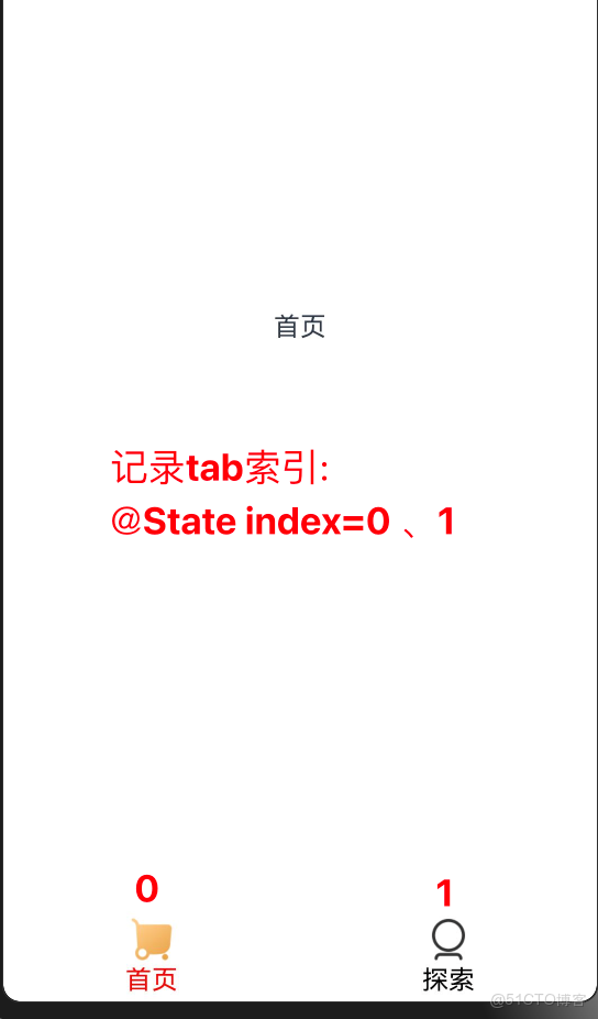
核心思路:
- 用
@State變量保存當前選中的索引 - 在
onChange和onTabBarClick事件中更新索引 - 在自定義 TabBar 中根據索引切換高亮樣式
代碼示例:
@Entry
@Component
struct HighlightTabBarDemo {
  // 保存當前選中的索引
  @State selectedIndex: number = 0

  build() {
    Column() {
      Tabs() {
        TabContent() {
          Text('首頁內容')
            .fontSize(30)
        }
        // 傳遞默認圖標、高亮圖標、文字和索引
        .tabBar(this.tabBarBuilder($r('app.media.ic_tabbar_icon_0'), $r('app.media.ic_tabbar_icon_0_selected'), '首頁', 0))

        TabContent() {
          Text('我的內容')
            .fontSize(30)
        }
        .tabBar(this.tabBarBuilder($r('app.media.ic_tabbar_icon_3'), $r('app.media.ic_tabbar_icon_3_selected'), '我的', 1))
      }
      .layoutWeight(1)
      .barPosition(BarPosition.End)
      // 滑動切換時觸發
      .onChange((index) => {
        this.selectedIndex = index
      })
      // 點擊TabBar時觸發
      .onTabBarClick((index) => {
        this.selectedIndex = index
      })
    }
  }

  // 自定義TabBar的Builder函數
  @Builder
  tabBarBuilder(img: ResourceStr, selectedImg: ResourceStr, text: string, index: number) {
    Column() {
      // 根據選中狀態切換圖片
      Image(this.selectedIndex == index ? selectedImg : img)
        .width(30)
        .height(30)
      // 根據選中狀態切換文字顏色
      Text(text)
        .fontSize(12)
        .fontColor(this.selectedIndex == index ? '#efc07e' : Color.Black)
    }
    .width('100%')
    .height('100%')
    .justifyContent(FlexAlign.Center)
  }
}
3. 優化 TabBar 參數(使用接口)
當自定義 TabBar 的參數越來越多時,直接傳遞多個參數容易出錯。咱們可以使用接口來優化參數傳遞~ 📝
代碼示例:
// 定義TabBar參數的接口
interface TabBarParams {
img: ResourceStr // 默認圖標
selectedImg: ResourceStr // 高亮圖標
text: string // 標籤文字
index: number // 標籤索引
}
@Entry
@Component
struct OptimizedTabBarDemo {
@State selectedIndex: number = 0
build() {
Column() {
Tabs() {
TabContent() {
Text('首頁內容')
.fontSize(30)
}
// 使用對象傳遞參數
.tabBar(this.tabBarBuilder({
img: $r('app.media.ic_tabbar_icon_0'),
selectedImg: $r('app.media.ic_tabbar_icon_0_selected'),
text: '首頁',
index: 0
}))
TabContent() {
Text('我的內容')
.fontSize(30)
}
.tabBar(this.tabBarBuilder({
img: $r('app.media.ic_tabbar_icon_3'),
selectedImg: $r('app.media.ic_tabbar_icon_3_selected'),
text: '我的',
index: 1
}))
}
.layoutWeight(1)
.barPosition(BarPosition.End)
.onChange((index) => {
this.selectedIndex = index
})
.onTabBarClick((index) => {
this.selectedIndex = index
})
}
}
// 使用接口類型的參數
@Builder
tabBarBuilder(params: TabBarParams) {
Column() {
Image(this.selectedIndex == params.index ? params.selectedImg : params.img)
.width(30)
.height(30)
Text(params.text)
.fontSize(12)
.fontColor(this.selectedIndex == params.index ? '#efc07e' : Color.Black)
}
.width('100%')
.height('100%')
.justifyContent(FlexAlign.Center)
}
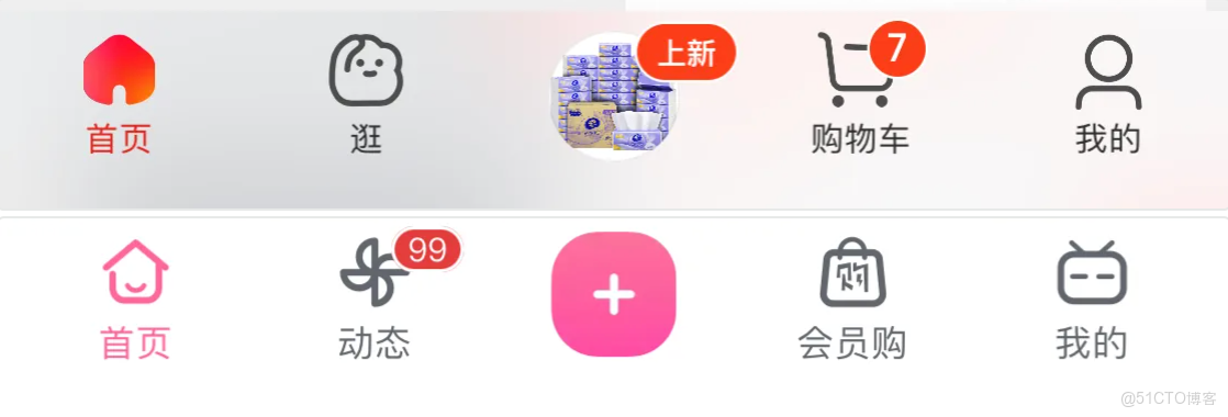
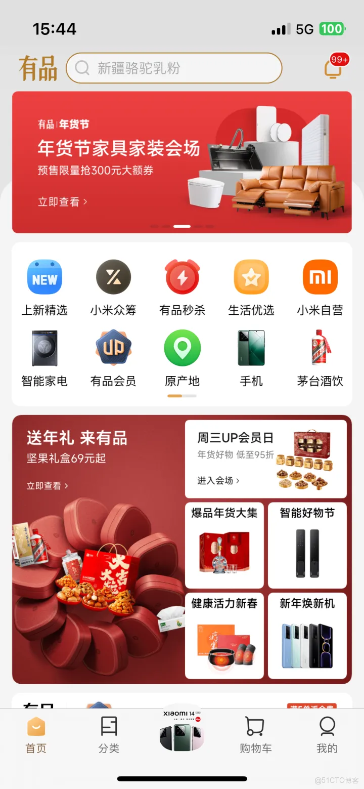
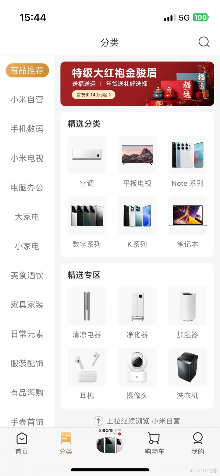
}五、實戰案例:小米有品底部導航
咱們來做一個實戰案例,模仿小米有品的底部導航效果,這個效果在很多 App 裏都很常見哦~ 🛒
效果預覽:
切換效果:
需求分析
- 底部有 5 個標籤:首頁、分類、中間特殊按鈕、購物車、我的
- 中間按鈕是特殊樣式(突出顯示)
- 選中時圖標和文字會高亮
代碼實現
// 定義TabBar參數接口
interface XMTabBarParams {
  img: ResourceStr
  selectedImg: ResourceStr
  text: string
  index: number
}

@Entry
@Component
struct XiaomiYoupinDemo {
  // 保存當前選中的索引
  @State selectedIndex: number = 0

  build() {
    Column() {
      Tabs() {
        // 首頁
        TabContent() {
          Image($r('app.media.ic_xiaomi_content_00'))
            .width('100%')
            .height('100%')
        }
        .tabBar(this.tabBarBuilder({
          img: $r('app.media.ic_tabbar_icon_0'),
          selectedImg: $r('app.media.ic_tabbar_icon_0_selected'),
          text: '首頁',
          index: 0
        }))

        // 分類
        TabContent() {
          Image($r('app.media.ic_xiaomi_content_01'))
            .width('100%')
            .height('100%')
        }
        .tabBar(this.tabBarBuilder({
          img: $r('app.media.ic_tabbar_icon_1'),
          selectedImg: $r('app.media.ic_tabbar_icon_1_selected'),
          text: '分類',
          index: 1
        }))

        // 中間特殊按鈕
        TabContent() {
          Image($r('app.media.ic_xiaomi_content_02'))
            .width('100%')
            .height('100%')
        }
        .tabBar(this.centerTabBarBuilder()) // 使用特殊的TabBar

        // 購物車
        TabContent() {
          Image($r('app.media.ic_xiaomi_content_03'))
            .width('100%')
            .height('100%')
        }
        .tabBar(this.tabBarBuilder({
          img: $r('app.media.ic_tabbar_icon_2'),
          selectedImg: $r('app.media.ic_tabbar_icon_2_selected'),
          text: '購物車',
          index: 3 // 注意這裏的索引是3,因為中間按鈕佔用了索引2
        }))

        // 我的
        TabContent() {
          Image($r('app.media.ic_xiaomi_content_04'))
            .width('100%')
            .height('100%')
        }
        .tabBar(this.tabBarBuilder({
          img: $r('app.media.ic_tabbar_icon_3'),
          selectedImg: $r('app.media.ic_tabbar_icon_3_selected'),
          text: '我的',
          index: 4
        }))
      }
      .layoutWeight(1)
      .barPosition(BarPosition.End)
      .onChange((index) => {
        this.selectedIndex = index
      })
      .onTabBarClick((index) => {
        this.selectedIndex = index
      })
    }
  }

  // 普通TabBar的Builder
  @Builder
  tabBarBuilder(params: XMTabBarParams) {
    Column({ space: 5 }) {
      Image(this.selectedIndex == params.index ? params.selectedImg : params.img)
        .width(30)
        .height(30)
      Text(params.text)
        .fontSize(12)
        .fontColor(this.selectedIndex == params.index ? '#efc07e' : Color.Black)
    }
    .width('100%')
    .height('100%')
    .justifyContent(FlexAlign.Center)
  }

  // 中間特殊TabBar的Builder
  @Builder
  centerTabBarBuilder() {
    Image($r('app.media.ic_xiaomi_center_tabBar'))
      .width(60)
      .height(60)
      .borderRadius(30)
  }
}
六、Tabs 組件的事件
Tabs 組件提供了兩個常用事件,咱們可以用來監聽標籤切換:
|
事件名
|
功能描述
|
|
|
標籤切換後觸發(滑動或點擊都觸發)
|
|
|
點擊標籤欄時觸發
|
代碼示例:
@Entry
@Component
struct TabsEventsDemo {
  build() {
    Tabs() {
      TabContent() {
        Text('首頁')
          .fontSize(30)
      }
      .tabBar('首頁')

      TabContent() {
        Text('推薦')
          .fontSize(30)
      }
      .tabBar('推薦')
    }
    .onChange((index) => {
      console.log('標籤切換到了:' + index)
    })
    .onTabBarClick((index) => {
      console.log('點擊了標籤:' + index)
    })
  }
}
🥦 西蘭花小貼士
- TabContent 的子組件:每個 TabContent 只能有一個直接子組件,如果需要多個子組件,要使用容器組件(如 Column、Row)包裹
- 導航欄位置:設置
barPosition(BarPosition.End)可以讓導航欄在底部,適合做 App 的主導航 - 滑動切換:可以通過
scrollable(false)禁用滑動切換,只能通過點擊標籤切換 - 動畫時長:使用
animationDuration()可以調整標籤切換的動畫時長 - 自定義 TabBar:自定義 TabBar 後,需要自己實現高亮效果,記得同時監聽
onChange和onTabBarClick事件
📚 官方文檔
如果想了解更多關於 Tabs 組件的內容,可以查看官方文檔: 鴻蒙 Tabs 組件官方文檔
總結
今天咱們學習了 Tabs 組件的全部用法,從基礎用法到自定義 TabBar,再到實戰案例,是不是感覺已經掌握了這個組件的精髓?
Tabs 組件就像一個分類收納盒,把不同的內容整理得井井有條,讓用户能快速找到自己想要的內容。在實際開發中,它可是咱們的得力助手~ 🛠️
我是鹽焗西蘭花, 不教理論,只給你能跑的代碼和避坑指南。 下期見!🥦