

theme中配置-官方推薦
在根css文件裏添加@theme,在其中添加變量
@import "tailwindcss";

@theme {
  /* 顏色的定義 */
  --color-primary: #1677FF;
}使用:直接border-primary即可
<div className="border border-primary text-primary">測試文字</div>;
具體的規則如下:
--color-*: xxx; 表示定義的--color,*則是你的自定義名稱,之後是變量具體值。
比如:--color-my-color: cyan;
你定義了一個 my-color的變量,顏色為cyan,頁面使用:
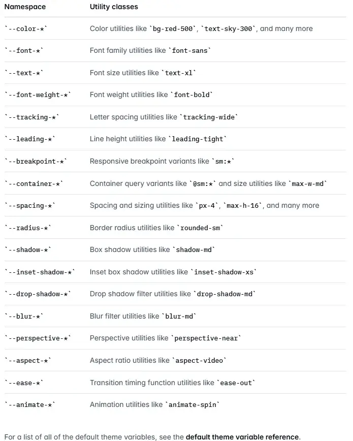
className="text-my-color"每個自定義主題都有對應的命名空間規則,官網有説明,具體如下:
這裏演示更多自定義主題
@import "tailwindcss";

@theme {
  /* 顏色的定義 --color開頭 */
  --color-primary: #1677FF;

  /* 字體大小 --text開頭 */
  --text-big: 20px;

  /* 可以橫槓分割 */
  /* 字粗 --font-weight開頭 */
  --font-weight-big-bold: 800;

  /* 也可以駝峯 */
  /* 圓角 --radius開頭 */
  --radius-myRadius: 10px;
}
頁面使用
<div className="
  border-primary
  text-primary
  font-family
  font-big-bold
  text-big
  rounded-myRadius
  m-2
  border p-2">
  測試文字
</div>
Tailwind還會為你的主題變量生成常規 CSS 變量,以便你可以在任意值或內聯樣式中使用,如下:
<div
  style={{
  margin: "20px",
  padding: "6px",
  color: "var(--color-primary)",
  fontSize: "var(--text-big)",
  border: "1px solid var(--color-primary)",
  borderRadius: "var(--radius-myRadius)"
  }}
  >
  定義的變量也可以當普通css變量使用
</div>
tailwind.config.ts中配置
官方文檔:
Theme Configuration
CSS-first configuration
github相關issues
你也可以在tailwind.config.ts文件中配置自定義主題,儘管這種方法在4.0+版本已經不被官方推薦

export default {
  theme: {
    extend: {
      colors: {
        secondary: "#10b981",
        accent: "#f59e0b",
        // 定義顏色層級
        brand: {
          50: "#eff6ff",
          100: "#dbeafe",
          500: "#3b82f6",
          900: "#1e3a8a"
        }
      },
      borderRadius: {
        // 可以使用 kebab-case 命名
        "my-radius": "10px",
        // 也支持駝峯命名
        myRadius2: "30px"
      }
    }
  }
};在根css文件引入
@import "tailwindcss";
@config "../tailwind.config.ts";
頁面使用
<div className="
  text-accent
  border-accent
  rounded-myRadius2
  border p-2">
  tailwind.config.ts配置主題變量
</div>


<div className="
  text-brand-500
  border-brand-500
  rounded-my-radius
  border
  p-2">
  tailwind.config.ts配置主題變量
</div>
注意,tailwind.config.ts配置的自定義主題只會生成css類,不會生成 css 變量,直接當普通變量寫是無效的。
在4.0+的@theme中配置會自動生成css變量
<!-- 下面的寫法無效 -->
<div
  style={{
  color: "var(--color-accent)"
  }}
  >
  tailwind.config.ts配置主題變量直接當css變量使用
</div>
參考資料:
Tailwindcss-Theme variables
Theme Configuration
CSS-first configuration
github相關issues