
It’s always great to have a little toolbox with just the right tools waiting for you when you need them. What if you are about to start working on a new project which should apply the material design language introduced by Google last year? What if you had just a good starter kit with everything you need to dive into the creative process without being distracted by routine tasks?
We’re here to have your back — with a little selection of handy goodies, icons, templates and tools to help you get off the ground faster.
Material Design, The Visual Language
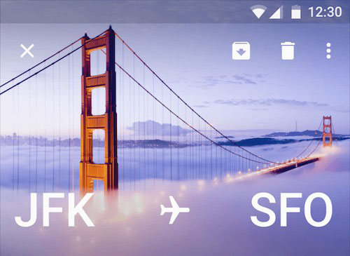
Intended by Google primarily for Android apps running on phones, tablets and everything in between, material design raised awareness of the delightful details that can make up an interface — from subtle transitions and animations to colorful interfaces with bold, vibrant typography. Experiences crafted with material design in mind are bright and appealing; if well crafted, they’re smooth and accessible as well. No wonder that the visual language found its way through to a brave new mobile world in native apps, hybrid apps and also websites.
The visual language is based on strong color schemes, clarity and space. Shadows play a central role in creating a three-dimensional feeling on 2-D screens, and support consistency and continuity when used with animations in the user experience. It’s more than an extended style guide, though. There are many freely available resources dedicated to material design and you can use them for your project right away. Material design is well documented and elaborated to the last detail.

Yet whenever we talk about aesthetics and interaction, we ought to have a conversation about performance, too. Even performant animations can prove an enormous bottleneck when every DOM element is supposed to move, animate and transition from one state to another. Performance matters more than ever before and we have to find the delicate balance between smooth interactions and getting content to the user fast.
More weight doesn’t mean more wait, so we could treat animations as progressive enhancement, acknowledging that the experience isn’t going to match the material design culture for everybody. That’s when responsive animations — the concept we haven’t been thinking about a lot yet — might become important as well (not to be mixed up with animations in responsive design, which can be delightful as well).
What can be adopted, though, are colors, spacing, fonts and icons. In fact, there are quite a few resources you can use to get just what you need quickly, when you need it.
Material Design Fonts
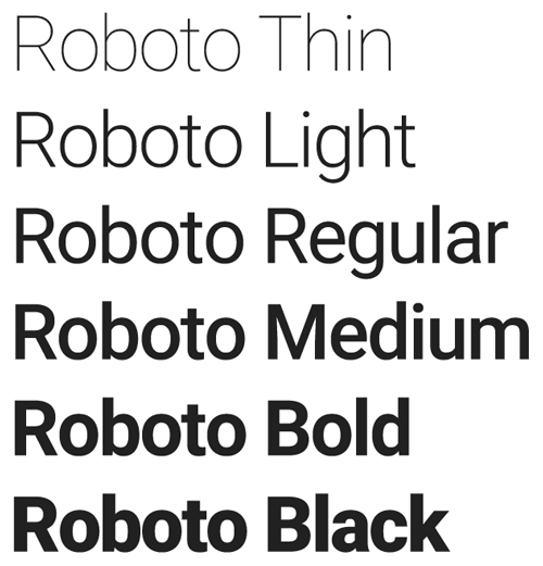
If you look into the material design typography guidelines, Google actively promotes just one main typeface: Roboto, a neat reference to the Android robot. When crafting user experiences dedicated to the Asian market, you can also use Noto, whose vertical metrics are compatible with Roboto. Both fonts are, of course, available on Google Fonts, Roboto’s source is available on GitHub, and the typeface has been released under Apache License 2.0.
Obviously, Roboto has been extensively crafted to fit the purpose of material design, so it’s highly versatile and fully supports Cyrillic, Latin, Greek and Vietnamese (extended character sets, of course). The typeface is available in a variety of weights, from thin and light, to normal and medium, to bold and black (100–300–400–500–700–900); the same goes for italic variants, too. The family can be used alongside the Roboto Condensed family and the Roboto Slab family.
Material Design Colors
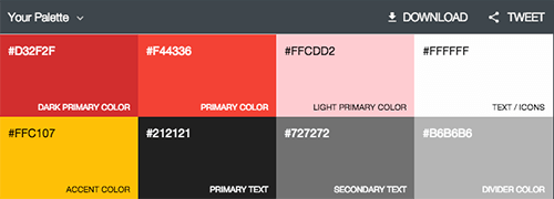
When it comes to color, Google also provides extensive guidelines. Colors are clearly defined, and we’ve prepared a little color palette for Photoshop and Illustrator (ZIP) that you can use right away. You can also use a very handy material palette generator which will help you create your own custom color schemes.
While Google has suggested a few valid
restrictions
constraints when designing Android apps, you can still fit in enough space for creativity to play with the aesthetics of your interface.
Material Design Icons
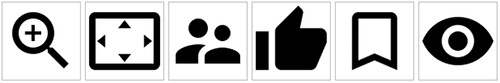
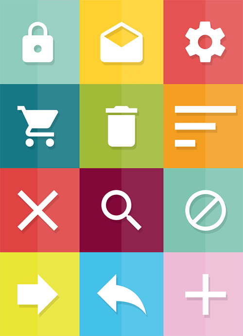
Iconography is tricky, simply because it can be ambiguous. But in material design, the visual side of user experience is critical, and it’s highly encourage that icons are used extensively. In fact, Google has open-sourced a comprehensive material design icon set. You can also download all icons individually at MaterialUp, and even integrate them into your WordPress theme.
Iconography is an important factor, but often it can’t exist alone: for a stronger visual impact, it needs supporting photography or illustrations. Furthermore, Google also encourages using (and mixing) illustrations and photos to enhance the user’s experience — with predictive, specific and relevant images, and potentially with an interactive overlay to hide them when they aren’t needed.
The Physical Side Of Material Design
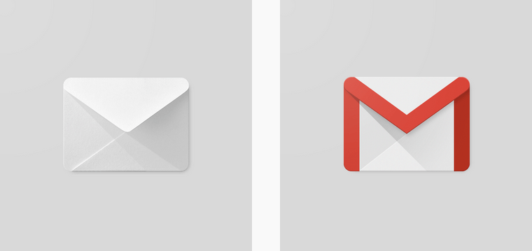
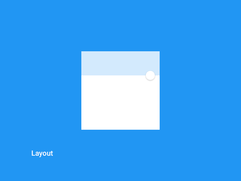
Unlike flat design, material design widely uses the so-called paper shadow. This shadow is supposed to act like a sheet of paper lying on a bright surface. It emulates a 3-D presence for a digital object. Material design is derived from the material world. Probably the most well-known example is the Gmail icon, which uses lighting effects to make you think of a conventional envelope.
Aside from Google’s official icon set, designers have taken the approach further by crafting their own icons and adapting the visual languages to their needs. That might not exactly correspond to the original idea behind material design, but it doesn’t mean that it can’t work well. For example, Muhammad Yasir from Dubai has released a free PSD material icon set. There are many more icons available free, too.
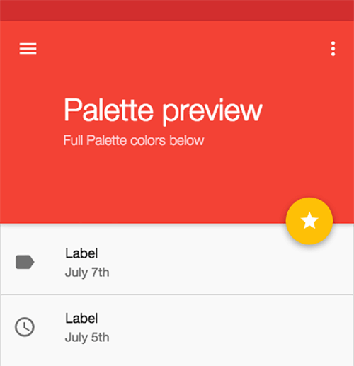
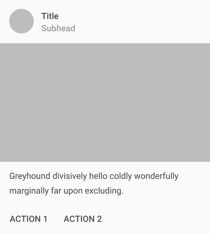
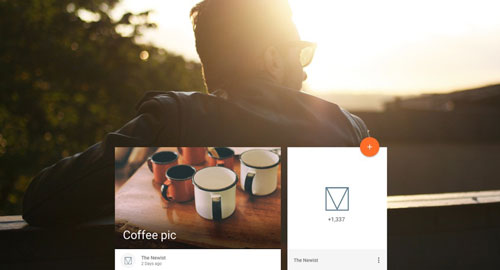
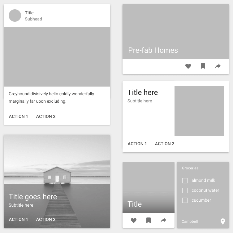
Cards
With material design, content is always presented in cards which use hierarchy, background images and content to “provide context and an entry point to more robust information and views.” Indeed, cards work well as they are supposed to put just the right amount of information in a compact overview, enhanced and supported by visual elements. There are several variations of cards, depending on the content you want to fill in, but usually you will either have an action displayed or provide information in a content block.
In material design, Google also advocates launch screens, which might sound like a good ol’ splash screen from the sweet and sour Flash times. However, the context might require them: for example, during the in-between time, when your application needs a few moments to fetch data or provide feedback. It might also be useful for onboarding.
Animations In Material Design
Smooth experiences with material design are achieved with animations. There are many interesting material design animations, and often they are quite subtle, but when put together they establish a sense of continuity and delight.
You can find a few examples and freely available samples below:
- Material Design: Animation Examples
- Keynote Material Design Animations Template
- Material Design Animations Collection, with HTML/CSS/JavaScript, on CodePen
- Material Design: Free After Effects Project File
- Polymer Starter Kit
- Polymer Material Design Elements
- Polymer Material Design Playground Demo
- Button Demo page
- A demo page for the Ripple effect.
If you’re looking for further tutorials and examples, search for “Polycasts”, a series of videos produced by Google.
HTML/CSS/JavaScript Components
Google has just launched Material Design Lite, an extensive set of components, templates and styles which have been heavily optimized for performance, speed and accessibility. The components do not rely on any JavaScript frameworks and fall back to a basic experience in legacy browsers. Among the templates, the library also has a “blog” template — at just 159KB, it’s a lightweight template containing built-in patterns for subscription call-to-action, comments, comment ratings, and more.
Besides the blog template, Google has also released a lite version of the current Android.com website. Its basic weight without web fonts is just 27KB, and contains a search field, navigation, and a carousel.
There’s much more useful stuff available at the Material Design Lite site, such as other page templates, and a great variety of components (buttons, cards, tables, etc.). If you need an HTML/CSS library to get going, that’s the place to start.
There are also other kits provided by other members of the community, including the Material UI kit for React.js (yes, React.js), Angular.js Material, Bootstrap Material, Ionic Material, and LumX. Just keep in mind that in many cases you might not need a framework altogether.
Material Design User Interface Kits For Free Download
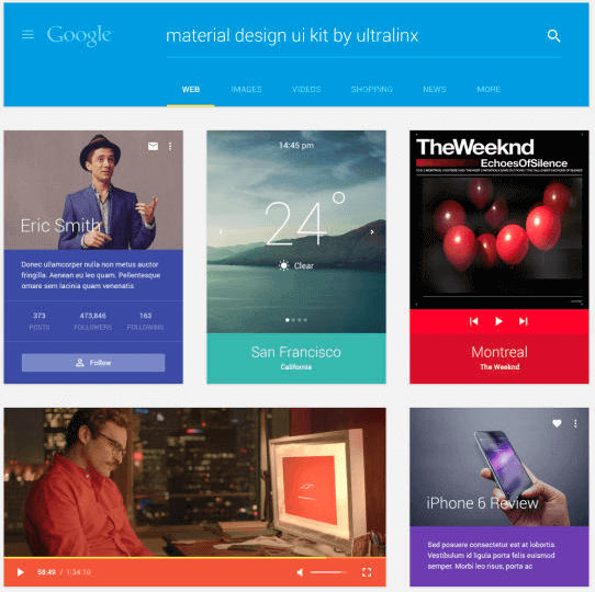
The Ultralinx Material Design Kit (PSD)
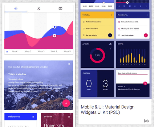
Okilla Material Design Kits (PSD)
InVision’s Sketch UI Kit (.sketch)
Google’s Sticker Sheet Material Design UI Kit (.sketch, .ai, .psd)
Where To Go From Here
Trends aren’t important, but techniques are. Whatever flavor of material design you select for your project, keep in mind that it’s all about conforming to the culture of the device your users are using, yet also creating a distinctive, memorable, delightful experience for your users. We can, of course, achieve it without material design, but we can also benefit from some of the qualities and patterns of its rich visual language.
One way or another, at this point you should have a few tools in your toolbox to approach that project head-on, without losing time, and focusing on crafting those websites that your users will love and keep returning to.
Did you like this “Sideblog” piece? Would you love to see more posts like this one on the future? We’d love to hear your feedback in the comments to this post.
Related Resources
- Google’s material design explained: Continuity of experience
- Material Design as Fast As Possible (video)
- Growing repository of material UI components
- Introducing Material Design Lite by Addy Osmani
- Sketch With Material Design by Patrick Keenan
- Making Material Design (video)
- Daily material design updates on MaterialUp.com
Further Reading
- Sketch With Material Design
- A Responsive Material Design App With Polymer Starter Kit
- How To Use Shadows And Blur Effects In Modern UI Design
- How To Design Better Buttons
This article was written by Sven Lennartz, co-founder of Smashing Magazine. It was first published in German, and then extended and edited by Markus Seyfferth and Vitaly Friedman.