

1. AlphabetIndexer 是什麼?
AlphabetIndexer 是 ArkUI 信息展示類組件中的 索引條組件,典型場景是:
- 通訊錄按 A~Z 快速定位聯繫人;
- 城市選擇列表按拼音首字母定位;
- 歌曲/視頻列表按首字母快速跳轉;
- 任意「長列表 + 字母索引」的導航場景。
特點簡單總結一下:
- 只能聯動另一側的容器組件(常見是
List/Grid); - 支持彈窗 展示一級/二級索引(如:A →「安、艾、奧」等列表);
- 支持 自動摺疊模式(索引項很多時自動壓縮呈現);
- 支持 背景模糊、圓角、觸控振動反饋 等 UI 細節。
支持:從 API 7 起引入,API 11、12、18 逐步增強(元服務、多級索引、自動摺疊等能力)。
2. 核心接口概覽
2.1 組件創建
AlphabetIndexer(options: AlphabetIndexerOptions)AlphabetIndexerOptions 常用字段(簡化版):
| 字段名 | 類型 | 必填 | 説明 |
|---|---|---|---|
arrayValue |
Array<string> |
是 | 索引條顯示的字符串數組,每個元素一個索引項,比如 ['#','A','B',...,'Z'] |
selected |
number |
否 | 初始選中的索引下標,支持 $$ 雙向綁定 |
⚠️ 注意:arrayValue 的順序要與你的業務列表邏輯保持一致,否則跳轉會「錯位」。
2.2 樣式相關常用屬性
下面列的是日常開發最常用的一批屬性,方便你查表式使用:
AlphabetIndexer({ arrayValue, selected })
  // 文本顏色 & 字體
  .color(value: ResourceColor)                  // 未選中項文字顏色
  .selectedColor(value: ResourceColor)          // 選中項文字顏色
  .popupColor(value: ResourceColor)             // 彈窗一級索引文字顏色
  .font(value: Font)                            // 未選中項字體
  .selectedFont(value: Font)                    // 選中項字體
  .popupFont(value: Font)                       // 彈窗一級索引字體

  // 尺寸 & 對齊
  .itemSize(value: string | number)             // 單個索引項大小(正方形邊長,vp)
  .alignStyle(value: IndexerAlign, offset?)     // 彈窗相對索引條左右對齊 + 間距
  .popupPosition(value: Position)               // 彈窗位置(相對索引條上邊框中點)

  // 背景 & 圓角
  .selectedBackgroundColor(value: ResourceColor)     // 選中項背景色
  .popupBackground(value: ResourceColor)             // 彈窗背景色
  .popupItemBackgroundColor(value: ResourceColor)    // 彈窗二級索引項背景色
  .itemBorderRadius(value: number)                   // 索引條每一格圓角
  .popupItemBorderRadius(value: number)              // 彈窗裏每一格圓角
  .popupBackgroundBlurStyle(value: BlurStyle)        // 彈窗背景模糊材質
  .popupTitleBackground(value: ResourceColor)        // 彈窗一級索引背景

  // 行為控制
  .usingPopup(value: boolean)                   // 是否展示彈窗
  .autoCollapse(value: boolean)                 // 是否開啓自適應摺疊模式
  .enableHapticFeedback(value: boolean)         // 是否啓用觸控振動反饋
提示:
width="auto"時索引條寬度會隨 最長索引項寬度 自適應;padding默認是4vp;- 字體縮放
maxFontScale/minFontScale強制為 1,不跟隨系統字體大小變化。
2.3 事件與回調
// 常用事件
.onSelect((index: number) => void)                         // 索引項選中
.onRequestPopupData((index: number) => Array<string>)      // 請求二級索引內容
.onPopupSelect((index: number) => void)                    // 彈窗二級索引被選中
三個類型別名(API 18+):
type OnAlphabetIndexerSelectCallback = (index: number) => void
type OnAlphabetIndexerPopupSelectCallback = (index: number) => void
type OnAlphabetIndexerRequestPopupDataCallback = (index: number) => Array<string>usingPopup(true)時,onRequestPopupData會在索引項被選中時觸發,返回的字符串數組會 豎排顯示在彈窗中,最多顯示 5 條,超過可上下滑動。
2.4 對齊方式枚舉 IndexerAlign
enum IndexerAlign {
  Left,     // 彈窗在索引條一側
  Right,    // 彈窗在索引條另一側
  START,    // 跟隨 LTR/RTL 方向的開始側
  END       // 跟隨 LTR/RTL 方向的結束側
}在國際化場景(LTR/RTL)下,用START/END可以避免你手動切換 Left/Right。
3. 最小可用示例:先能跑起來

下面先給一個最小可跑版本(不帶二級索引、不帶各種炫酷效果),你可以先在 demo 工程裏試一把。
// xxx.ets
@Entry
@Component
struct SimpleAlphabetIndexerSample {
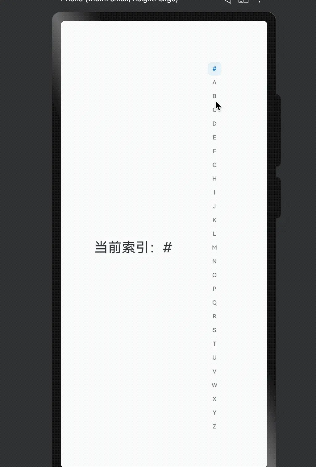
private indexes: string[] = ['#', 'A', 'B', 'C', 'D', 'E', 'F', 'G',
'H', 'I', 'J', 'K', 'L', 'M', 'N',
'O', 'P', 'Q', 'R', 'S', 'T', 'U',
'V', 'W', 'X', 'Y', 'Z'];
@State currentIndex: number = 0;
build() {
Row() {
// 左邊可以是 List / Grid,這裏先用簡單的佔位
Column() {
Text(`當前索引:${this.indexes[this.currentIndex]}`)
.fontSize(24)
.margin(10)
}
.width('70%')
// 右側是 AlphabetIndexer
AlphabetIndexer({ arrayValue: this.indexes, selected: this.currentIndex })
.usingPopup(false)
.itemSize(24)
.selectedColor(0xFF007DFF)
.selectedBackgroundColor(0x1A007DFF)
.onSelect((index: number) => {
this.currentIndex = index;
console.info(`Selected index: ${this.indexes[index]}`);
})
}
.width('100%')
.height('100%')
}
}這個最小例子主要讓你熟悉:
- 如何傳入
arrayValue; - 如何用
selected+onSelect做一個最基本的「選中反饋」。
接下來,我們用完整例子演示 聯動 List,彈窗展示二級索引,自動摺疊 和 模糊材質。
4. 示例一:聯動 List + 自定義彈窗內容
這個例子主要展示:
- 左邊
List展示聯繫人姓氏; - 右邊
AlphabetIndexer做 A~Z 索引; onRequestPopupData根據當前字母動態返回二級索引列表(如「安、卜、白…」)。
// xxx.ets
@Entry
@Component
struct AlphabetIndexerSample1 {
  private arrayA: string[] = ['安'];
  private arrayB: string[] = ['卜', '白', '包', '畢', '丙'];
  private arrayC: string[] = ['曹', '成', '陳', '催'];
  private arrayL: string[] = ['劉', '李', '樓', '梁', '雷', '呂', '柳', '盧'];

  private value: string[] = ['#', 'A', 'B', 'C', 'D', 'E', 'F', 'G',
    'H', 'I', 'J', 'K', 'L', 'M', 'N',
    'O', 'P', 'Q', 'R', 'S', 'T', 'U',
    'V', 'W', 'X', 'Y', 'Z'];

  build() {
    Stack({ alignContent: Alignment.Start }) {
      Row() {
        // 左側 List:模擬按首字母分組的聯繫人列表
        List({ space: 20, initialIndex: 0 }) {
          ForEach(this.arrayA, (item: string) => {
            ListItem() {
              Text(item)
                .width('80%')
                .height('5%')
                .fontSize(30)
                .textAlign(TextAlign.Center)
            }
          }, (item: string) => item)

          ForEach(this.arrayB, (item: string) => {
            ListItem() {
              Text(item)
                .width('80%')
                .height('5%')
                .fontSize(30)
                .textAlign(TextAlign.Center)
            }
          }, (item: string) => item)

          ForEach(this.arrayC, (item: string) => {
            ListItem() {
              Text(item)
                .width('80%')
                .height('5%')
                .fontSize(30)
                .textAlign(TextAlign.Center)
            }
          }, (item: string) => item)

          ForEach(this.arrayL, (item: string) => {
            ListItem() {
              Text(item)
                .width('80%')
                .height('5%')
                .fontSize(30)
                .textAlign(TextAlign.Center)
            }
          }, (item: string) => item)
        }
        .width('50%')
        .height('100%')

        // 右側 AlphabetIndexer:開啓彈窗 & 自定義樣式
        AlphabetIndexer({ arrayValue: this.value, selected: 0 })
          .autoCollapse(false)                        // 關閉自適應摺疊模式
          .enableHapticFeedback(false)                // 關閉觸控振動
          .selectedColor(0xFFFFFF)                    // 選中項文本顏色
          .popupColor(0xFFFAF0)                       // 彈窗一級索引文本顏色
          .selectedBackgroundColor(0xCCCCCC)          // 選中項背景色
          .popupBackground(0xD2B48C)                  // 彈窗背景色
          .usingPopup(true)                           // 選中時顯示彈窗
          .selectedFont({ size: 16, weight: FontWeight.Bolder })
          .popupFont({ size: 30, weight: FontWeight.Bolder })
          .itemSize(28)                               // 索引項尺寸
          .alignStyle(IndexerAlign.Left)              // 彈窗在索引條一側
          .popupItemBorderRadius(24)                  // 彈窗項圓角
          .itemBorderRadius(14)                       // 索引項圓角
          .popupBackgroundBlurStyle(BlurStyle.NONE)   // 關閉背景模糊
          .popupTitleBackground(0xCCCCCC)             // 彈窗一級索引背景
          .popupSelectedColor(0x00FF00)               // 彈窗二級索引選中文本顏色
          .popupUnselectedColor(0x0000FF)             // 彈窗二級索引未選中文本顏色
          .popupItemFont({ size: 30, style: FontStyle.Normal })
          .popupItemBackgroundColor(0xCCCCCC)
          .onSelect((index: number) => {
            console.info(this.value[index] + ' Selected!');
            // 一般這裏會配合 List 滾動到對應分組
          })
          .onRequestPopupData((index: number) => {
            // 字母 → 二級索引內容的映射
            if (this.value[index] == 'A') {
              return this.arrayA;
            } else if (this.value[index] == 'B') {
              return this.arrayB;
            } else if (this.value[index] == 'C') {
              return this.arrayC;
            } else if (this.value[index] == 'L') {
              return this.arrayL;
            } else {
              // 其它字母只顯示一級索引
              return [];
            }
          })
          .onPopupSelect((index: number) => {
            console.info('onPopupSelected:' + index);
            // 可在這裏根據二級索引定位到更具體的位置
          })
      }
      .width('100%')
      .height('100%')
    }
  }
}
使用要點小結:
usingPopup(true)+onRequestPopupData是做「二級索引」的關鍵;- 當返回空數組時,彈窗只顯示一級索引(如僅一個「A」)。
5. 示例二:開啓自適應摺疊模式
當索引項很多時(比如 26 個字母 + #),在手機上全顯示會比較擠。
autoCollapse(true) 可以讓系統根據 索引數量 + 高度 自動選擇:
- 全顯示;
- 短折疊;
- 長摺疊。
下面這個示例支持「切換摺疊模式」以及「動態調整索引條高度」:
// xxx.ets
@Entry
@Component
struct AlphabetIndexerSample2 {
  private arrayA: string[] = ['安'];
  private arrayB: string[] = ['卜', '白', '包', '畢', '丙'];
  private arrayC: string[] = ['曹', '成', '陳', '催'];
  private arrayJ: string[] = ['嘉', '賈'];

  private value: string[] = ['#', 'A', 'B', 'C', 'D', 'E', 'F', 'G',
    'H', 'I', 'J', 'K', 'L', 'M', 'N',
    'O', 'P', 'Q', 'R', 'S', 'T', 'U',
    'V', 'W', 'X', 'Y', 'Z'];

  @State isNeedAutoCollapse: boolean = false;
  @State indexerHeight: string = '75%';

  build() {
    Stack({ alignContent: Alignment.Start }) {
      Row() {
        // 左側 List:模擬數據
        List({ space: 20, initialIndex: 0 }) {
          ForEach(this.arrayA, (item: string) => {
            ListItem() {
              Text(item)
                .width('80%')
                .height('5%')
                .fontSize(30)
                .textAlign(TextAlign.Center)
            }
          }, (item: string) => item)

          ForEach(this.arrayB, (item: string) => {
            ListItem() {
              Text(item)
                .width('80%')
                .height('5%')
                .fontSize(30)
                .textAlign(TextAlign.Center)
            }
          }, (item: string) => item)

          ForEach(this.arrayC, (item: string) => {
            ListItem() {
              Text(item)
                .width('80%')
                .height('5%')
                .fontSize(30)
                .textAlign(TextAlign.Center)
            }
          }, (item: string) => item)

          ForEach(this.arrayJ, (item: string) => {
            ListItem() {
              Text(item)
                .width('80%')
                .height('5%')
                .fontSize(30)
                .textAlign(TextAlign.Center)
            }
          }, (item: string) => item)
        }
        .width('50%')
        .height('100%')

        Column() {
          // 上半部分:索引條本體
          Column() {
            AlphabetIndexer({ arrayValue: this.value, selected: 0 })
              .autoCollapse(this.isNeedAutoCollapse)  // 是否開啓摺疊
              .height(this.indexerHeight)             // 動態控制索引條高度
              .enableHapticFeedback(false)
              .selectedColor(0xFFFFFF)
              .popupColor(0xFFFAF0)
              .selectedBackgroundColor(0xCCCCCC)
              .popupBackground(0xD2B48C)
              .usingPopup(true)
              .selectedFont({ size: 16, weight: FontWeight.Bolder })
              .popupFont({ size: 30, weight: FontWeight.Bolder })
              .itemSize(28)
              .alignStyle(IndexerAlign.Right)
              .popupTitleBackground("#D2B48C")
              .popupSelectedColor(0x00FF00)
              .popupUnselectedColor(0x0000FF)
              .popupItemFont({ size: 30, style: FontStyle.Normal })
              .popupItemBackgroundColor(0xCCCCCC)
              .onSelect((index: number) => {
                console.info(this.value[index] + ' Selected!');
              })
              .onRequestPopupData((index: number) => {
                if (this.value[index] == 'A') {
                  return this.arrayA;
                } else if (this.value[index] == 'B') {
                  return this.arrayB;
                } else if (this.value[index] == 'C') {
                  return this.arrayC;
                } else if (this.value[index] == 'J') {
                  return this.arrayJ;
                } else {
                  return [];
                }
              })
              .onPopupSelect((index: number) => {
                console.info('onPopupSelected:' + index);
              })
          }
          .height('80%')
          .justifyContent(FlexAlign.Center)

          // 下半部分:控制按鈕
          Column() {
            Button('切換成摺疊模式')
              .margin('5vp')
              .onClick(() => {
                this.isNeedAutoCollapse = true;
              })
            Button('切換索引條高度到30%')
              .margin('5vp')
              .onClick(() => {
                this.indexerHeight = '30%';
              })
            Button('切換索引條高度到70%')
              .margin('5vp')
              .onClick(() => {
                this.indexerHeight = '70%';
              })
          }
          .height('20%')
        }
        .width('50%')
        .justifyContent(FlexAlign.Center)
      }
      .width('100%')
      .height(720)
    }
  }
}
關於
autoCollapse的摺疊規則要點(邏輯簡化版本):
- 如果首項是
"#":判斷時會 先去掉首項 再看數量;- 9 個以內:全顯示;
- 9~13 個:根據高度自適應選擇全顯示或「短折疊」;
- 13 個以上:根據高度在「短折疊 / 長摺疊」中自適應。
6. 示例三:彈窗背景模糊材質
在更偏「設計感」的頁面上,通常會需要 毛玻璃彈窗效果。
popupBackgroundBlurStyle 就是用來控制彈窗的背景模糊材質的。
下面這個示例:
- 用按鈕切換兩種模糊材質;
- 背景是一張圖片(記得換成自己的資源)。
// xxx.ets
@Entry
@Component
struct AlphabetIndexerSample3 {
  private arrayA: string[] = ['安'];
  private arrayB: string[] = ['卜', '白', '包', '畢', '丙'];
  private arrayC: string[] = ['曹', '成', '陳', '催'];
  private arrayL: string[] = ['劉', '李', '樓', '梁', '雷', '呂', '柳', '盧'];

  private value: string[] = ['#', 'A', 'B', 'C', 'D', 'E', 'F', 'G',
    'H', 'I', 'J', 'K', 'L', 'M', 'N',
    'O', 'P', 'Q', 'R', 'S', 'T', 'U',
    'V', 'W', 'X', 'Y', 'Z'];

  @State customBlurStyle: BlurStyle = BlurStyle.NONE;

  build() {
    Stack({ alignContent: Alignment.Start }) {
      Row() {
        // 左側 List:依舊是一些示例數據
        List({ space: 20, initialIndex: 0 }) {
          ForEach(this.arrayA, (item: string) => {
            ListItem() {
              Text(item)
                .width('80%')
                .height('5%')
                .fontSize(30)
                .textAlign(TextAlign.Center)
            }
          }, (item: string) => item)

          ForEach(this.arrayB, (item: string) => {
            ListItem() {
              Text(item)
                .width('80%')
                .height('5%')
                .fontSize(30)
                .textAlign(TextAlign.Center)
            }
          }, (item: string) => item)

          ForEach(this.arrayC, (item: string) => {
            ListItem() {
              Text(item)
                .width('80%')
                .height('5%')
                .fontSize(30)
                .textAlign(TextAlign.Center)
            }
          }, (item: string) => item)

          ForEach(this.arrayL, (item: string) => {
            ListItem() {
              Text(item)
                .width('80%')
                .height('5%')
                .fontSize(30)
                .textAlign(TextAlign.Center)
            }
          }, (item: string) => item)
        }
        .width('30%')
        .height('100%')

        Column() {
          // 上半部分:切換模糊材質的按鈕
          Column() {
            Text('切換模糊材質: ')
              .fontSize(24)
              .fontColor(0xcccccc)
              .width('100%')
            Button('COMPONENT_REGULAR')
              .margin('5vp')
              .width(200)
              .onClick(() => {
                this.customBlurStyle = BlurStyle.COMPONENT_REGULAR;
              })
            Button('BACKGROUND_THIN')
              .margin('5vp')
              .width(200)
              .onClick(() => {
                this.customBlurStyle = BlurStyle.BACKGROUND_THIN;
              })
          }
          .height('20%')

          // 下半部分:索引條 + 模糊彈窗
          Column() {
            AlphabetIndexer({ arrayValue: this.value, selected: 0 })
              .usingPopup(true)
              .alignStyle(IndexerAlign.Left)
              .popupItemBorderRadius(24)
              .itemBorderRadius(14)
              .popupBackgroundBlurStyle(this.customBlurStyle) // 核心點
              .popupTitleBackground(0xCCCCCC)
              .onSelect((index: number) => {
                console.info(this.value[index] + ' Selected!');
              })
              .onRequestPopupData((index: number) => {
                if (this.value[index] == 'A') {
                  return this.arrayA;
                } else if (this.value[index] == 'B') {
                  return this.arrayB;
                } else if (this.value[index] == 'C') {
                  return this.arrayC;
                } else if (this.value[index] == 'L') {
                  return this.arrayL;
                } else {
                  return [];
                }
              })
              .onPopupSelect((index: number) => {
                console.info('onPopupSelected:' + index);
              })
          }
          .height('80%')
        }
        .width('70%')
      }
      .width('100%')
      .height('100%')
      // 注意替換為你工程中的圖片資源
      .backgroundImage($r('app.media.image'))
    }
  }
}
小 Tips:
- 模糊效果會疊加在
popupBackground上,所以顏色看起來會和你寫的不完全一樣;- 如果不想要毛玻璃效果,可以設為
BlurStyle.NONE。
7. 實戰開發中的常見坑 & 小技巧
-
索引項太多 vs 高度不夠
itemSize是索引項區域的正方形邊長;- 實際大小會被組件寬高和
padding限制; - 當高度不夠時,建議開啓
autoCollapse(true),否則界面會很擠。
-
二級索引內容過多
onRequestPopupData返回的字符串數組 最多顯示 5 行,超出可以滑動,但不宜塞太多;- 建議二級列表只放「常用/命中率高」的條目,避免彈窗太長影響體驗。
-
觸控反饋別忘了權限
-
enableHapticFeedback(true)時,需要在module.json5裏配置振動權限:"requestPermissions": [ { "name": "ohos.permission.VIBRATE" } ] - 否則有的機型上會沒有振動效果或直接報權限問題。
-
-
國際化 & RTL 支持
-
如果你的應用要支持 RTL 語言(如阿拉伯語),對齊方式儘量用
START/END:.alignStyle(IndexerAlign.START) - 這樣在 LTR/RTL 場景下會自動切換索引條左/右側。
-
-
聯動 List 記得加「滾動定位」
onSelect裏除了打印日誌,一般會調用List的scrollToIndex或position綁定;- 做到「按字母 → 左側列表跳到對應分組」才是完整體驗。
-
寬度自適應的使用
- 當
width('auto')時,寬度會跟隨最長索引文本寬度變化; - 如果你用的是多字母組合(比如「熱門」、「最近」),注意可能導致索引條變寬,對佈局有影響。
- 當
如果你後面打算寫 通訊錄、城市選擇、音樂/視頻列表 之類的實戰 demo,可以直接在上面的三個示例基礎上改數據結構,把 List 的滾動聯動補齊,就已經是一份很完整的 ArkUI 索引條實戰工程了。