


滾動視差
介紹
視差滾動(Parallax Scrolling)是指多層背景以不同的速度移動,形成立體的運動效果,帶來非常出色的視覺體驗。
實現原理
方式一:
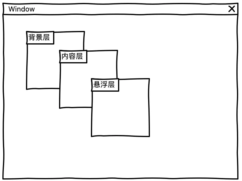
利用 background-attachment 屬性,我們可以把網頁解刨成:背景層、內容層、懸浮層
background-attachment 的作用是設置背景圖像隨着頁面滾動的時候固定,即使一個元素有滾動機制,背景也不會隨着元素的內容而滾動,它的值有以下三個:
- Scroll:默認值,背景圖像會隨着頁面其餘部分的滾動而移動。
- fixed:當頁面的其餘部分滾動時,背景圖像不會移動。
- inherit:繼承父元素
background-attachment屬性的值。
此實現方式可參考👇🏻

方式二:
配合使用 transform 和 perspective 利用3D視圖空間實現物體運動的速度差從而來實現視覺差效果。
原理如下:
transform: 可以對元素進行變換(2d/3d),包括平移 translate,旋轉 rotate,縮放 scale,等等。
perspective : 當元素涉及 3d 變換時,它可以定義我們眼睛看到的 3d 立體效果,即空間感。
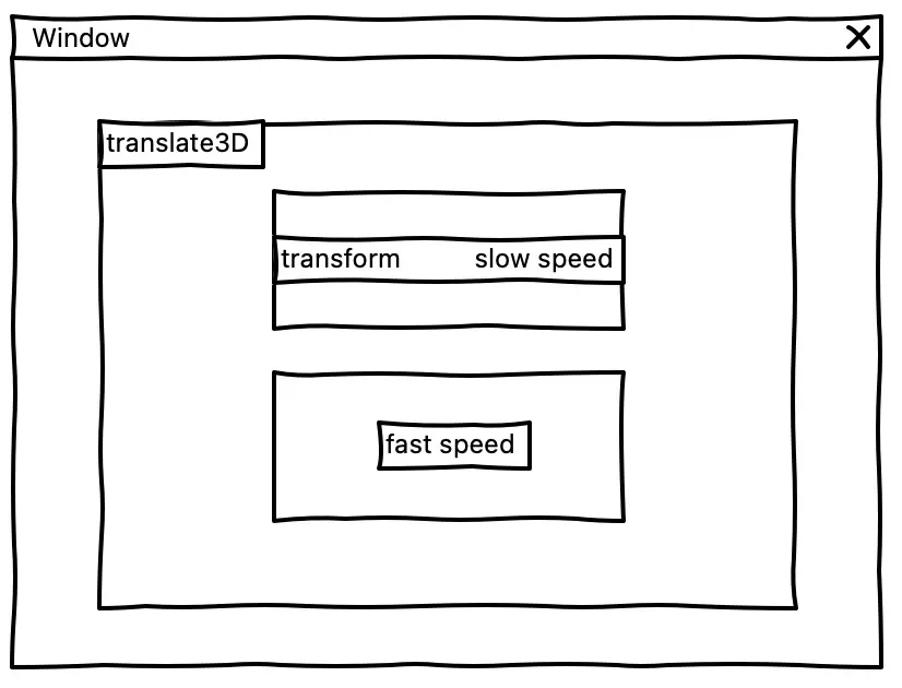
注意:當設置 translateZ 後,需要通過 scale 放大或者縮小元素來讓元素達到肉眼所見的物體沒被被放大縮小的感覺,計算 scale 的公式如下:
scale = ((translateZ * (-1)) / perspective) + 1經典案例
- 利用background-attachment經典案例
- 這是一款名為Olija的遊戲的網站,這是關於一個揮舞着魚叉的英雄探索敵對土地以找到回家的路的故事。遊戲有兩個核心方面,首先是它的視覺流動性,其像素藝術中的像素尺寸相當大,因此如果不看到它的動態,就很難傳達這款遊戲的美感;第二個核心方面是它的故事。感覺就像遊戲是根據已有的書籍或電視劇改編的。該網站的目標是抓住這兩個核心方面,並吸引用户與之互動;讓他們感覺自己是故事的一部分,並讓他們感覺可以控制行動。
實戰
視差動畫demo-01
<!DOCTYPE html>
<html>
    <head>
        <meta charset="utf-8">
        <title></title>
        <style>
            section {
                height: 100vh;
                background: rgba(0, 0, 0, .7);
                color: #fff;
                display: flex;
                justify-content: center;
                align-items: center;
                font-size: 20vh;
            }

            .img1 {
                background-image: url(https://qnm.xxx.com/Fkx77YvvfwdODmMvNVv_IaQx42wT);
                background-attachment: fixed;
                background-size: cover;
                background-position: center center;
            }

            .img2 {
                background-image: url(https://qnm.xxx.com/Fjh7nb4J7JonMOgGfbxXQU0WNRS0);
                background-attachment: fixed;
                background-size: cover;
                background-position: center center;
            }

            .img3 {
                background-image: url(https://qnm.xxx.com/lhXcD2QvakkntJVZMzyI2xiwEgic);
                background-attachment: fixed;
                background-size: cover;
                background-position: center center;
            }
        </style>
    </head>
    <body>
        <section class="text">1</section>
        <section class="img1">2</section>
        <section class="text">3</section>
        <section class="img2">4</section>
        <section class="text">5</section>
        <section class="img3">6</section>
        <section class="text">7</section>
    </body>
</html>
視差動畫demo-02
<!DOCTYPE html>
<html>
  <head>
    <meta charset="utf-8" />
    <title></title>
    <style>
      #app {
        width: 100vw;
        height: 100vh;
        perspective: 1px;
        overflow-x: hidden;
        overflow-y: auto;
        transform-style: preserve-3d;
      }
      img {
        width: 100%;
        height: 100%;
      }
      .one {
        width: 100vw;
        height: 100vh;
        transform: translateZ(-1px) scale(2);
      }
      .two {
        width: 100vw;
        height: 100vh;
      }
    </style>
  </head>
  <body>
    <div id="app">
      <div class="one">
        <img
          src="https://qnm.xxx.com/FiRfmtOJCR62lDHO1hHrEg9kwPao"
          alt=""
        />
      </div>
      <div class="two">
        <img
          src="https://qnm.xxx.com/FuxV78Ht4u5EMKuupEzix6wYTQYF"
          alt=""
        />
      </div>
    </div>
  </body>
</html>
鼠標移動視差
案例
參考視差動畫庫parralax.js首頁效果

原理
綜合來看,其實主要還是圍繞着監聽鼠標移動事件——mousemove,通過獲取實時的 clientX 和 clientY 的偏移量來使當前畫布中的參照物和物體實現一系列的變形(transform)的過程。
監聽鼠標事件
window.onload = () => {
  // 監聽鼠標在 pageX 容器移動
  pageX.addEventListener('mousemove', parallax, false)
}
旋轉
// 旋轉角度係數
let range = 40
// 旋轉公式(返回-20 ~ 20,保留1為小數)
let calcValue = (a, b) => (a / b * range - range / 2).toFixed(1)
// 通過 calcValue 根據鼠標當前位置和容器寬高比計算得出的值
let xValue = calcValue(x, pageX.offsetWidth)
let yValue = calcValue(y, pageX.offsetHeight)
// 設置容器的旋轉角度
cards.style.transform = "rotateX(" + yValue + "deg) rotateY(" + xValue + "deg)";
背景圖偏移
bgContainer.style.backgroundPosition = xValue * .45 + "px " + -yValue * .45 + "px"圖片的位移
picItem.style.transform = "translateX(" + -xValue + "px) translateY(" + yValue + "px)"源碼
gitHub 倉庫地址:https://github.com/cong1223/p...
參考文章
- stealing-game-animation-techniques-to-engage-users
- 視差特效的原理和實現方法


