

rem是什麼?
rem(font size of the root element)是指相對於根元素的字體大小的單位。簡單的説它就是一個相對單位。看到rem大家一定會想起em單位,em(font size of the element)是指相對於父元素的字體大小的單位。它們之間其實很相似,只不過一個計算的規則是依賴根元素(rem)一個是依賴父元素計算(em)。
個人理解rem佈局可分為倆種情況無設計稿和有設計稿:
無設計稿
1、首先需要在<head>標籤中加入
<meta name="viewport" content="width=device-width,initial-scale=1.0,maixmum-scale=1.0,minimum-scale=1.0,user-scalable=no">
2、在<script>標籤中加入
window.onresize = function(){
  document.documentElement.style.fontSize = document.documentElement.offsetWidth / 20 +'px';
}
/*
document.documentElement.style.fontSize 是得到<html>標籤併為它設置font-size樣式字體大小,因為REM計算的規則是依賴根元素也就是<html>元素的字體大小
document.documentElement.offsetWidth  是獲取整個視口的寬度
*/
document.documentElement.offsetWidth / 20 這裏的20不是固定的,這裏 / 20 是把屏幕均分為20份,當然也可使用16、18... , 但是這裏有一個問題就是Chorme瀏覽器字體最小隻能為12px,所以這裏的最後結果(document.documentElement.offsetWidth / 20 = ?)最好別小於12。
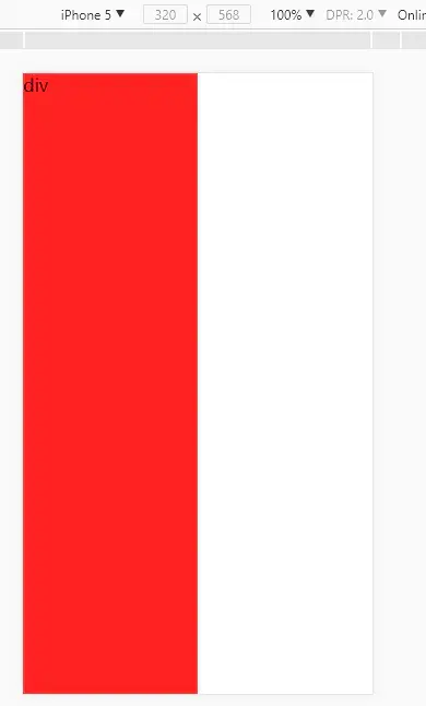
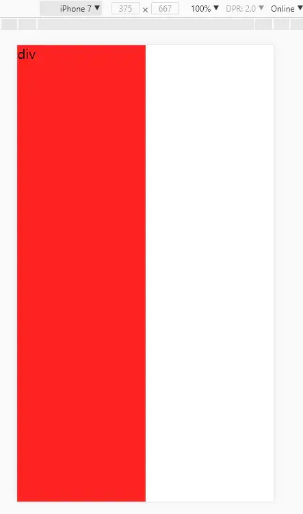
3、嘗試讓一個div不管在什麼屏幕下都佔據一半,這裏使用20均分所以這裏div寬度只需要定位10rem就可以在任何屏幕下都佔據一半。
<!DOCTYPE html>
<html lang="en">
<head>
    <meta charset="UTF-8">
    <title>無設計稿rem</title>
    <meta name="viewport" content="width=device-width,initial-scale=1.0,maixmum-scale=1.0,user-scalable=no">
    <style>
        *{
            margin:0;
            padding:0;
        }
        html,body{
            width:100%;
            height:100%;
        }
    </style>
</head>
<body>
<div style="width:10rem;height:100%;background:#f22;">div</div>
<script>
    window.onresize = getRem;
    function getRem(){
        document.documentElement.style.fontSize = document.documentElement.offsetWidth / 20+'px';
    }
    getRem();
</script>
</body>
</html>
有計稿
以 iPhone5 和 iPhone7 舉例他們的屏幕分辨率是320px568px,375px667px
視覺設計師給的平面稿一般是 640px , 750px 寬度的設計稿
為什麼設計稿會屏幕比例的倆倍呢?
這裏引出一個知識點:
dpr是什麼?
window.devicePixelRatio是設備上物理像素和設備獨立像素(device-independent pixels (dips))的比例。
公式表示就是:window.devicePixelRatio = 物理像素 / dips
物理像素,比較好理解,一個物理像素是顯示器(手機屏幕)上最小的物理顯示單元,在操作系統的調度下,每一個設備像素都有自己的顏色值和亮度值。
dips,(dip或dp或device independent pixels)指的是設備獨立像素(也叫密度無關像素),可以認為是計算機座標系統中得一個點,這個點代表一個可以由程序使用的
簡單的講其實就是dpr決定了css 1px 等於多少屏幕物理像素。
拿 iPhone6 和 普通PC機 舉例:
iPhone6的dpr等於2,也就是説如果你為一個div設置100px(這裏100px是css像素)寬度,在iPhone6 屏幕上面div其實佔據了200px物理像素(因為iPhone 6 下 dpr=2)。而在普通pc屏幕下這個div佔據的剛好是100px(因為pc屏幕下dpr=1)
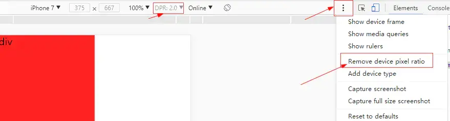
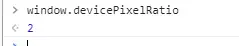
可以在Chorme移動端DEBUG下開啓顯示dpr,也可以在console中打印window.devicePixelRatio查看
設計稿給的是 640px 的如下:
實現rem佈局:
<!DOCTYPE html>
<html lang="en">
<head>
<meta charset="UTF-8">
<title>有設計稿rem</title>
<meta name="viewport" content="width=device-width,initial-scale=1.0,maixmum-scale=1.0,user-scalable=no">
<style>
*{
margin:0;
padding:0;
}
html,body{
width:100%;
height:100%;
}
</style>
</head>
<body>
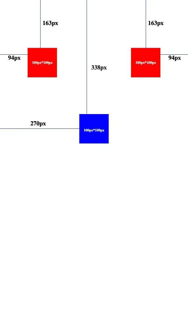
<div style="position:absolute;left:.94rem;top:1.63rem;width:1rem;height:1rem;background:#f00;"></div>
<div style="position:absolute;right:.94rem;top:1.63rem;width:1rem;height:1rem;background:#f00;"></div>
<div style="position:absolute;left:2.7rem;top:3.38rem;width:1rem;height:1rem;background:#00f;"></div>
<script>
window.onresize = getRem;
function getRem(){
document.documentElement.style.fontSize = document.documentElement.offsetWidth / 6.4+'px';
}
getRem();
</script>
</body>
</html>
在任何設備下這三個div都會和設計稿一樣的佈局展現。
document.documentElement.offsetWidth / 6.4
這裏 / 6.4是為了方便計算,當然 / 80,/ 50...都行 , 前面提到過
有一個問題就是Chorme瀏覽器字體最小隻能為12px,所以這裏的最後結果最好別小於12。
所以這裏讓設計稿寬度 / 100 之後
document.documentElement.offsetWidth / ( 640 / 100)
<div style="position:absolute;left:.94rem;top:1.63rem;width:1rem;height:1rem;background:#f00;"></div>
<div style="position:absolute;right:.94rem;top:1.63rem;width:1rem;height:1rem;background:#f00;"></div>
<div style="position:absolute;left:2.7rem;top:3.38rem;width:1rem;height:1rem;background:#00f;"></div>
div的單位只要跟隨 / 100 就行了,因為 / 100 很好計算所以無需計算直接就能得出想要的rem大小。
相關問題:
- 使用rem後行內元素間的間距很大怎麼辦?
- 原生應用 webview 控件佈局顯示錯誤問題。
解決方法1:
需要開發原生app小夥伴配合。
客户端固定webview字體大小 (類似這樣的api方法:webview.getSettings().setTextZoom(100))
解決方法2:
<script>
    var d = window.document.createElement('div');
    d.style.width = '1rem';
    d.style.display = "none";
    var head = window.document.getElementsByTagName('head')[0];
    head.appendChild(d);
    //得到webview默認字體大小
    var defaultFontSize = parseFloat(window.getComputedStyle(d, null).getPropertyValue('width'));

    function getRem(){
        //計算方式不變,只需要在最後把單位轉換為百分比
        document.documentElement.style.fontSize = document.documentElement.offsetWidth / 6.4 / defaultFontSize * 100 + '%';
    }
    window.onresize = getRem;
    getRem();
</script>
以上示例均沒考慮兼容性問題,落實到項目上時切記自行補充兼容性代碼。