

平時我除了業務需求,偶爾會投入到UI組件的開發中,大多數時候只會負責自己業務場景相關或者一小部分公共組件,極少有從創建項目、集成可視化、測試到發佈的整個過程的操作,這篇文章就是記錄組件開發全流程,UI組件在此僅作為調試用,重點在於集成項目環境。
組件
我們使用 React + TypeScript 來開發UI組件庫,為了簡化 webpack 環境和 Typescript 環境配置,這裏直接使用 create-react-app 通過如下命令來創建一個新項目。
npx create-react-app 項目名稱 --template typescript創建項目後先將無用文件刪除,在 scr/components/Button/index.tsx 下定義一個簡單的 Button 組件。
import React, { FC, ReactNode } from "react";
import cn from "classnames";
import "./index.scss";

interface BaseButtonProps {
  className?: string;
  size?: "small" | "middle" | "large";
  disabled?: boolean;
  children?: ReactNode;
}

type ButtonProps = BaseButtonProps & React.ButtonHTMLAttributes<HTMLElement>;

const Index: FC<ButtonProps> = (props) => {
  const {
    size = "middle",
    children = "按鈕",
    className,
    disabled,
    ...restProps
  } = props;

  return (
    <button
      className={cn("btn", `btn-${size}`, className, { disabled })}
      {...restProps}
    >
      {children}
    </button>
  );
};
export default Index;
使用 scss 對其進行樣式編寫,這裏需要注意,create-react-app 中沒有自動支持 scss 文件,如果需要使用需要手動安裝 sass 資源來處理。
.btn {
    background-color: #fff;
    border: 1px solid #d9d9d9;
    color: rgba(0, 0, 0, 0.88);
    line-height: 1.5;
    &.disabled {
        cursor: not-allowed;
        color: rgba(0, 0, 0, 0.25);
        background-color: rgba(0, 0, 0, 0.04);
    }
}
.btn-large {
    font-size: 16px;
    height: 40px;
    padding: 7px 15px;
    border-radius: 8px;
}
.btn-middle {
    font-size: 14px;
    height: 32px;
    padding: 4px 15px;
    border-radius: 6px
}
.btn-small {
    font-size: 14px;
    height: 24px;
    padding: 0 7px;
    border-radius: 4px
}
在 App.tsx 文件中引入組件並測試,驗證其功能是否可用。
import React from "react";
import Button from "./components/Button";
import "./app.scss";
function App() {
return (
<div className="container">
<Button
size="large"
onClick={() => {
console.log("我是一個大按鈕");
}}
>
大按鈕
</Button>
<Button disabled>中等按鈕</Button>
<Button size="small">小按鈕</Button>
</div>
);
}
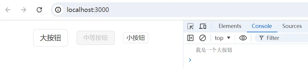
export default App;在瀏覽器中可以看到組件效果,以及點擊【大按鈕】會觸發對應的事件
Jest測試
功能簡單自測後,我們需要編寫測試用例來對組件進行測試,一方面是為了提高代碼質量減少bug,另一方面在後期的維護升級或者重構中,只需要執行自動化腳本,便可以確認是否兼容歷史版本。
這裏選用 jest 和 testing-library ,我們通過 create-react-app 創建的 react 腳手架已經集成了單元測試的能力。
首先查看項目中的 setupTests.ts 有如下 Jest 斷言增強的導入語句
import '@testing-library/jest-dom/extend-expect';然後在 Button 文件夾下增加 index.test.tsx 文件編寫測試用例,先判斷是否成功渲染一個 Button 組件。
import React from 'react';
import { render, screen } from "@testing-library/react";
import Button from ".";
describe("Button組件", () => {
it("默認Button", () => {
render(<Button>查詢</Button>); // 渲染一個名為查詢的按鈕
const element = screen.getByText("查詢");
expect(element).toBeInTheDocument(); // 判斷按鈕是否在頁面上
});
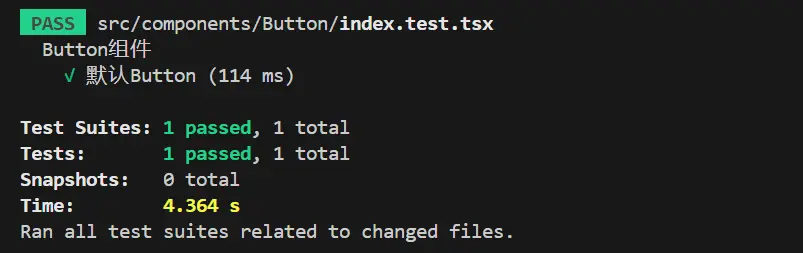
});腳手架 package.json 中已經添加了 test 指令的配置,我們在執行單元測試的時候只需要執行 npm run test,等待幾秒便可以看到單元測試的執行結果
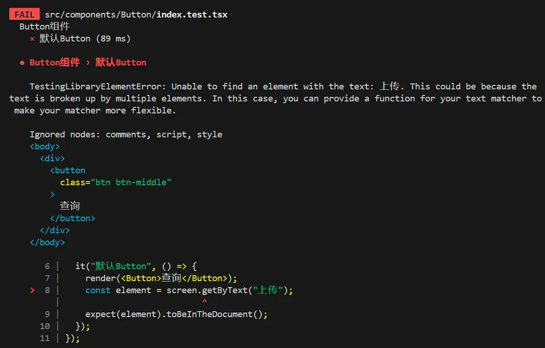
當我們將 const element = screen.getByText("查詢"); 中的字符串 查詢 改為 上傳 時,會立馬給出錯誤信息。
另外,還可以進一步的對渲染的組件進行測試,如判斷 tagName、判斷類名、是否是 disabled 狀態、點擊事件是否執行。
import React from 'react';
import { fireEvent, render, screen } from "@testing-library/react";
import Button from ".";

const defaultProps = {
  onClick: jest.fn()
}
describe("Button組件", () => {
  it("默認Button", () => {
    render(<Button {...defaultProps}>查詢</Button>);
    const element = screen.getByText("查詢");
    expect(element).toBeInTheDocument();
    expect(element.tagName).toEqual('BUTTON');
    expect(element.disabled).toBeFalsy();
    expect(element).toHaveClass('btn btn-middle');
    fireEvent.click(element)
    expect(defaultProps.onClick).toHaveBeenCalled()
  });
});
為組件增加新屬性或者新特性時,記得為其在原來測試用例的基礎上新增用例並執行,這樣能在保證兼容歷史功能的基礎上驗證新功能。
Storybook
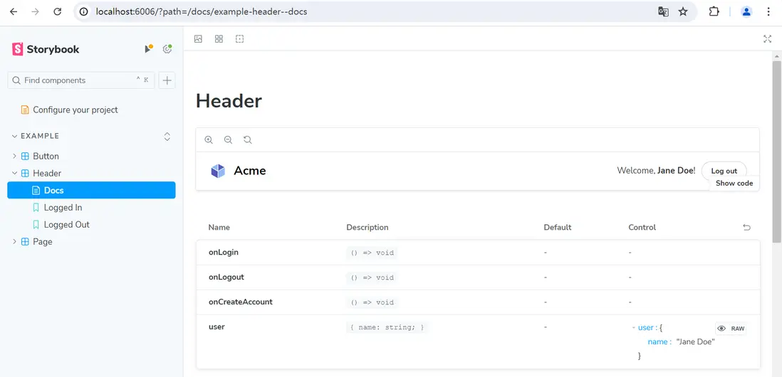
通過項目入口文件 app.tsx 引入 Button 組件可以在本地服務運行的頁面中預覽效果,但隨着組件的開發,我們需要不斷 import 新的組件註釋舊的引用來調試。
這樣開發起來非常的繁瑣,我們期望能有一個地方可以根據對組件進行分類,並且隨時預覽組件的效果,最好還能展示所有的組件配置,能根據選擇配置展示組件效果。
針對以上的訴求,Storybook 就是一個非常好的解決方案。
使用 npm install storybook -d 安裝,並通過 npx sb init 初始化,此時 storybook 會開啓個一本地端口來展示默認生成的 stories 文件夾內案例。
我們在開發組件的 Button 文件夾下新增 index.stories.tsx 文件,來編寫我們自己組件描述,一開始如果不知道如何定義,可以直接在案例組件的基礎上進行修改。
import type { Meta, StoryObj } from "@storybook/react";
import { fn } from "@storybook/test";
import Button from ".";

const meta = {
  title: "Example/iceButton", // 用於展示組件的目錄
  component: Button,
  tags: ["autodocs"], // 是否存在 Docs 頁面
  args: { onClick: fn() },
} satisfies Meta<typeof Button>;
export default meta;

type Story = StoryObj<typeof meta>;
export const Primary: Story = {
  args: {
    children: "按鈕", // 配置自己組件的屬性
  },
};
這樣我們自己編寫的組件就加入到了頁面中,右下方 Control 中是我們為組件添加的
interface BaseButtonProps,storybook 會自動將這部分填充進來,並且部分屬性還可以直接在頁面上修改並預覽效果。
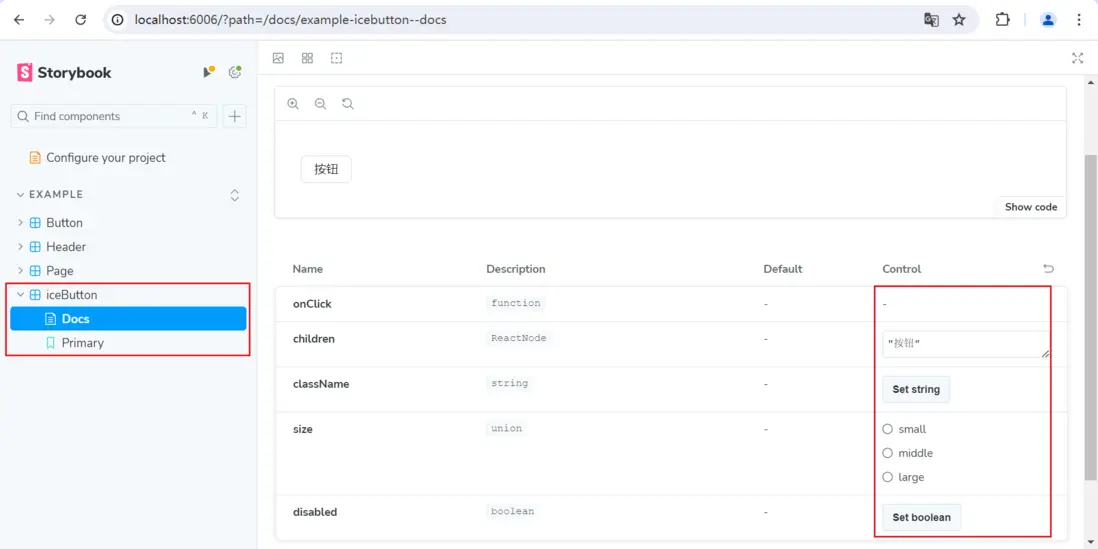
每新增一個組件,我們為其添加一個對應的 stories 文件,不僅便於預覽功能,同時還能為提供詳細的配置説明,直接省去編寫文檔的時間。
編譯
在進行發佈之前,我們還需要做一些配置,首先是修改入口文件,原本在 React 項目中,index.jsx 文件是找到頁面中 id 為 root 的根元素並渲染組件的,現在要修改成將所有定義的組件導出,開發者者通過 import 就能導入使用。
export { default as Button} from "./components/Button";然後我們使用 typecript 工具來對項目進行編譯,react 項目初始化了 tsconfig.json,這個文件和開發相關,編譯的配置需要我們自定義 tsconfig.build.json 文件。
{
  "compilerOptions": {
    // 輸出文件夾
    "outDir": "dist",
    // 是 esmodule 的形式,還可以選 amd、cmd
    "module": "esnext",
    // 輸出的ES版本,ES3-ESNext
    "target": "ES5",
    // typescript 使用庫的時候,可以獲取類型提示,在 .d.ts 文件,所以這個文件也要導出
    "declaration": true,
    // jsx 是 React.createElement 的語法糖,可選 preserve | react | react-native,編譯出來的文件使用 React.createElement 代替 jsx 語法
    "jsx": "react",
    // 加載資源的方案,有classic 和 node 兩種,classic 對應的是相對路徑的方案,從當前路徑一直往上找到 root。但是 node 是去 node_modules 中查找
    "moduleResolution": "node",
    // 支持默認導出的方式,不定義時只支持 import * as React from 'react'
    "allowSyntheticDefaultImports": true
  },
  // 編譯src下的文件
  "include": ["src"],

// 排除 src 無需編譯的文件
  "exclude": ["src/**/*.test.tsx", "src/**/*.stories.tsx", "src/setupTests.ts"]
}
可以看到常用的組件庫,樣式資源都是單獨加載的,比如 antd 👉 import 'antd/dist/antd.css',element 👉 npm install element-theme-default,我們項目也按照這種方式來做一些調整。
去除各組件 scss 文件的引入,統一收口在 src 下的 index.scss 文件中,如 @import './components/Button/index.scss';,然後為以上修改在 package.json 中添加指令。
"scripts": {
"build-ts": "tsc -p tsconfig.build.json",
"build-css": "sass ./src/index.scss ./dist/index.css --no-source-map",
"build": "npm run build-css && npm run build-ts"
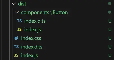
}執行 npm run build 後生成如下文件
發佈npm
在發佈 npm 之前,我們需要確保用户通過 npm 下載的組件資源是可用的,在本地通過 npm link 先驗證一下功能。
我的UI組件項目名稱為 ice-ts-app,對它執行 npm link,測試項目執行 npm link ice-ts-app,並引入測試代碼。
import { Button } from 'ice-ts-app';
import 'ice-ts-app/dist/index.css';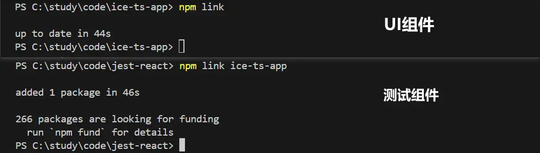
運行測試項目,如果組件及其功能生效則代表驗證成功。
驗證完成後,還需要對 package.json 的配置做一些調整,包含項目的入口文件 dist/inde.js,TypeScript 類型定義文件 dist/index.d.ts,發佈到 npm 的文件夾 dist ,調整 dependencies 和 devDependencies 的依賴,將 react 和 react-dom 遷移至 peerDependencies 中。
{
  "main": "dist/index.js",
  "module": "dist/index.js",
  "types": "dist/index.d.ts",
  "files": ["dist"],
  "peerDependencies": {
     "react": ">=16.8.0",
     "react-dom": ">=16.8.0"
  },
}
還有一些通用的屬性,包括 description、license、author、homepage 等等,開發者按需配置。
另外每次執行 npm run build 都需要手動刪除 dist 文件夾,這裏可以安裝並使用 rimraf 自動刪除,同時再增加一條 script 指令,用於發佈前執行。安裝: npm install rimraf --save
"script": {
"clean": "rimraf ./dist",
"build": "npm run clean && npm run build-css && npm run build-ts",
"prepublishOnly": "npm run build"
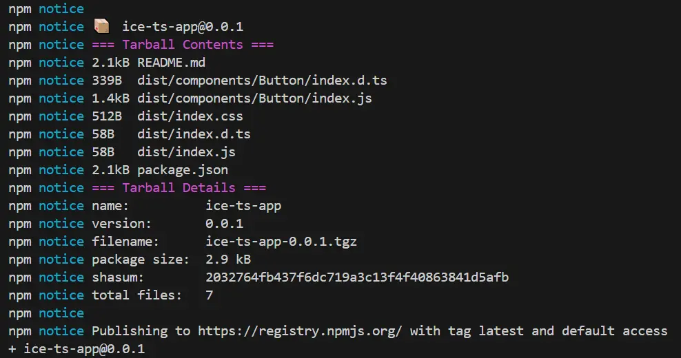
}發佈之前先在 npm 倉庫 上登錄,然後執行 npm publish ,可以看到發佈日誌中有我們提交的文件名稱、文件大小,版本號等信息。
接着我們將用於測試的項目執行 npm unlink ice-ts-app 來解除本地的綁定,並通過 npm install app-ts-app 安裝並驗證剛剛發佈到 npm 倉庫的資源,如果組件能夠正常使用就代表成功啦~
完整代碼
以上便是 React + TypeScript 組件開發、測試、可視化及發佈解析,完整代碼我放在了 github 上,戳 ice-ts-app 可查看,歡迎大家點個 star~
