

Tooltips feel like the smallest UI problem you can have. They’re tiny and usually hidden. When someone asks how to build one, the traditional answer almost always comes back using some JavaScript library. And for a long time, that was the sensible advice.
I followed it, too.
On the surface, a tooltip is simple. Hover or focus on an element, show a little box with some text, then hide it when the user moves away. But once you ship one to real users, the edges start to show. Keyboard users Tab into the trigger, but never see the tooltip. Screen readers announce it twice, or not at all. The tooltip flickers when you move the mouse too quickly. It overlaps content on smaller screens. Pressing Esc does not close it. Focus gets lost.
Over time, my tooltip code grew into something I didn’t really want to own anymore. Event listeners piled up. Hover and focus had to be handled separately. Outside clicks needed special cases. ARIA attributes had to be kept in sync by hand. Every small fix added another layer of logic.
Libraries helped, but they were also more like black boxes I worked around instead of fully understanding what was happening behind the scenes.
That was what pushed me to look at the newer Popover API. I wanted to see what would happen if I rebuilt a single tooltip using the browser’s native model without the aid of a library.
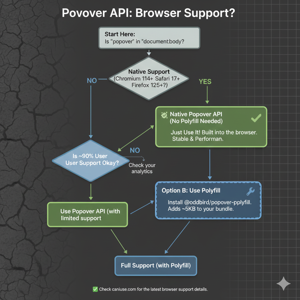
As we start, it’s worth noting that, as with any new feature, there are some things with it that are still being ironed out. That said, it currently enjoys great browser support, although there are several pieces to the overall API that are in flux. It’s worth keeping an eye on Caniuse in the meantime.
The “Old” Tooltip
Before the Popover API, using a tooltip library was not a shortcut. It was the default. Browsers didn’t have a native concept of a tooltip that worked across mouse, keyboard, and assistive technology. If you cared about correctness, your only option was to use a library, and that is exactly what I did.
At a high level, the pattern was always the same: a trigger element, a hidden tooltip element, and JavaScript to coordinate the two.
<button class="info">?</button>
<div class="tooltip" role="tooltip">Helpful text</div>
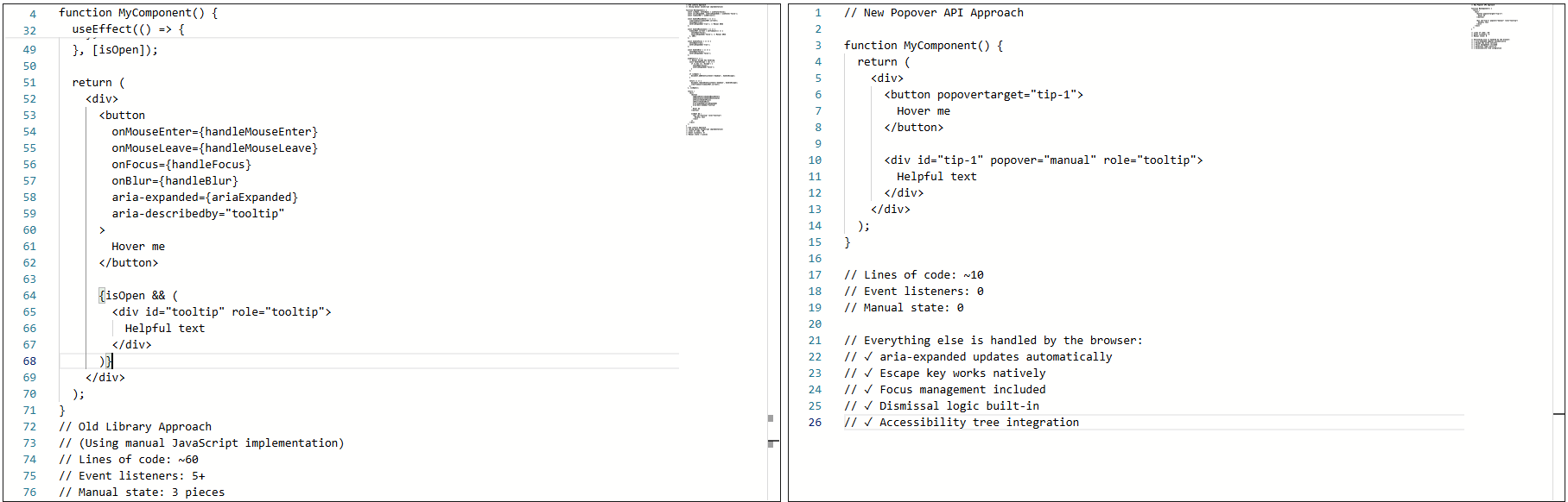
The library handled the wiring that allowed the element to show on hover or focus, hide on blur or mouse leave, and reposition/resize on scroll.
None of it was accidental. It was merely compensating for gaps in web platform features.
Why I Used A Library
The library was doing real work for me: positioning, flipping at viewport edges, event coordination across input types, and scroll awareness inside complex layouts. Positioning alone justified the dependency. Handling scroll containers, transforms, and responsive layouts correctly is not simple.
The real issues showed up in accessibility behavior, not visuals. The tooltip worked, but not all the time. Here’s where things started to fray at the seams:
- Tooltips sometimes appeared late or not at all.
- Tabbing quickly could skip them entirely.
- Escape dismissal was not reliable.
I also ran into issues trying to sync hover and focus behavior:
- Mouse users expect immediacy.
- Keyboard users expect predictability.
- Supporting both meant delays and edge cases.
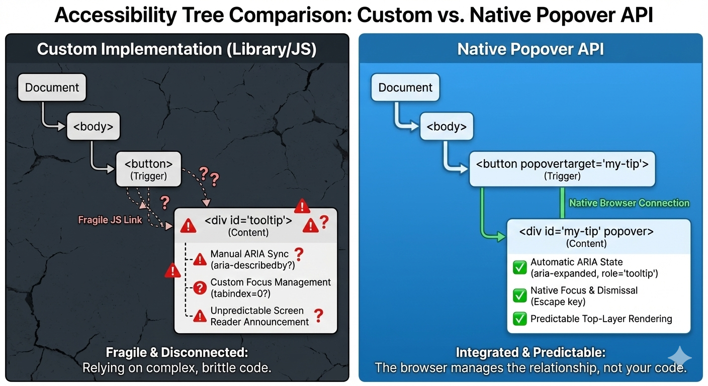
Not to mention, there were issues with assistive technologies, particularly screen readers: Sometimes the tooltip was announced, sometimes it wasn’t, and sometimes it was announced twice.
Keeping ARIA attributes in sync required manual updates. Miss one state change, and the tooltip became confusing or invisible to the accessibility tree.
This Was Not Bad Code
The implementation was tested, the library was solid, and the behavior was reasonable given the tools available at the time.
The core problem was not the code. It was that the web platform lacked proper affordances.
For example, the browser has no real way of knowing that the element was a tooltip. Everything was built from conventions: generic elements, event listeners, manually-managed ARIA, and custom dismissal logic.
Over time, the tooltip could become fragile. Small changes carried risk. Minor fixes caused regressions. Worse, adding new tooltips inherited the same complexity. Things technically worked, but never felt settled or complete.
That was the state of things when I decided to rebuild the tooltip using the browser’s native Popover API.
The Moment I Tried The Popover API
I didn’t switch to using the Popover API because I wanted to experiment with something new. I switched because I was tired of maintaining tooltip behavior that I believed the browser should have already understood.
I was skeptical at first. Most new web APIs promise simplicity, but still require glue, edge-case handling, or fallback logic that quietly recreates the same complexity that you were trying to escape.
So, I tried the Popover API in the smallest way possible. Here’s what that looked like:
<!-- popovertarget creates the connection to id="tip-1" -->
<button popovertarget="tip-1">?</button>

<!-- popover="manual": browser manages this as a popover -->
<!-- role="tooltip": tells assistive technology what this is -->
<div id="tip-1" popover="manual" role="tooltip">
  This button triggers a helpful tip.
</div>
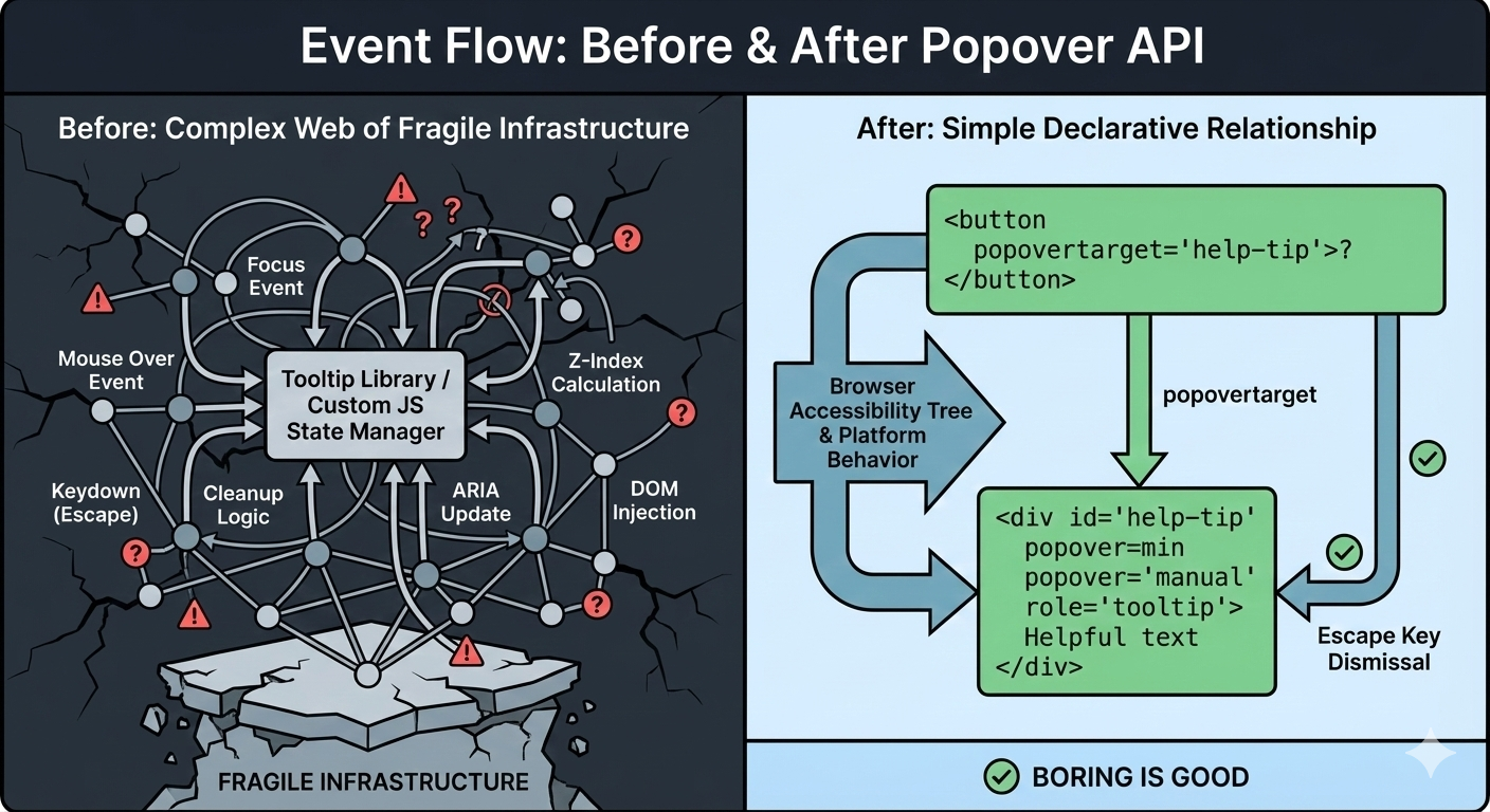
No event listeners. No state tracking. No ARIA updates handled in JavaScript. I focused the button, and the tooltip appeared. I pressed the Esc key, and it disappeared.
What Immediately Stood Out
A few things became obvious within minutes:
I Didn’t Write Any JavaScript To Open Or Close It
The browser handled invocation entirely through HTML. The relationship between trigger and tooltip was explicit.
The Esc Key Just Worked
I didn’t add a key listener. Pressing the Esc key properly closed the tooltip because the browser understands that popovers should be dismissible.
ARIA State Automatically Synced
The aria-expanded attribute updated on its own when the popover opened and closed. There was no need for manual bookkeeping and no risk of stale state.
This was the moment that the Popover API stopped feeling like a convenience and more like true bona fide platform behavior.
What surprised me most was not the reduced code but the change in responsibility. Before, the tooltip existed because my JavaScript said so. Now, it exists because the browser understands what it is supposed to be and its role in the markup. The tooltip is no longer simply a box positioned near a button anymore, but participating in the browser’s focus model, the accessibility tree, and native dismissal rules.
That’s when my migration to the Popover API started.
Understanding Invoker Commands
The popovertarget and popovertargetaction attributes are part of HTML’s invoker commands, a declarative way to control interactive elements without JavaScript.
popovertarget="id": Connects the button to a popover element.popovertargetaction: Specifies what should happen:show: Only opens the popover.hide: Only closes the popover.toggle(default): Opens the popover if closed and closes it if it’s open.
This means you can have multiple triggers for the same tooltip:
<button popovertarget="help-tip" popovertargetaction="show">
  Show Help
</button>

<button popovertarget="help-tip" popovertargetaction="hide">
  Close Help
</button>

<div id="help-tip" popover="manual" role="tooltip">
  Help content
</div>
The browser coordinates everything with no JavaScript needed for the basic interaction.
Free Accessibility Wins
This is the part that made me switch completely. I expected the Popover API to reduce code. I didn’t expect it to remove entire categories of accessibility bugs I had been chasing for years. Before the migration, my tooltip system looked fine at the very least. Keyboard support existed, ARIA attributes were present, and screen readers usually behaved accordingly. But “usually” did a lot of heavy lifting.
Once I swapped in native popovers, three things changed immediately.
1. The Keyboard “Just Works”
Keyboard support depended on multiple layers lining up correctly: focus had to trigger the tooltip, blur had to hide it, Esc had to be wired manually, and timing mattered. If you missed one edge case, the tooltip would either stay open too long or disappear before it could be read.
With the popover attribute set to auto or manual, the browser takes over the basics: Tab and Shift+Tab behave normally, Esc closes the tooltip every time, and no extra listeners are required.
<div popover="manual">
  Helpful explanation
</div>
What disappeared from my codebase were global keydown handlers, Esc-specific cleanup logic, and state checks during keyboard navigation. The keyboard experience stopped being something I had to maintain, and it became a browser guarantee.
2. Screenreader Predictability
This was the biggest improvement. Even with careful ARIA work, the behavior varied, as I outlined earlier. Every small change felt risky. Using a popover with a proper role looks and feels a lot more stable and predictable as far as what’s going to happen:
<div popover="manual" role="tooltip">
  Helpful explanation
</div>
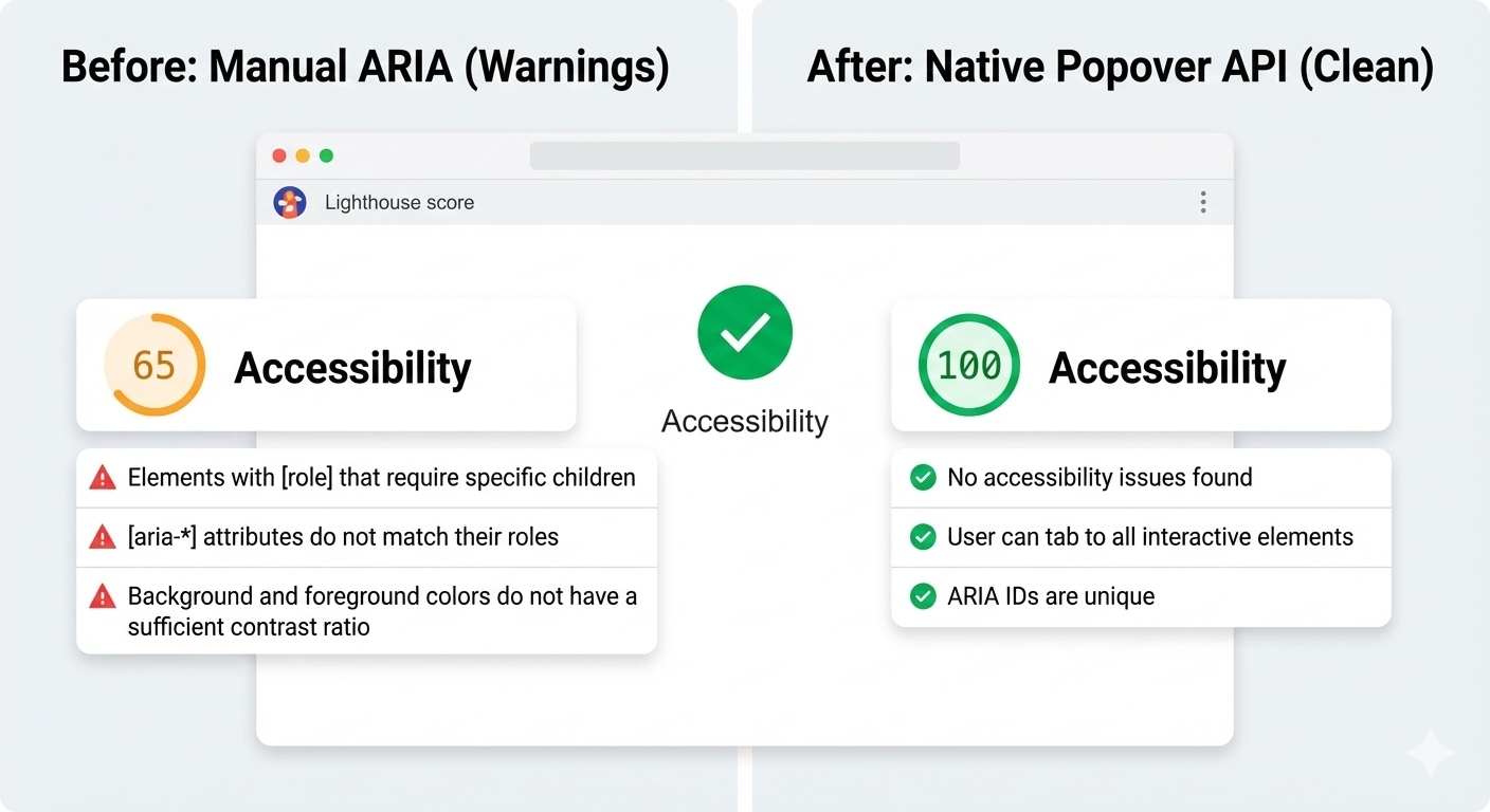
And here’s another win: After the switch, Lighthouse stopped flagging incorrect ARIA state warnings for the interaction, largely because there are no longer custom ARIA states for me to accidentally get wrong.
3. Focus Management
Focus used to be fragile. Before, I had rules like: let focus trigger show tooltip, move focus into tooltip and don’t close, blur trigger when it’s too close, and close tooltip and restore focus manually. This worked until it didn’t.
With the Popover API, the browser enforces a simpler model where focus can more naturally move into the popover. Closing the popover returns focus to the trigger, and there are no invisible focus traps or lost focus moments. And I didn’t add focus restoration code; I removed it.
Where The Popover API Maybe Still Isn’t Enough
As much as the Popover API has simplified my code and improved semantics, it still has not completely eliminated JavaScript. That’s not totally a bad thing because what’s changed is that JavaScript is no longer a key dependency. I am no longer compensating for missing platform behavior anymore. I am much more focused on intent.
Here are a few places where I could see the API continue to improve.
Tooltip Timing Still Matters
Native popovers open and close immediately. That is usually the expected behavior, but not always ideal for what we consider to be tooltips. In those cases, instant dismissal can feel unstable when you move your mouse a few pixels too quickly or accidentally brush past the trigger — the tooltip will flash, then disappear, which can be jarring.
I want to be able to control that timing and apply delays between hover or focus and opening the tooltip. So I still add small delays. What changed was how much of the interaction logic I actually needed to own. Before, even basic open and close behavior required JavaScript. With the Popover API, and especially with HTML invoker commands, that responsibility shifts back to the browser.
<button
  popovertarget="help-tip"
  popovertargetaction="show">
  ?
</button>

<div id="help-tip" popover="manual" role="tooltip">
  This button triggers a helpful tip.
</div>
At this point, the browser handles invocation, dismissal, and ARIA state on its own. There’s no JavaScript involved just to make the tooltip appear or disappear.
JavaScript only comes back in when I want intentional behavior. In this case, a short delay before hiding the tooltip, and cancelling if the pointer moves into it. This isn’t about accessibility fixes. It’s about human behavior.
It’s worth noting that CSS is beginning to explore this space as well. The emerging interest/invoker work introduces ways to express entry and exit delays directly in CSS, which could remove this small bit of JavaScript entirely. For now, I still handle it imperatively, but the direction of the platform is clear.
let hideTimeout;

const show = () => {
  clearTimeout(hideTimeout);
  tooltip.showPopover();
};

const hide = () => {
  hideTimeout = setTimeout(() => {
    tooltip.hidePopover();
  }, 200);
};
The difference is that this logic stays small and local. It no longer defines how the tooltip works. It simply refines how it feels.
Hover Intent With Invoker Commands
The browser does not know why someone hovers over an element or focuses on it. Was it intentional, or was the pointer just passing through? That part has always required some judgment.
What changed is where that logic lives. With invoker commands handling the core open and close behavior, JavaScript no longer owns the interaction model. It only adds intent on top of it.
<button
 popovertarget="help-tip"
 popovertargetaction="show">
  ?
</button>
The platform manages invocation, dismissal, and ARIA state. JavaScript is only needed when we want behavior that the browser cannot infer, such as a short delay before hiding or cancelling dismissal if the pointer moves into the tooltip.
let hideTimeout;

const show = () => {
clearTimeout(hideTimeout);
  tooltip.showPopover();
};

const hide = () => {
  hideTimeout = setTimeout(() => {
    tooltip.hidePopover();
  }, 200);
};
And again, CSS is beginning to explore this space with new interaction primitives, which may reduce the need for custom hover intent code even further.
Manual Popovers And Focus
For popover="manual", the browser does not restore focus automatically the way it can for auto popovers. That responsibility remains explicit. When a tooltip opens on focus and closes on blur, I return focus deliberately to the trigger:
tooltip.hidePopover();
trigger.focus();
This is not a limitation but a clear boundary between platform behavior and person intent.
The Honest Take
The Popover API does not magically solve tooltips. It stopped forcing me to rebuild fragile infrastructure. I still write JavaScript and think about edge cases, but now I am solving product problems instead of recreating UI primitives the browser should already understand.
When I would Still Reach For A Tooltip Library
Even after migrating my tooltips to the Popover API, I did not walk away thinking libraries were old and obsolete. They have earned their place, just in more specific situations.
1. Large Or Mature Design Systems
If you are maintaining a large design system used across multiple teams, a tooltip library can still make sense because centralized behavior, documented patterns, and consistent defaults across products. In those environments, changing the underlying interaction model is not just a technical decision; it is an organizational one. A well-maintained library gives teams guardrails, especially when not everyone is deeply familiar with accessibility nuances.
2. Complex Positioning Requirements
For most tooltips, native positioning is enough, but if you need collision detection across nested scroll containers, custom flipping logic, or fine-grained control over offsets and boundaries, libraries like Floating UI still shine. They are optimized for geometry problems that the platform is only beginning to address.
It is also worth mentioning CSS anchor positioning, which is starting to cover many of the problems that tooltip libraries historically solved. Anchors allow a popover to be positioned relative to a trigger using pure CSS, including viewport-aware placement and edge flipping. This moves even more responsibility back to the platform instead of JavaScript.
That said, anchor positioning is still new and there are known issues, although the good news is that they are part of Interop, meaning we can look forward to full and consistent browser support. For teams that need consistent cross-browser behavior today, libraries remain the practical choice. The direction is clear that the platform is steadily absorbing work that once required dedicated positioning engines.
3. Teams Without Accessibility Experience
This one matters. If a team does not have strong accessibility knowledge, a good library can act as a safety net, though it will not guarantee perfect accessibility. It can, however, prevent the many common mistakes. The Popover API gives you better defaults, but it still assumes you know when to add roles, labels, focus management, and testing. Without that understanding, even native tools can be misused.
The Decision Line
For me, the choice now looks like this:
“
And sometimes the right tool is still a library — just no longer by default.
Conclusion
The Popover API means that tooltips are no longer something you simulate. They’re something the browser understands. Opening, closing, keyboard behavior, Escape handling, and a big chunk of accessibility now come from the platform itself, not from ad-hoc JavaScript.
That does not mean tooltip libraries are obsolete because they still make sense for complex design systems, heavy customization, or legacy constraints, but the default has shifted. For the first time, the simplest tooltip can also be the most correct one. If you are curious, try this experiment: Simply replace just one tooltip in your product with the Popover API, do not rewrite everything, do not migrate a whole system, and just pick one and see what disappears from your code.
When the platform gives you a better primitive, the win is not just fewer lines of JavaScript, but it is fewer things you have to worry about at all.
Check out the full source code in my GitHub repo.
Further Reading
For deeper dives into popovers and related APIs:
- “Poppin’ In”, Geoff Graham
- “Clarifying the Relationship Between Popovers and Dialogs”, Zell Liew
- “What is popover=hint?”, Una Kravets
- “Invoker Commands”, Daniel Schwarz
- “Creating an Auto-Closing Notification with an HTML Popover”, Preethi
- Open UI Popover API Explainer
- “Pop(over) the Balloons”, John Rhea
- “CSS Anchor Positioning”, Juan Diego Rodríguez
MDN also offers comprehensive technical documentation for the Popover API.