
We’re not always able to load different-sized images for an HTML element. If we use a width and height that isn’t proportional to the image’s aspect ratio, the image might either be compressed or stretched. That isn’t good, and it can be solved either with object-fit for an img element or by using background-size.
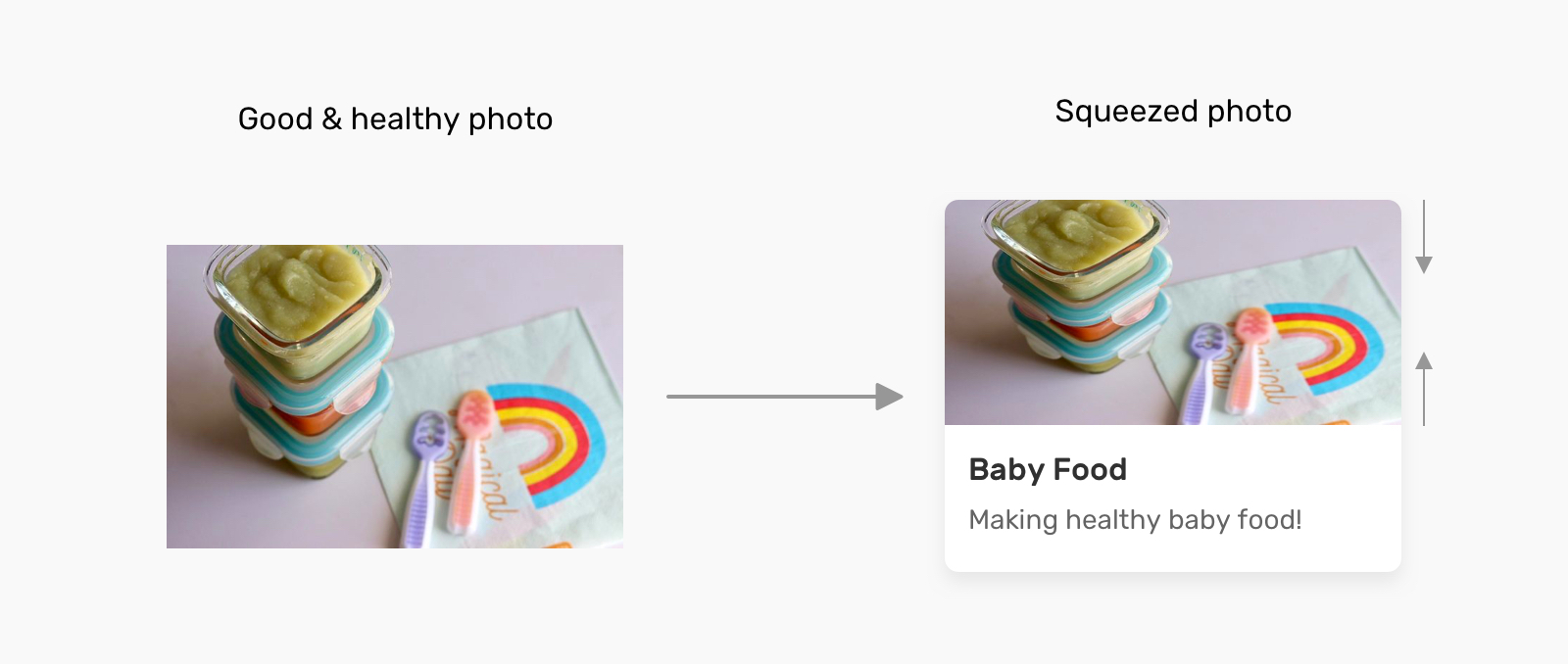
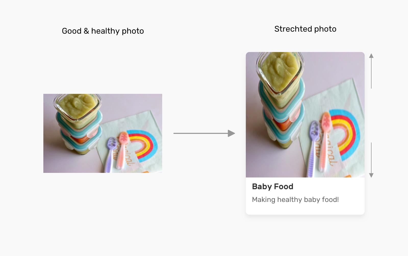
First, let’s define the problem. Consider the following figure:
Why is this happening?
An image will have an aspect ratio, and the browser will fill the containing box with that image. If the image’s aspect ratio is different than the width and height specified for it, then the result will be either a squeezed or stretched image.
We see this in the following figure:
The Solution
We don’t always need to add a different-sized image when the aspect ratio of the image doesn’t align with the containing element’s width and height. Before diving into CSS solutions, I want to show you how we used to do this in photo-editing apps:
Now that we understand how that works, let’s get into how this works in the browser. (Spoiler alert: It’s easier!)
CSS object-fit
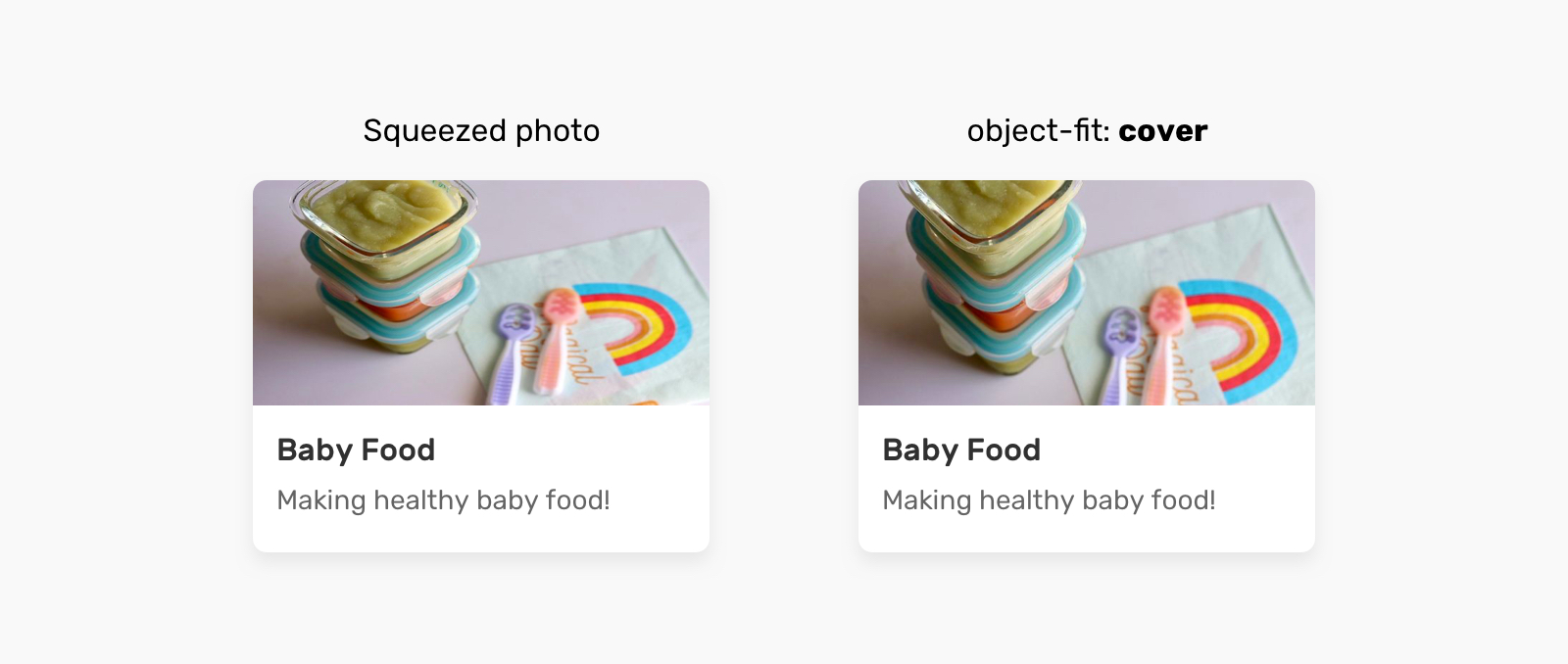
The object-fit property defines how the content of a replaced element such as img or video should be resized to fit its container. The default value for object-fit is fill, which can result in an image being squeezed or stretched.
Let’s go over the possible values.
Possible Values For object-fit
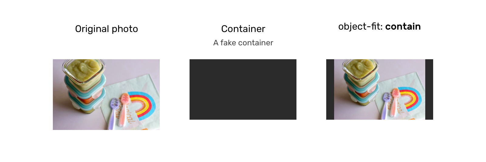
object-fit: contain
In this case, the image will be resized to fit the aspect ratio of its container. If the image’s aspect ratio doesn’t match the container’s, it will be letterboxed.
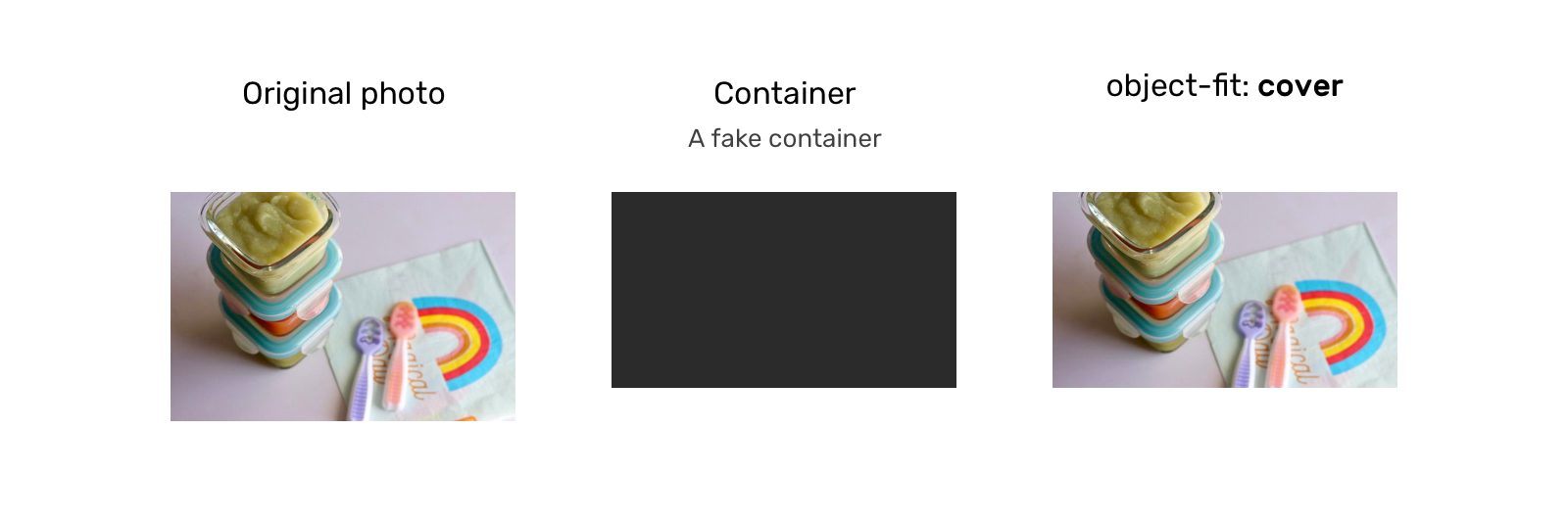
object-fit: cover
Here, the image will also be resized to fit the aspect ratio of its container, and if the image’s aspect ratio doesn’t match the container’s, then it will be clipped to fit.
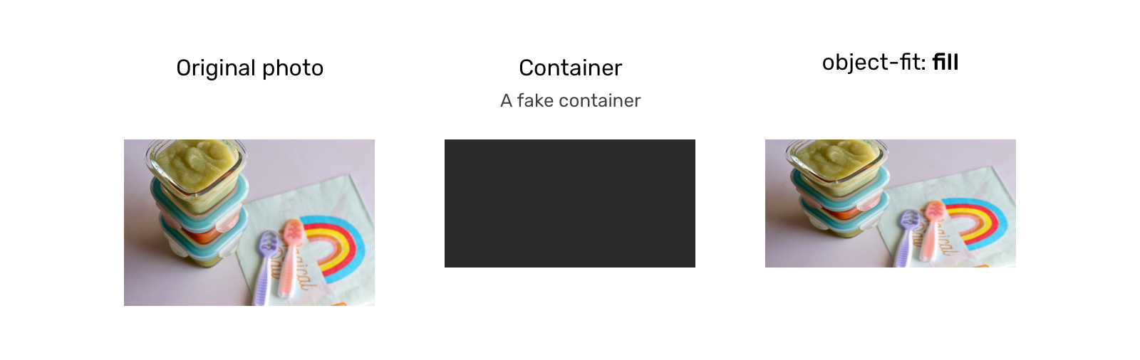
object-fit: fill
With this, the image will be resized to fit the aspect ratio of its container, and if the image’s aspect ratio doesn’t match the container’s, it will be either squeezed or stretched. We don’t want that.
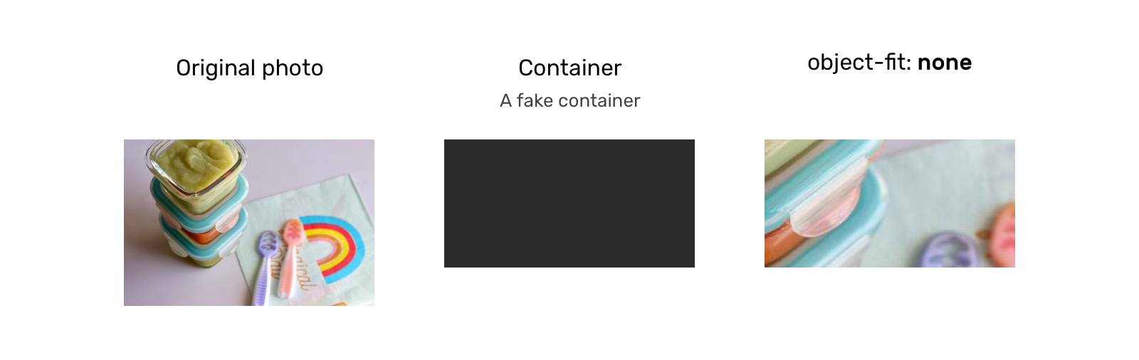
object-fit: none
In this case, the image won’t be resized at all, neither stretched nor squeezed. It works like the cover value, but it doesn’t respect its container’s aspect ratio.
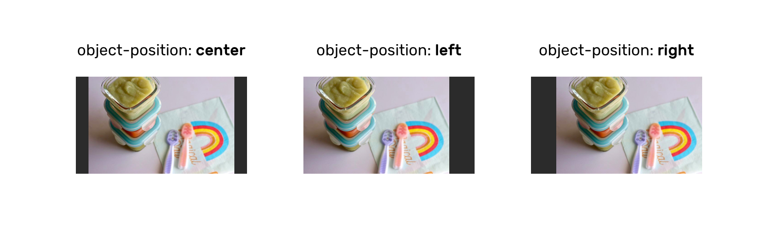
Aside from object-fit, we also have the object-position property, which is responsible for positioning an image within its container.
Possible Values For object-position
The object-position property works similar to CSS’ background-position property:
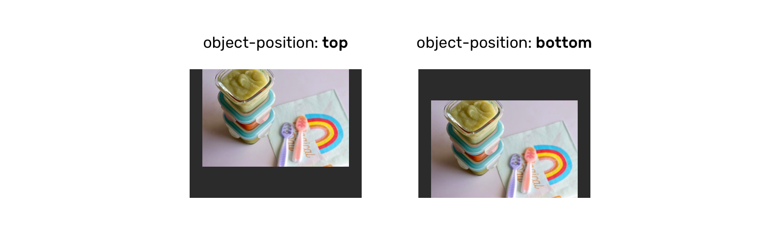
The top and bottom keywords also work when the aspect ratio of the containing box is vertically larger:
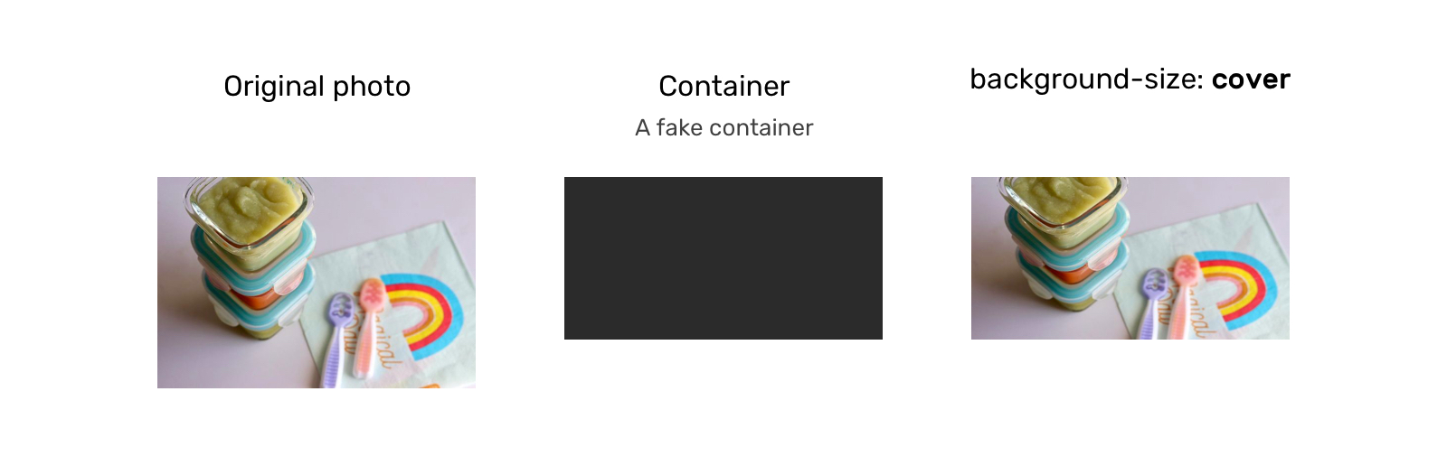
CSS background-size
With background-size, the first difference is that we’re dealing with the background, not an HTML (img) element.
Possible Values For background-size
The possible values for background-size are auto, contain, and cover.
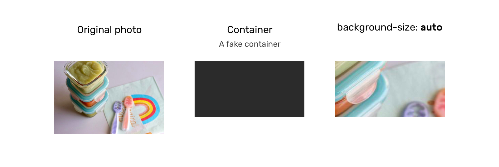
background-size: auto
With auto, the image will stay at its default size:
background-size: cover
Here, the image will be resized to fit in the container. If the aspect ratios are not the same, then the image will be masked to fit.
background-size: contain
In this case, the image will be resized to fit in the container. If the aspect ratios are off, then the image will be letterboxed as shown in the next example:

As for background-position, it’s similar to how object-position works. The only difference is that the default position of object-position is different than that of background-position.
When Not To Use object-fit Or background-size
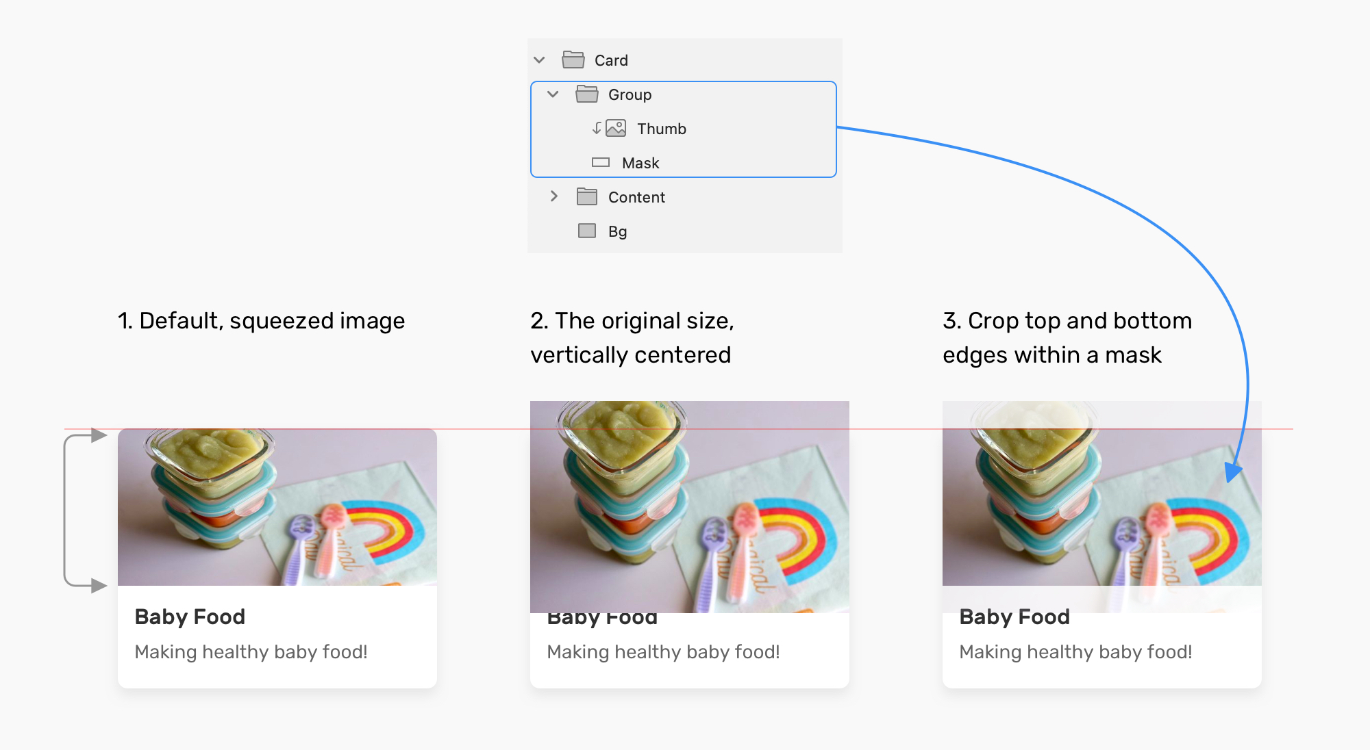
If the element or the image is given a fixed height and has either background-size: cover or object-fit: cover applied to it, there will be a point where the image will be too wide, thus losing important detail that might affect how the user perceives the image.
Consider the following example in which the image is given a fixed height:
.card__thumb {
    height: 220px;
}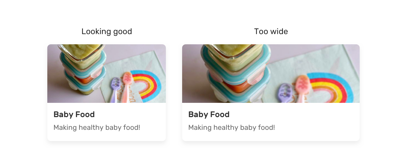
If the card’s container is too wide, it will result in what we see on the right (an image that is too wide). That is because we are not specifying an aspect ratio.
There is only one of two fixes for this. The first is to use the padding hack to create an intrinsic ratio.
.card__thumb {
    position: relative;
    padding-bottom: 75%;
    height: 0;
}

.card__thumb img {
    position: absolute;
    left: 0;
    top: 0;
    width: 100%;
    height: 100%;
    object-fit: cover;
}
The second fix is to use the new aspect-ratio CSS property. Using it, we can do the following:
.card__thumb img {
    aspect-ratio: 4 / 3;
}Note: I’ve already written about the aspect-ratio property in detail in case you want to learn about it: “Let’s Learn About Aspect Ratio In CSS”.
Use Cases And Examples
User Avatars
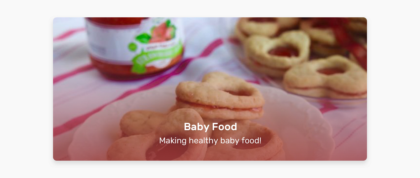
A perfect use case for object-fit: cover is user avatars. The aspect ratio allowed for an avatar is often square. Placing an image in a square container could distort the image.
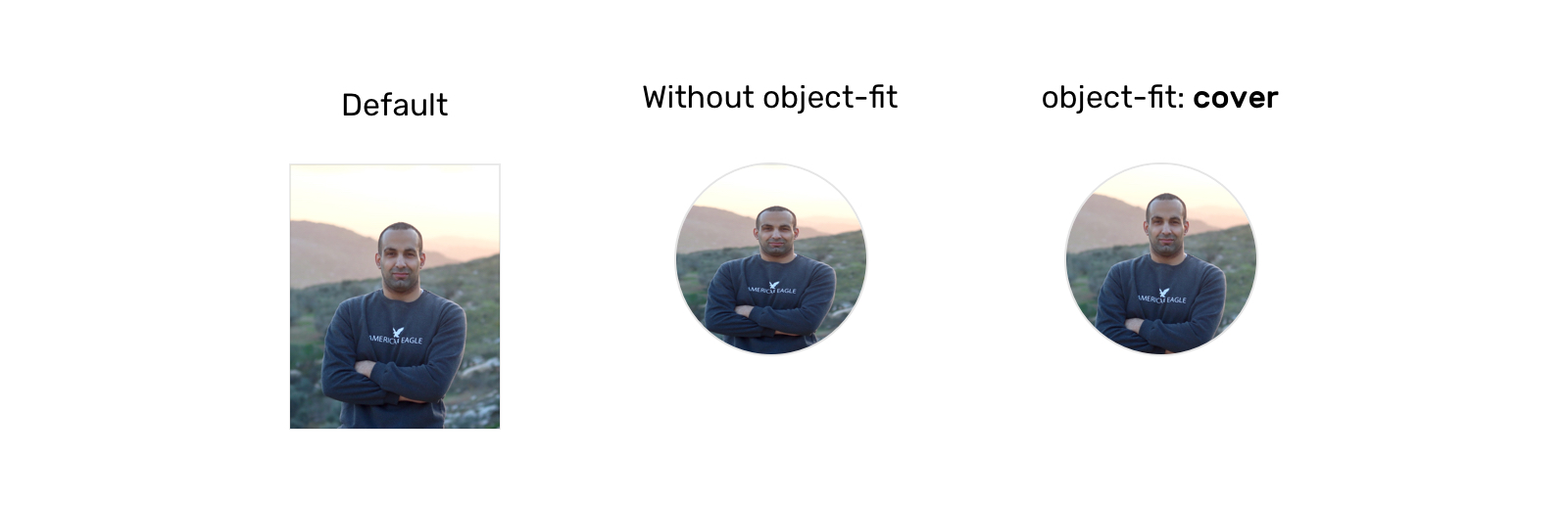
.c-avatar {
    object-fit: cover;
}
Logos List
Listing the clients of a business is important. We will often use logos for this purpose. Because the logos will have different sizes, we need a way to resize them without distorting them.
Thankfully, object-fit: contain is a good solution for that.
.logo__img {
    width: 150px;
    height: 80px;
    object-fit: contain;
}
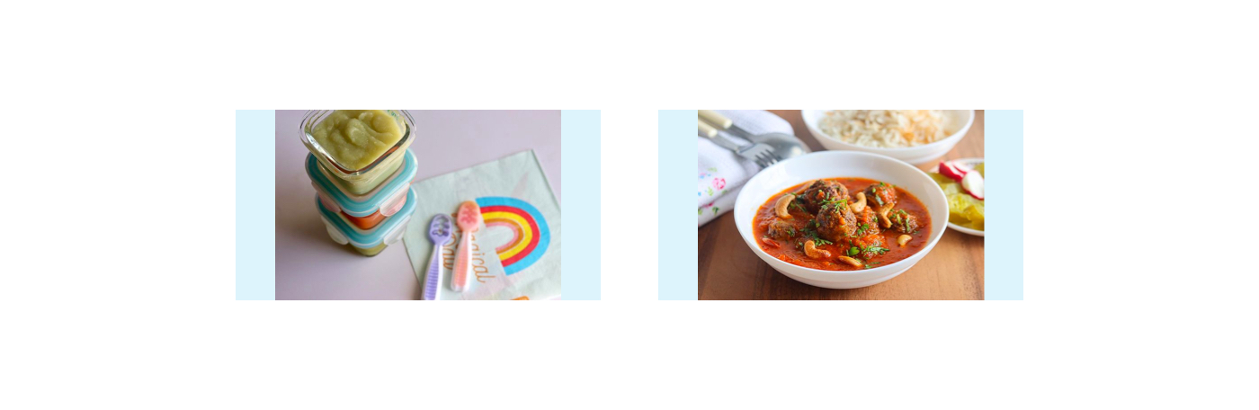
Article Thumbnail
This is a very common use case. The container for an article thumbnail might not always have an image with the same aspect ratio. This issue should be fixed by the content management system (CMS) in the first place, but it isn’t always.
.article__thumb {
    object-fit: cover;
}
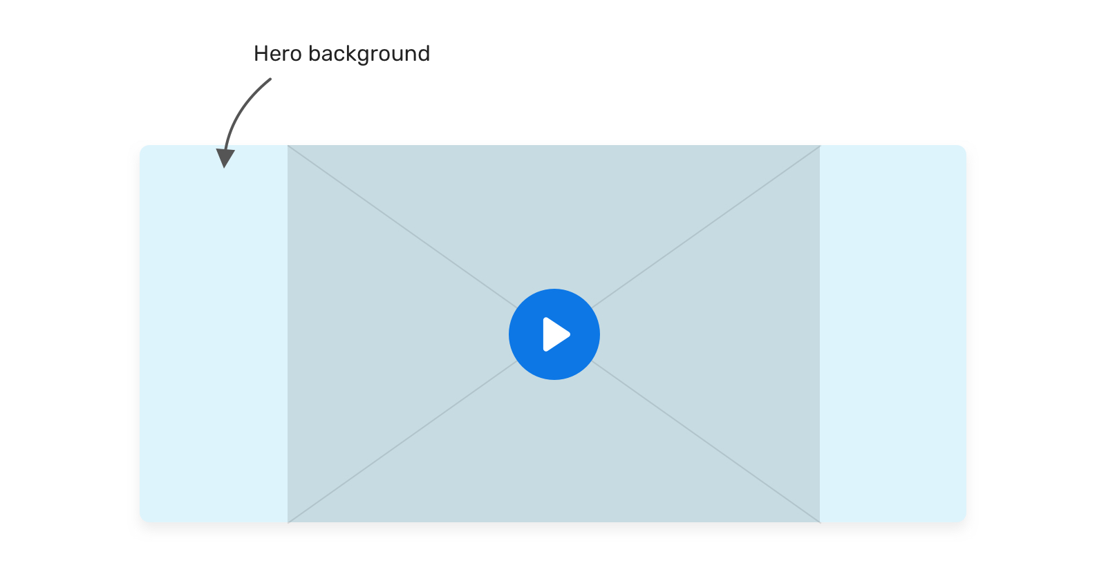
Hero Background
In this use case, the decision of whether to use an img element or a CSS background will depend on the following:
- Is the image important? If CSS is disabled for some reason, would we want the user to see the image?
- Or is the image’s purpose merely decorative?
Based on our answer, we can decide which feature to use. If the image is important:
<section class="hero">
    <img class="hero__thumb" src="thumb.jpg" alt="" />
</section>
.hero {
position: relative;
}
.hero__thumb {
position: absolute;
left: 0;
top: 0;
width: 100%;
height: 100%;
object-fit: cover;
}If the image is decorative, we can go with background-image:
.hero {
    position: relative;
    background-image: linear-gradient(to top, #a34242, rgba(0,0,0,0), url("thumb.jpg");
    background-repeat: no-repeat;
    background-size: cover;
}
The CSS is shorter in this case. Make sure that any text placed over the image is readable and accessible.
Adding A Background To An Image With object-fit: contain
Did you know that you can add a background color to img? We would benefit from that when also using object-fit: contain.
In the example below, we have a grid of images. When the aspect ratios of the image and the container are different, the background color will appear.
img {
    object-fit: contain;
    background-color: #def4fd;
}
Video Element
Have you ever needed a video as a background? If so, then you probably wanted it to take up the full width and height of its parent.
.hero {
    position: relative;
    background-color: #def4fd;
}

.hero__video {
    position: aboslute;
    left: 0;
    top: 0;
    width: 100%;
    height: 100%;
}
To make it fully cover the width and height of its parent, we need to override the default object-fit value:
.hero__video {
    /* other styles */
    object-fit: cover;
}
Conclusion
As we’ve seen, both object-fit and background-size are very useful for handling different image aspect ratios. We won’t always have control over setting the perfect dimensions for each image, and that’s where these two CSS features shine.
A friendly reminder on the accessibility implications of choosing between an img element and a CSS background: If the image is purely decorative, then go for a CSS background. Otherwise, an img is more suitable.
I hope you’ve found this article useful. Thank you for reading.