一、引言
組件體驗的革新
在前端開發領域,Ant Design 一直是企業級 React 應用的首選 UI 庫之一。隨着 Ant Design 6.0 的發佈,我們又見證了一次聚焦於組件功能與用户體驗的革新。本次更新不僅引入了多個全新組件,更對現有核心組件進行了功能性增強,使開發者能夠以更少的代碼實現更豐富的交互效果。
二、Masonry 瀑布流組件:智能動態佈局
傳統網格佈局在處理高度不一的元素時常出現大量空白區域,Masonry(瀑布流)佈局則完美解決了這一問題。Ant Design 6.0 全新推出的 Masonry 組件讓實現這種流行佈局變得異常簡單。
基礎實現與響應式配置
import { useState, useEffect, useRef } from "react";
import { Masonry, Card, Image, Spin } from "antd";
/**
 * Masonry瀑布流頁面
 */
export default () => {
  const [isLoading, setIsLoading] = useState(false);
  const containerRef = useRef<HTMLDivElement>(null);
  const isLoadingRef = useRef(false);
  const imageList = [
    "https://images.xxx.com/photo-xxx-4b4e3d86bf0f",
    ...
    "https://images.xxx.com/photo-xxx-98f7befd1a60",
  ];
  const titles = [
    "山間日出",
    ...
    "自然風光",
  ];
  const descriptions = [
    "清晨的第一縷陽光",
    ...
    "色彩鮮豔的料理",
  ];
  const heights = [240, 260, 280, 300, 320, 350, 380, 400];
  // Mock數據生成函數
  const generateMockData = (startIndex: number, count: number) => {
    return Array.from({ length: count }, (_, index) => ({
      id: startIndex + index + 1,
      src: imageList[Math.floor(Math.random() * imageList.length)],
      title: titles[(startIndex + index) % titles.length],
      description: descriptions[(startIndex + index) % descriptions.length],
      height: heights[Math.floor(Math.random() * heights.length)],
    }));
  };
  // 初始數據:20條
  const [photoItems, setPhotoItems] = useState(() => generateMockData(0, 20));
  // 滾動監聽
  useEffect(() => {
    isLoadingRef.current = isLoading;
  }, [isLoading]);
  useEffect(() => {
    const loadMoreData = async () => {
      if (isLoadingRef.current) return;
      isLoadingRef.current = true;
      setIsLoading(true);
      // 模擬API請求延遲
      await new Promise((resolve) => setTimeout(resolve, 500));
      setPhotoItems((prev) => {
        const newItems = generateMockData(prev.length, 10);
        return [...prev, ...newItems];
      });
      isLoadingRef.current = false;
      setIsLoading(false);
    };
    const checkScroll = () => {
      if (isLoadingRef.current) return;
      const container = containerRef.current;
      if (!container) return;
      const scrollTop = container.scrollTop;
      const scrollHeight = container.scrollHeight;
      const clientHeight = container.clientHeight;
      // 當滾動到距離底部100px時觸發加載
      if (scrollTop + clientHeight >= scrollHeight - 100) {
        loadMoreData();
      }
    };
    const handleWindowScroll = () => {
      if (isLoadingRef.current) return;
      const windowHeight = window.innerHeight;
      const documentHeight = document.documentElement.scrollHeight;
      const scrollTop =
        window.pageYOffset || document.documentElement.scrollTop;
      // 當滾動到距離底部100px時觸發加載
      if (scrollTop + windowHeight >= documentHeight - 100) {
        loadMoreData();
      }
    };
    const container = containerRef.current;
    // 初始檢查一次,以防內容不足一屏
    setTimeout(() => {
      checkScroll();
      handleWindowScroll();
    }, 100);
    // 監聽容器滾動
    if (container) {
      container.addEventListener("scroll", checkScroll);
    }
    // 同時監聽 window 滾動(作為備選)
    window.addEventListener("scroll", handleWindowScroll);
    return () => {
      if (container) {
        container.removeEventListener("scroll", checkScroll);
      }
      window.removeEventListener("scroll", handleWindowScroll);
    };
  }, []);
  return (
    <div ref={containerRef} className="w-full h-[100vh] overflow-auto p-[24px]">
      <Masonry
        // 響應式列數配置
        columns={{ xs: 2, sm: 3, md: 4, lg: 5 }}
        // 列間距與行間距
        gutter={16}
        items={photoItems as any}
        itemRender={(item: any) => (
          <Card
            key={item.id}
            hoverable
            cover={
              <div style={{ height: item.height, overflow: "hidden" }}>
                <Image
                  src={item.src}
                  alt={item.title}
                  height={item.height}
                  width="100%"
                  style={{
                    width: "100%",
                    height: "100%",
                    objectFit: "cover",
                  }}
                  preview={{
                    visible: false,
                  }}
                />
              </div>
            }
            styles={{
              body: {
                padding: "12px",
              },
            }}
          >
            <Card.Meta title={item.title} description={item.description} />
            <div
              className="mt-[8px] text-[12px] text-[#999]"
            >
              圖片 #{item.id}
            </div>
          </Card>
        )}
      />
      {isLoading && (
        <div
          className="flex items-center justify-center p-[20px] text-[#999]"
        >
          <Spin style={{ marginRight: "8px" }} />
          <span>加載中...</span>
        </div>
      )}
    </div>
  );
};
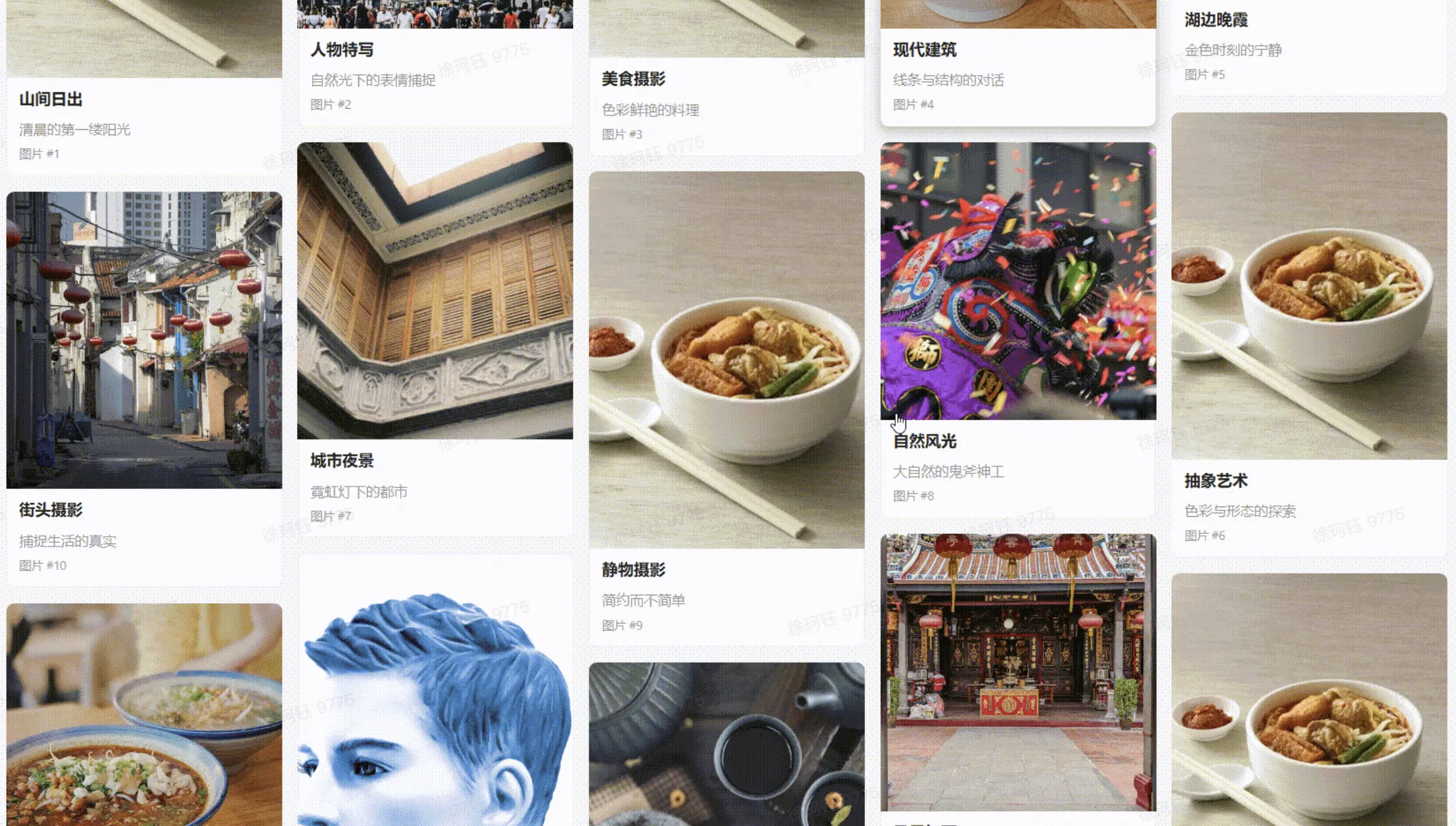
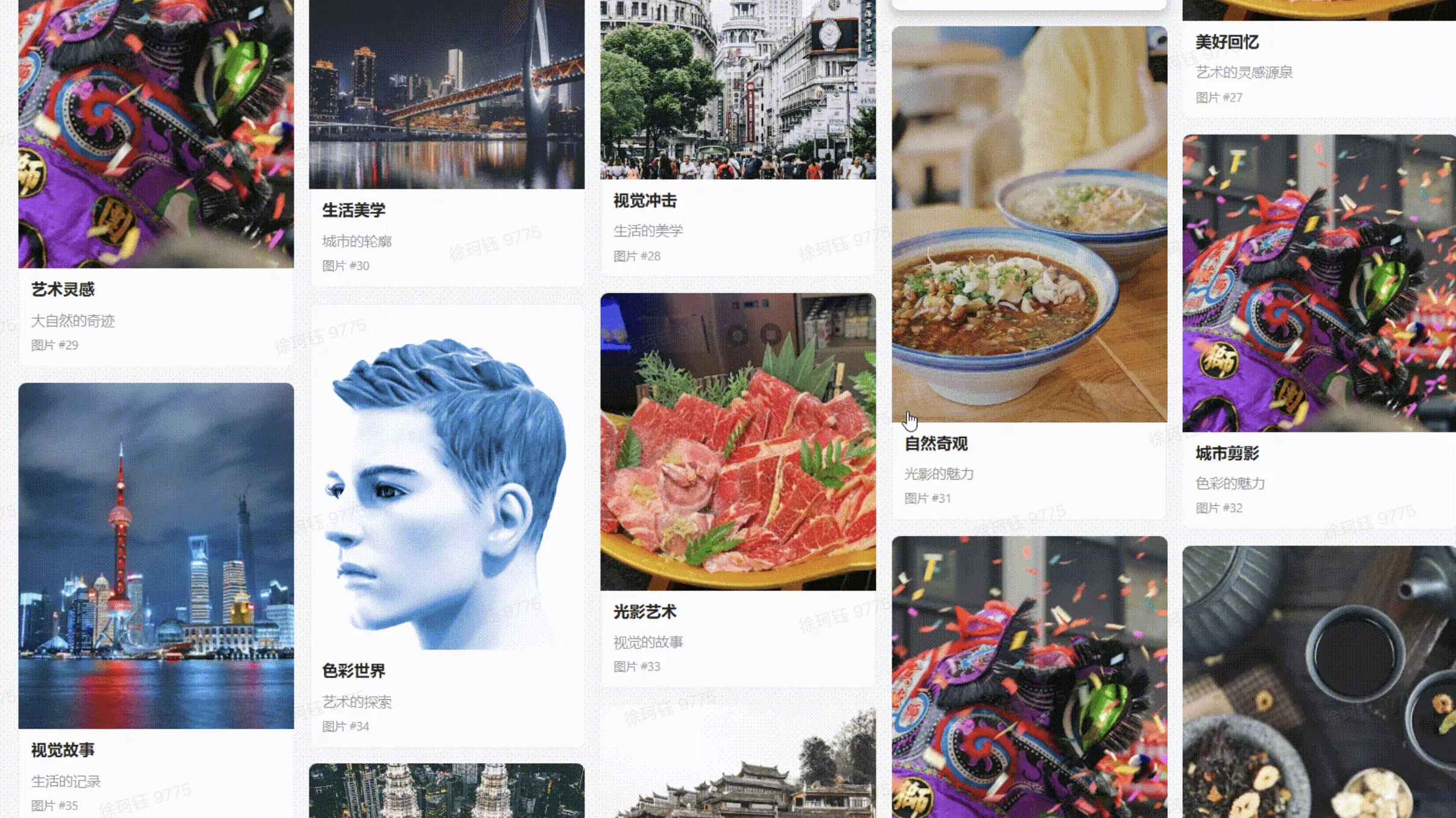
佈局效果説明
Masonry 組件會根據設定的列數自動將元素排列到高度最小的列中。與傳統的網格佈局相比,這種佈局方式能有效減少內容下方的空白區域,特別適合展示高度不一的內容塊。
對於圖片展示類應用,這種佈局能讓用户的視線自然流動,提高瀏覽的沉浸感和內容發現率。
三、Tooltip 平滑移動:優雅的交互引導
在 Ant Design 6.0 中,Tooltip 組件引入了獨特的平滑過渡效果,通過 ConfigProvider 全局配置的 tooltip.unique 配置項,當用户在多個帶有提示的元素間移動時,提示框會以流暢的動畫跟隨,而不是突然消失和重現。
實現平滑跟隨效果
import { Tooltip, Button, Card, ConfigProvider } from "antd";
import {
  UserOutlined,
  SettingOutlined,
  BellOutlined,
  MailOutlined,
  AppstoreOutlined,
} from "@ant-design/icons";
import { TooltipPlacement } from "antd/es/tooltip";
/**
 * Tooltip 示例
 */
export default () => {
  const buttonItems = [
    {
      icon: <UserOutlined />,
      text: "個人中心",
      tip: "查看和管理您的個人資料",
      placement: "top",
    },
    {
      icon: <SettingOutlined />,
      text: "系統設置",
      tip: "調整應用程序參數和偏好",
      placement: "top",
    },
    {
      icon: <BellOutlined />,
      text: "消息通知",
      tip: "查看未讀提醒和系統消息",
      placement: "top",
    },
    {
      icon: <MailOutlined />,
      text: "郵箱",
      tip: "收發郵件和管理聯繫人",
      placement: "bottom",
    },
    {
      icon: <AppstoreOutlined />,
      text: "應用中心",
      tip: "探索和安裝更多應用",
      placement: "bottom",
    },
  ];
  return (
    <div className="w-full h-[100vh] overflow-auto p-[24px] space-y-5">
      <ConfigProvider
        tooltip={{
          unique: true,
        }}
      >
        <Card title="平滑過渡導航工具欄" bordered={false}>
          <div className="flex justify-center gap-6 py-10 px-5 bg-gradient-to-br from-[#f5f7fa] to-[#c3cfe2] rounded-3xl">
            {buttonItems.map((item, index) => (
              <Tooltip
                placement={item.placement as TooltipPlacement}
                key={index}
                title={
                  <div>
                    <div className="font-bold mb-1">{item.text}</div>
                    <div className="text-xs text-[#fff]/60">{item.tip}</div>
                  </div>
                }
                color="#1677ff"
              >
                <Button
                  type="primary"
                  shape="circle"
                  icon={item.icon}
                  size="large"
                  className="w-[60px] h-[60px] text-2xl shadow-md transition-all duration-300 ease-in-out"
                />
              </Tooltip>
            ))}
          </div>
          <div className="mt-5 p-4 bg-green-50 border border-green-300 rounded-md">
            <div className="flex items-center">
              <div className="w-3 h-3 rounded-full bg-green-500 mr-2"></div>
              <span>
                提示:嘗試將鼠標在不同圖標間快速移動,觀察 Tooltip
                的平滑過渡效果
              </span>
            </div>
          </div>
        </Card>
      </ConfigProvider>
      <Card title="非平滑過渡導航工具欄" bordered={false}>
        <div className="flex justify-center gap-6 py-10 px-5 bg-gradient-to-br from-[#f5f7fa] to-[#c3cfe2] rounded-3xl">
          {buttonItems.map((item, index) => (
            <Tooltip
              key={index}
              placement={item.placement as TooltipPlacement}
              title={
                <div>
                  <div className="font-bold mb-1">{item.text}</div>
                  <div className="text-xs text-[#fff]/60">{item.tip}</div>
                </div>
              }
              color="#1677ff"
            >
              <Button
                type="primary"
                shape="circle"
                icon={item.icon}
                size="large"
                className="w-[60px] h-[60px] text-2xl shadow-md transition-all duration-300 ease-in-out"
              />
            </Tooltip>
          ))}
        </div>
        <div className="mt-5 p-4 bg-green-50 border border-green-300 rounded-md">
          <div className="flex items-center">
            <div className="w-3 h-3 rounded-full bg-green-500 mr-2"></div>
            <span>
              提示:嘗試將鼠標在不同圖標間快速移動,觀察 Tooltip 的非平滑過渡效果
            </span>
          </div>
        </div>
      </Card>
    </div>
  );
};
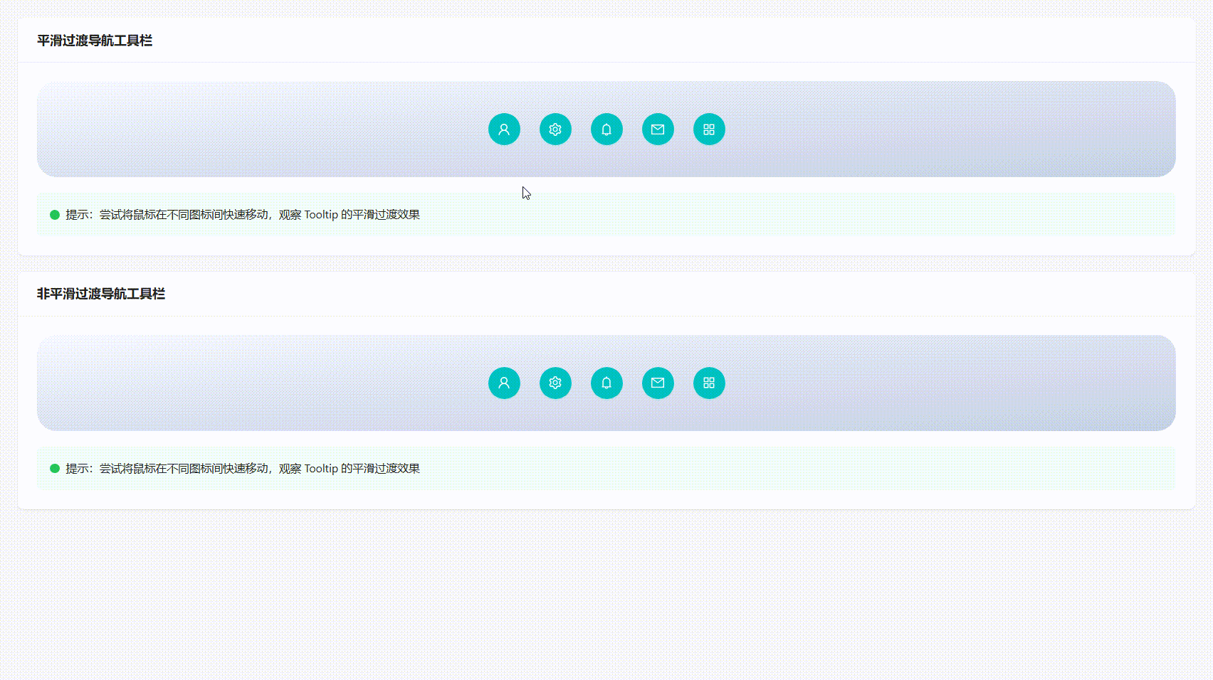
交互效果説明
當 tooltip.unique 設置為 true 時,用户在不同元素間移動鼠標時,Tooltip 會呈現以下行為:
-
平滑位置過渡:Tooltip 不會立即消失,而是平滑移動到新目標位置
-
內容無縫切換:提示內容在新位置淡入,舊內容淡出
-
視覺連續性:保持同一時刻只有一個 Tooltip 顯示,避免界面混亂
這種設計特別適合工具欄、導航菜單等元素密集的區域,能有效降低用户的認知負荷,提供更加流暢的交互體驗。
四、InputNumber 撥輪模式:直觀的數字輸入
數字輸入框是表單中的常見組件,但傳統的上下箭頭控件在小屏幕或觸摸設備上操作不便。Ant Design 6.0 的 InputNumber 組件新增了 mode="spinner" 屬性,提供了更直觀的“加減按鈕”界面。
撥輪模式實現
import { InputNumber, Card, Row, Col, Typography, Space } from "antd";
import {
  ShoppingCartOutlined,
  DollarOutlined,
  GiftOutlined,
} from "@ant-design/icons";
const { Title, Text } = Typography;
/**
 * InputNumber 示例
 */
export default () => {
  return (
    <div className="w-full h-[100vh] overflow-auto p-[24px] space-y-5">
      <Card title="商品訂購面板" bordered={false}>
        <Row gutter={[24, 24]}>
          <Col span={8}>
            <div className="text-center">
              <div className="w-[80px] h-[80px] mx-auto mb-4 rounded-3xl bg-[#f0f5ff] flex items-center justify-center text-[32px] text-[#1677ff]">
                <ShoppingCartOutlined />
              </div>
              <Title level={5} className="mb-3">
                購買數量(非數字撥輪)
              </Title>
              <InputNumber
                min={1}
                max={50}
                defaultValue={1}
                size="large"
                className="w-[250px]!"
                addonBefore="數量"
              />
              <div className="mt-2 text-xs text-gray-600">限購50件</div>
            </div>
          </Col>
          <Col span={8}>
            <div className="text-center">
              <div className="w-[80px] h-[80px] mx-auto mb-4 rounded-3xl bg-[#fff7e6] flex items-center justify-center text-[32px] text-[#fa8c16]">
                <DollarOutlined />
              </div>
              <Title level={5} className="mb-3">
                折扣力度(數字撥輪)
              </Title>
              <InputNumber
                min={0}
                max={100}
                defaultValue={10}
                mode="spinner"
                size="large"
                formatter={(value) => `${value ?? 0}%`}
                parser={(value) =>
                  Number.parseFloat(value?.replace("%", "") ?? "0") as any
                }
                className="w-[250px]!"
                addonBefore="折扣"
              />
              <div className="mt-2 text-xs text-gray-600">0-100%範圍</div>
            </div>
          </Col>
          <Col span={8}>
            <div className="text-center">
              <div className="w-[80px] h-[80px] mx-auto mb-4 rounded-3xl bg-[#f6ffed] flex items-center justify-center text-[32px] text-[#52c41a]">
                <GiftOutlined />
              </div>
              <Title level={5} className="mb-3">
                禮品數量(數字撥輪,自定義加減按鈕)
              </Title>
              <Space.Compact block className="justify-center!">
                <Space.Addon>
                  <span>禮品</span>
                </Space.Addon>
                <InputNumber
                  min={0}
                  max={10}
                  defaultValue={0}
                  mode="spinner"
                  size="large"
                  className="w-[250px]!"
                  controls={{
                    upIcon: <span className="text-base">➕</span>,
                    downIcon: <span className="text-base">➖</span>,
                  }}
                />
              </Space.Compact>
              <div className="mt-2 text-xs text-gray-600">每單最多10份</div>
            </div>
          </Col>
        </Row>
        <div className="mt-8 p-4 bg-[#fff0f6] rounded-lg border border-dashed border-[#ffadd2]">
          <Text type="secondary">
            <strong>設計提示:</strong>
            撥輪模式相比傳統箭頭控件,提供了更大的點擊區域和更明確的視覺反饋,特別適合觸摸設備和需要頻繁調整數值的場景。加減按鈕的分離式設計也降低了誤操作的可能性。
          </Text>
        </div>
      </Card>
    </div>
  );
};
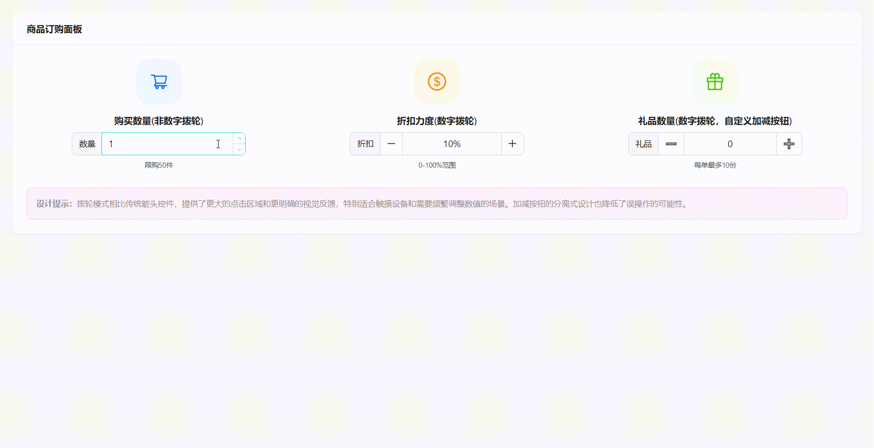
交互優勢分析
撥輪模式相比傳統數字輸入框具有明顯優勢:
-
觸摸友好:更大的按鈕區域適合移動端操作
-
意圖明確:“+”和“-”符號比小箭頭更直觀
-
快速調整:支持長按連續增減數值
-
視覺反饋:按鈕有明確的狀態變化(按下、懸停)
在電商、數據儀表盤、配置面板等需要頻繁調整數值的場景中,這種設計能顯著提升用户的操作效率和滿意度。
五、Drawer 拖拽調整:靈活的側邊面板
抽屜組件常用於移動端導航或詳情面板,但固定尺寸有時無法滿足多樣化的內容展示需求。Ant Design 6.0 為 Drawer 組件新增了 resizable 屬性,允許用户通過拖拽邊緣實時調整面板尺寸。
可調整抽屜實現
import { Drawer, Button, Card, Typography, Divider, List, Flex } from "antd";
import {
DragOutlined,
CalendarOutlined,
FileTextOutlined,
TeamOutlined,
CommentOutlined,
PaperClipOutlined,
} from "@ant-design/icons";
import { useState } from "react";
import { DrawerResizableConfig } from "antd/es/drawer";
const { Title, Text, Paragraph } = Typography;
/**
* Drawer 示例
*/
export default () => {
const [open, setOpen] = useState(false);
const [drawerWidth, setDrawerWidth] = useState(400);
const [resizable, setResizable] = useState<boolean | DrawerResizableConfig>(
false,
);
const tasks = [
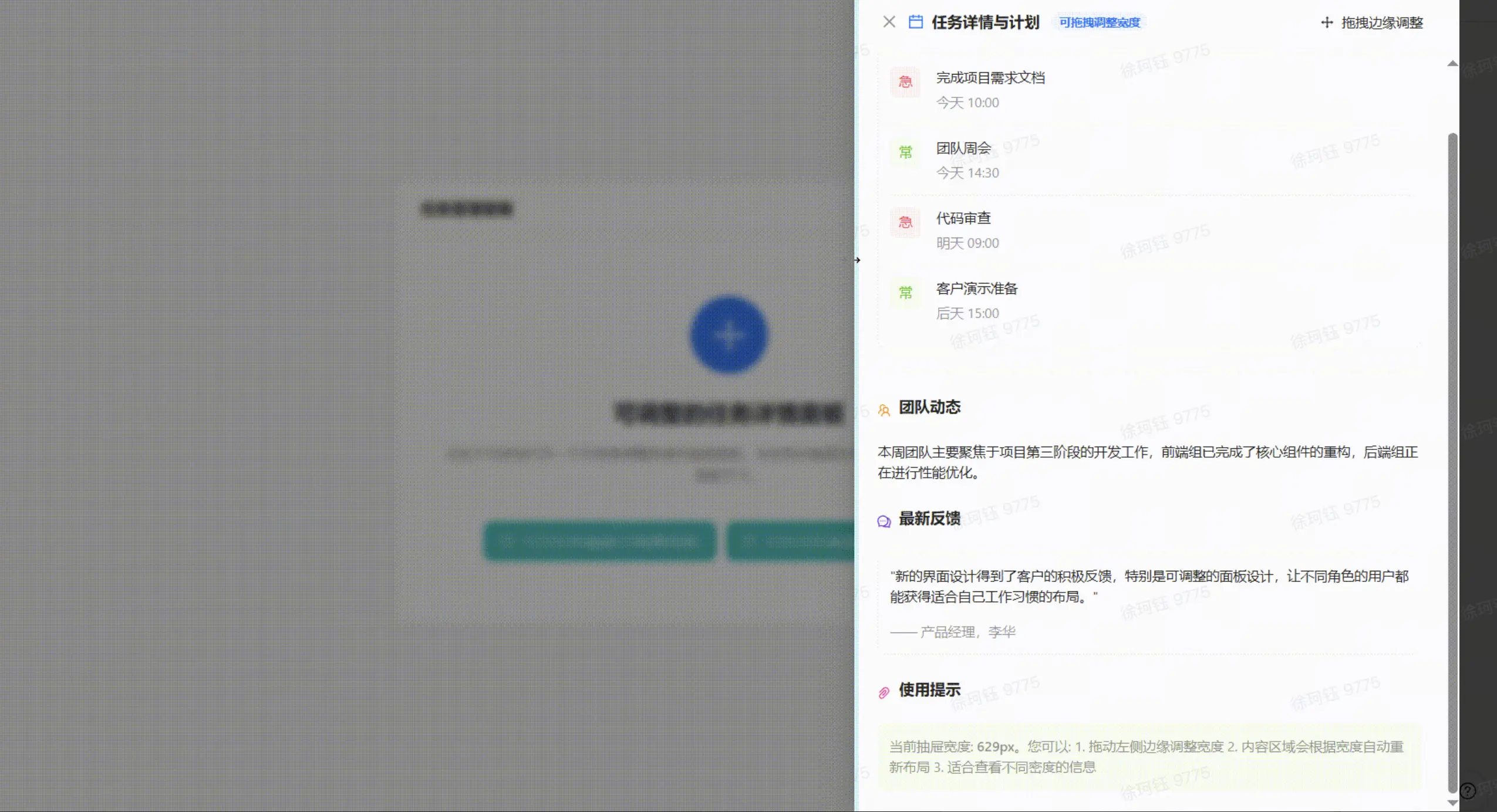
{ id: 1, title: "完成項目需求文檔", time: "今天 10:00", priority: "high" },
{ id: 2, title: "團隊週會", time: "今天 14:30", priority: "medium" },
{ id: 3, title: "代碼審查", time: "明天 09:00", priority: "high" },
{ id: 4, title: "客户演示準備", time: "後天 15:00", priority: "medium" },
];
const showDrawerWithResizable = () => {
setOpen(true);
setDrawerWidth(400);
setResizable({
onResize: (size) => {
setDrawerWidth(size);
},
});
};
const showDrawerWithoutResizable = () => {
setOpen(true);
setDrawerWidth(600);
setResizable(false);
};
const onClose = () => {
setOpen(false);
};
return (
<div className="w-full h-[100vh] flex items-center justify-center overflow-auto p-[24px] space-y-5">
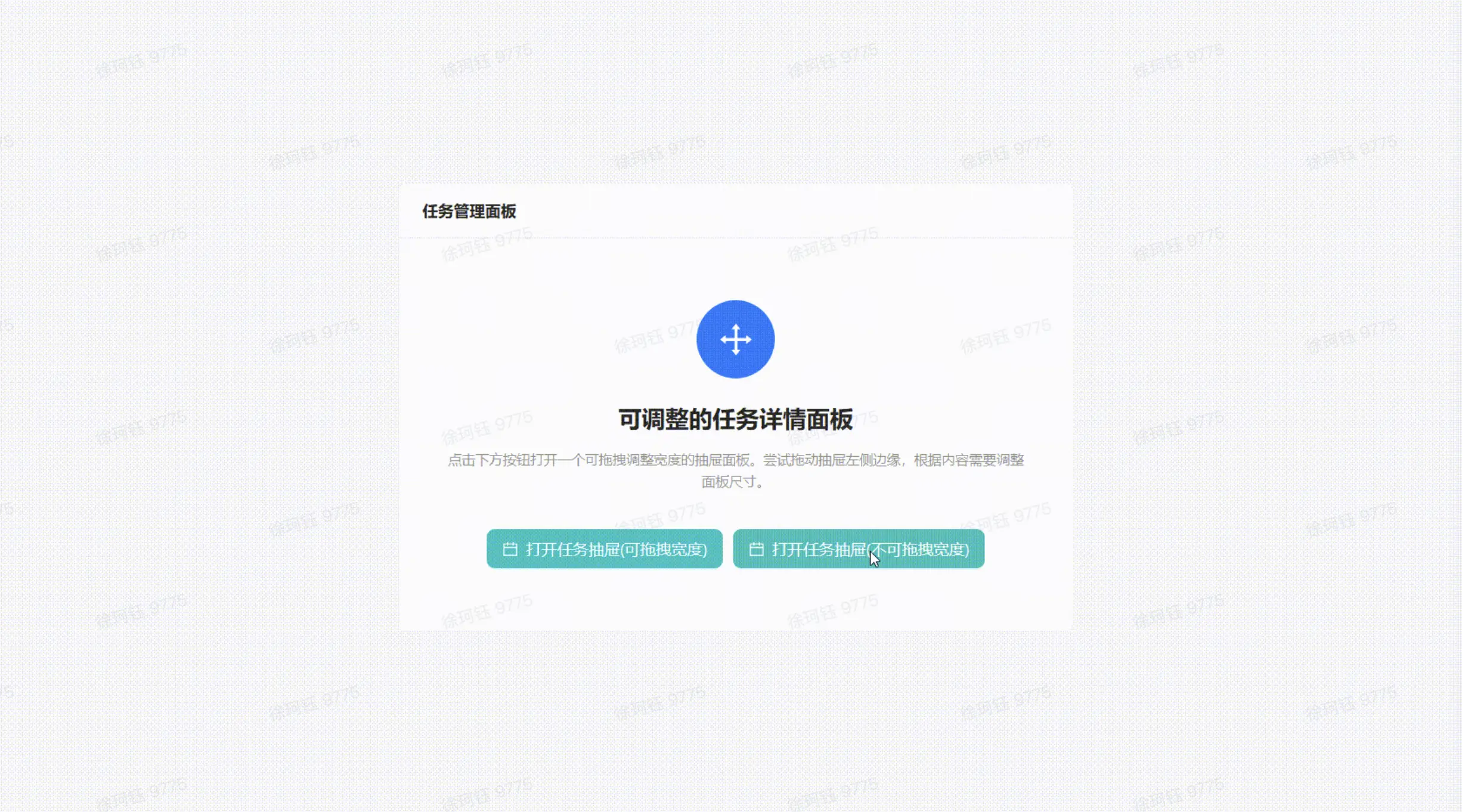
<Card
title="任務管理面板"
variant="outlined"
className="max-w-[800px] mx-auto"
>
<div className="py-10 px-5 text-center">
<div className="w-20 h-20 mx-auto mb-6 rounded-full bg-[#1677ff] flex items-center justify-center text-[36px] text-white">
<DragOutlined />
</div>
<Title level={3}>可調整的任務詳情面板</Title>
<Paragraph type="secondary" className="max-w-[600px] my-4 mx-auto">
點擊下方按鈕打開一個可拖拽調整寬度的抽屜面板。嘗試拖動抽屜左側邊緣,根據內容需要調整面板尺寸。
</Paragraph>
<Flex justify="center" gap={10}>
<Button
type="primary"
size="large"
onClick={showDrawerWithResizable}
icon={<CalendarOutlined />}
className="mt-6"
>
打開任務抽屜(可拖拽寬度)
</Button>
<Button
type="primary"
size="large"
onClick={showDrawerWithoutResizable}
icon={<CalendarOutlined />}
className="mt-6"
>
打開任務抽屜(不可拖拽寬度)
</Button>
</Flex>
</div>
</Card>
<Drawer
title={
<div className="flex items-center">
<CalendarOutlined className="mr-2 text-[#1677ff]" />
<span>任務詳情與計劃</span>
{resizable && (
<div className="ml-3 py-0.5 px-2 bg-[#f0f5ff] rounded-[10px] text-xs text-[#1677ff]">
可拖拽調整寬度
</div>
)}
</div>
}
placement="right"
onClose={onClose}
open={open}
size={drawerWidth}
resizable={resizable}
extra={
<Button type="text" icon={<DragOutlined />}>
{resizable ? "拖拽邊緣調整" : "不可拖拽"}
</Button>
}
styles={{
body: {
paddingTop: "12px",
},
header: {
borderBottom: "1px solid #f0f0f0",
},
}}
>
<div className="mb-6">
<div className="flex items-center mb-4">
<FileTextOutlined className="mr-2 text-[#52c41a]" />
<Title level={5} className="m-0">
當前任務
</Title>
</div>
<Card size="small">
<List
itemLayout="horizontal"
dataSource={tasks}
renderItem={(item) => (
<List.Item>
<List.Item.Meta
avatar={
<div
className={`w-8 h-8 rounded-md flex items-center justify-center ${
item.priority === "high"
? "bg-[#fff2f0] text-[#ff4d4f]"
: "bg-[#f6ffed] text-[#52c41a]"
}`}
>
{item.priority === "high" ? "急" : "常"}
</div>
}
title={<a>{item.title}</a>}
description={<Text type="secondary">{item.time}</Text>}
/>
</List.Item>
)}
/>
</Card>
</div>
<Divider />
<div className="mb-6">
<div className="flex items-center mb-4">
<TeamOutlined className="mr-2 text-[#fa8c16]" />
<Title level={5} className="m-0">
團隊動態
</Title>
</div>
<Paragraph>
本週團隊主要聚焦於項目第三階段的開發工作,前端組已完成了核心組件的重構,後端組正在進行性能優化。
</Paragraph>
</div>
<div className="mb-6">
<div className="flex items-center mb-4">
<CommentOutlined className="mr-2 text-[#722ed1]" />
<Title level={5} className="m-0">
最新反饋
</Title>
</div>
<Card size="small" type="inner">
<Paragraph>
"新的界面設計得到了客户的積極反饋,特別是可調整的面板設計,讓不同角色的用户都能獲得適合自己工作習慣的佈局。"
</Paragraph>
<Text type="secondary">—— 產品經理,XXX</Text>
</Card>
</div>
<div>
<div className="flex items-center mb-4">
<PaperClipOutlined className="mr-2 text-[#eb2f96]" />
<Title level={5} className="m-0">
使用提示
</Title>
</div>
<div className="p-3 bg-[#f6ffed] rounded-md border border-[#b7eb8f]">
<Text type="secondary">
當前抽屜寬度: <strong>{drawerWidth}px</strong>。您可以: 1.
拖動左側邊緣調整寬度 2. 內容區域會根據寬度自動重新佈局 3.
適合查看不同密度的信息
</Text>
</div>
</div>
</Drawer>
</div>
);
};
拖拽交互的價值
可調整抽屜的設計帶來了明顯的用户體驗提升:
-
自適應內容:用户可以根據當前查看的內容類型調整面板尺寸
-
個性化佈局:不同用户或場景下可以設置不同的面板大小
-
多任務處理:寬面板適合詳情查看,窄面板適合邊操作邊參考
-
漸進式披露:可以從緊湊視圖逐步展開到詳細視圖
六、Modal 背景模糊:朦朧美學的視覺升級
在傳統 Web 應用中,模態框的遮罩層往往是簡單的半透明黑色,視覺效果單調且缺乏現代感。而在 iOS 和 macOS 等系統中,毛玻璃(frosted glass)效果已成為標誌性的設計語言效果樣式。Ant Design 6.0 為所有彈層組件引入了原生背景模糊支持,並提供了強大的語義化樣式定製能力,讓開發者能輕鬆打造出高級感十足的視覺效果。
背景模糊與語義化樣式定製
以下示例展示瞭如何結合 Ant Design 6.0 的背景模糊特性和 antd-style 庫,實現兩種不同風格的模態框:
import { useState } from "react";
import { Button, Flex, Modal, Card, Image, Typography, Space } from "antd";
import type { ModalProps } from "antd";
import { createStyles } from "antd-style";
const { Title, Text } = Typography;
// 使用 antd-style 的 createStyles 定義樣式
const useStyles = createStyles(({ token }) => ({
// 用於模態框容器的基礎樣式
container: {
borderRadius: token.borderRadiusLG * 1.5,
overflow: "hidden",
},
}));
// 示例用的共享內容
const sharedContent = (
<Card size="small" bordered={false}>
<Image
height={300}
src="https://gw.alipayobjects.com/zos/antfincdn/LlvErxo8H9/photo-1503185912284-5271ff81b9a8.webp"
alt="示例圖片"
preview={false}
className="mx-auto!"
/>
<Text type="secondary" style={{ display: "block", marginTop: 8 }}>
Ant Design 6.0 默認的模糊背景與 antd-style
定製的毛玻璃面板相結合,營造出深邃而富有層次的視覺體驗。
</Text>
</Card>
);
export default () => {
const [blurModalOpen, setBlurModalOpen] = useState(false);
const [gradientModalOpen, setGradientModalOpen] = useState(false);
const { styles: classNames } = useStyles();
// 場景1:背景玻璃模糊效果(朦朧美學)
const blurModalStyles: ModalProps["styles"] = {
body: {
padding: 24,
},
};
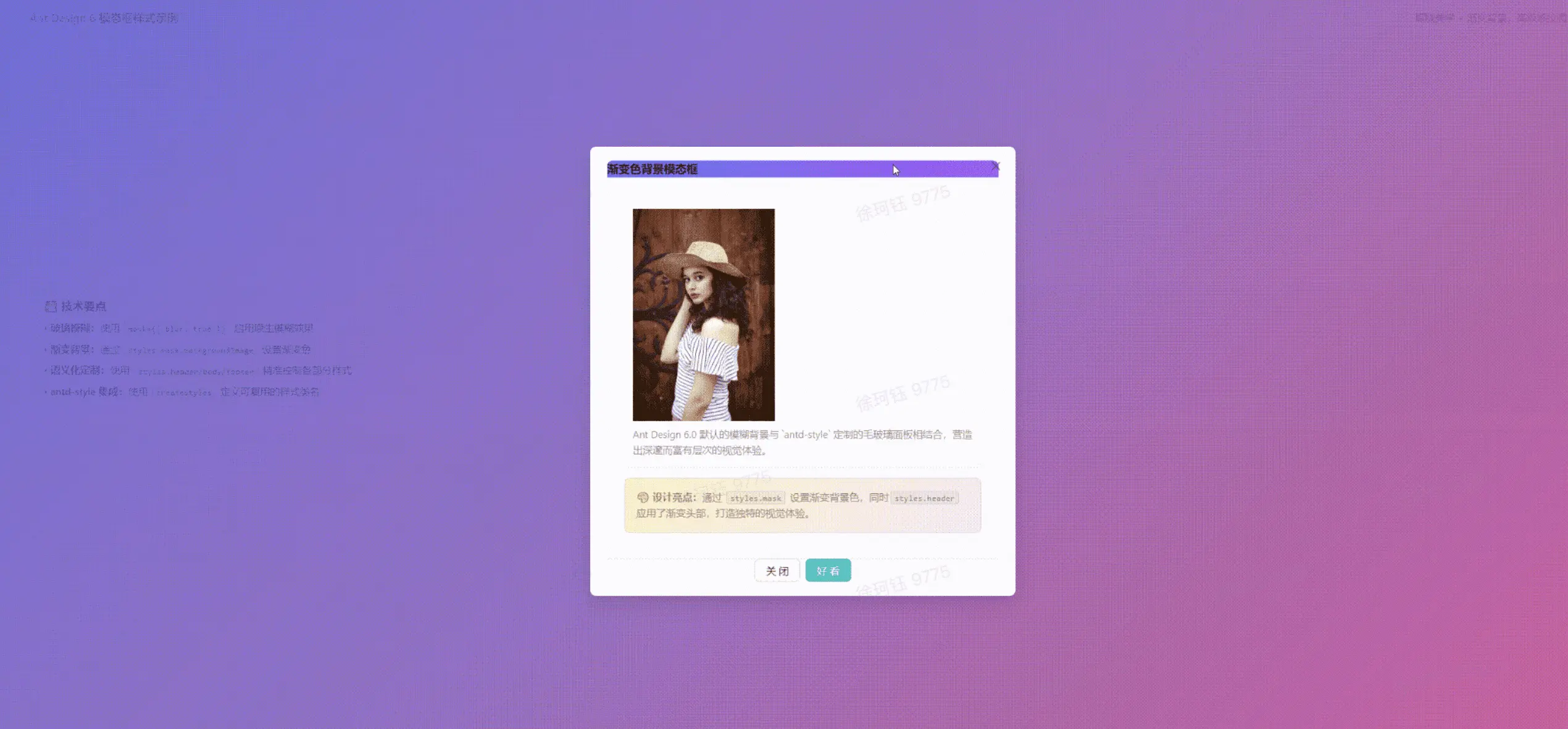
// 場景2:漸變色背景模態框(無模糊效果)
const gradientModalStyles: ModalProps["styles"] = {
mask: {
backgroundImage: `linear-gradient(
135deg,
rgba(99, 102, 241, 0.8) 0%,
rgba(168, 85, 247, 0.6) 50%,
rgba(236, 72, 153, 0.8) 100%
)`,
},
body: {
padding: 24,
},
header: {
background: "linear-gradient(to right, #6366f1, #a855f7)",
color: "#fff",
borderBottom: "none",
},
footer: {
borderTop: "1px solid #e5e7eb",
textAlign: "center",
},
};
// 共享配置
const sharedProps: ModalProps = {
centered: true,
classNames,
};
return (
<div className="w-full h-[100vh] overflow-auto p-[24px] space-y-5">
<Card
title="Ant Design 6 模態框樣式示例"
bordered={false}
extra={
<Text type="secondary" className="text-sm">
朦朧美學 + 漸變背景,高級感拉滿!
</Text>
}
>
<Flex
gap="middle"
align="center"
justify="center"
style={{ padding: 40, minHeight: 300 }}
>
<Button
type="primary"
size="large"
onClick={() => setBlurModalOpen(true)}
>
🌫️ 背景玻璃模糊效果
</Button>
<Button size="large" onClick={() => setGradientModalOpen(true)}>
🎨 漸變色背景模態框
</Button>
{/* 模態框 1:背景玻璃模糊效果(朦朧美學) */}
<Modal
{...sharedProps}
title="背景玻璃模糊效果"
styles={blurModalStyles}
open={blurModalOpen}
onOk={() => setBlurModalOpen(false)}
onCancel={() => setBlurModalOpen(false)}
okText="太美了"
cancelText="關閉"
mask={{ enabled: true, blur: true }}
width={600}
>
{sharedContent}
<div
style={{
marginTop: 16,
padding: 16,
background: "rgba(255, 255, 255, 0.6)",
borderRadius: 8,
backdropFilter: "blur(10px)",
}}
>
<Text type="secondary">
<strong>💡 設計亮點:</strong>
啓用了 mask={{ blur: true }},
背景會自動應用模糊效果,營造出朦朧美學的高級質感。
</Text>
</div>
</Modal>
{/* 模態框 2:漸變色背景(無模糊效果) */}
<Modal
{...sharedProps}
title="漸變色背景模態框"
styles={gradientModalStyles}
open={gradientModalOpen}
onOk={() => setGradientModalOpen(false)}
onCancel={() => setGradientModalOpen(false)}
okText="好看"
cancelText="關閉"
mask={{ enabled: true, blur: false }}
width={600}
>
{sharedContent}
<div
style={{
marginTop: 16,
padding: 16,
background: "linear-gradient(135deg, #fef3c7 0%, #fce7f3 100%)",
borderRadius: 8,
border: "1px solid rgba(168, 85, 247, 0.2)",
}}
>
<Text type="secondary">
<strong>🎨 設計亮點:</strong>
通過 styles.mask 設置漸變背景色,同時 styles.header
應用了漸變頭部,打造獨特的視覺體驗。
</Text>
</div>
</Modal>
</Flex>
<div className="mt-6 p-5 bg-gradient-to-r from-blue-50 to-purple-50 rounded-xl border border-purple-200">
<Title level={5} className="mb-3">
📚 技術要點
</Title>
<Space direction="vertical" size="small" className="w-full">
<Text>
• <strong>玻璃模糊:</strong>使用 mask={{ blur: true }} 啓用原生模糊效果
</Text>
<Text>
• <strong>漸變背景:</strong>通過 styles.mask.backgroundImage 設置漸變色
</Text>
<Text>
• <strong>語義化定製:</strong>使用 styles.header/body/footer 精準控制各部分樣式
</Text>
<Text>
• <strong>antd-style 集成:</strong>使用 createStyles 定義可複用的樣式類名
</Text>
</Space>
</div>
</Card>
</div>
);
};
核心特性解析
1. 背景模糊開關
通過 mask 屬性的 blur 配置項,可以一鍵開啓/關閉背景模糊效果:
- mask={{ enabled: true, blur: true }}:啓用毛玻璃效果
- mask={{ enabled: true, blur: false }}:使用傳統半透明遮罩
2. 語義化樣式定製
styles 屬性允許精準控制組件各個部分的樣式,無需編寫複雜的 CSS 選擇器:
- styles.mask:遮罩層樣式(可設置漸變背景)
- styles.header:頭部樣式(可定製顏色、邊框)
- styles.body:內容區樣式(可調整間距)
- styles.footer:底部樣式(可設置對齊方式)
3. antd-style 集成
結合 antd-style 可以創建主題感知的樣式:
- 訪問 Design Token(如 token.borderRadiusLG)
- 樣式自動響應主題切換(亮色/暗色模式)
- 通過 classNames 屬性應用 CSS 類名
視覺效果對比
使用背景模糊和語義化樣式定製後,Modal 的視覺呈現發生了顯著變化:
1. 背景模糊效果: 遮罩層從單調的半透明黑色變為毛玻璃效果,背景內容呈現柔和的模糊感
2. 精準樣式控制: 通過 styles.mask/header/body/footer 可以像搭積木一樣組裝出品牌化的對話框
3. 主題聯動: 結合 antd-style 後,樣式會自動響應全局主題切換,無需手動維護暗色模式樣式
4. 維護性提升: 告別 .ant-modal .ant-modal-content .ant-modal-header 這樣的深層選擇器,樣式意圖清晰明確
這種設計讓 Ant Design 6.0 的組件定製從"CSS 覆蓋戰爭"升級為"API 聲明式配置",顯著降低了樣式維護成本,同時保持了高度的靈活性。
七、Card 賽博朋克風格:霓虹科技美學的呈現
在傳統的企業級應用中,卡片組件往往採用簡潔素雅的設計。但對於遊戲、科技、創意類產品,開發者往往需要更具視覺衝擊力的效果。Ant Design 6.0 的 Card 組件配合 antd-style,可以輕鬆實現賽博朋克風格的霓虹發光邊框、深色內陰影和動態動畫效果,讓你的界面充滿未來感和科技感。
賽博朋克卡片實現
以下示例展示瞭如何使用 antd-style 的 CSS-in-JS 能力,為 Card 組件打造完整的賽博朋克視覺風格:
import { Card, Typography, Button, Space, Avatar, Row, Col } from "antd";
import { createStyles } from "antd-style";
import {
  ThunderboltOutlined,
  RocketOutlined,
  FireOutlined,
  StarOutlined,
  TrophyOutlined,
} from "@ant-design/icons";
const { Title, Text, Paragraph } = Typography;
// 使用 antd-style 創建賽博朋克風格樣式
const useStyles = createStyles(({ css }) => ({
  // 賽博朋克卡片 - 紫色霓虹
  cyberpunkCard: css`
    background: rgba(15, 15, 35, 0.9);
    border: 2px solid #a855f7;
    border-radius: 16px;
    overflow: hidden;
    position: relative;
    transition: all 0.3s ease;
    /* 發光邊框效果 */
    box-shadow: 0 0 20px rgba(168, 85, 247, 0.5),
      inset 0 0 20px rgba(168, 85, 247, 0.1);
    &:hover {
      transform: translateY(-5px);
      box-shadow: 0 0 30px rgba(168, 85, 247, 0.8),
        inset 0 0 30px rgba(168, 85, 247, 0.2);
      border-color: #c084fc;
    }
    /* 頂部霓虹燈條 */
    &::before {
      content: "";
      position: absolute;
      top: 0;
      left: 0;
      right: 0;
      height: 3px;
      background: linear-gradient(
        90deg,
        transparent,
        #a855f7,
        #c084fc,
        #a855f7,
        transparent
      );
      animation: neonFlow 3s ease-in-out infinite;
    }
    @keyframes neonFlow {
      0%, 100% { opacity: 1; }
      50% { opacity: 0.5; }
    }
  `,
  // 霓虹文字
  neonText: css`
    color: #fff;
    text-shadow: 0 0 10px currentColor,
                 0 0 20px currentColor,
                 0 0 30px currentColor;
    font-weight: bold;
  `,
  // 霓虹按鈕
  neonButton: css`
    background: transparent !important;
    border: 2px solid currentColor !important;
    color: inherit !important;
    text-shadow: 0 0 10px currentColor;
    box-shadow: 0 0 10px currentColor,
                inset 0 0 10px rgba(255, 255, 255, 0.1);
    transition: all 0.3s ease !important;
    &:hover {
      transform: scale(1.05);
      box-shadow: 0 0 20px currentColor,
                  inset 0 0 20px rgba(255, 255, 255, 0.2) !important;
    }
  `,
  // 數據面板
  dataPanel: css`
    background: rgba(0, 0, 0, 0.3);
    border: 1px solid rgba(255, 255, 255, 0.1);
    border-radius: 8px;
    padding: 16px;
    backdrop-filter: blur(10px);
  `,
}));
export default () => {
  const { styles } = useStyles();
  return (
    <Row gutter={[24, 24]}>
      <Col span={8}>
        <Card
          className={styles.cyberpunkCard}
          hoverable
          styles={{ body: { padding: 24 } }}
        >
          <div style={{ position: "relative", zIndex: 1 }}>
            {/* 頭部 */}
            <div style={{ display: "flex", alignItems: "center", marginBottom: 16 }}>
              <Avatar
                size={64}
                icon={<ThunderboltOutlined />}
                style={{
                  background: "linear-gradient(135deg, #a855f7, transparent)",
                  border: "2px solid #a855f7",
                  color: "#a855f7",
                  filter: "drop-shadow(0 0 10px #a855f7)",
                }}
              />
            </div>
            {/* 標題 */}
            <Title level={4} className={styles.neonText} style={{ color: "#a855f7" }}>
              QUANTUM PROCESSOR
            </Title>
            <Text style={{ color: "#888", display: "block", marginBottom: 16 }}>
              量子處理器
            </Text>
            {/* 描述 */}
            <Paragraph style={{ color: "#bbb", marginBottom: 20 }}>
              第九代量子處理器,採用納米級光刻技術,配備AI神經網絡加速引擎。
            </Paragraph>
            {/* 數據面板 */}
            <div className={styles.dataPanel} style={{ marginBottom: 20 }}>
              <Space direction="vertical" style={{ width: "100%" }} size={12}>
                <div style={{ display: "flex", justifyContent: "space-between" }}>
                  <Text style={{ color: "#888" }}>處理速度</Text>
                  <Text strong style={{ color: "#a855f7" }}>5.2 PHz</Text>
                </div>
                <div style={{ display: "flex", justifyContent: "space-between" }}>
                  <Text style={{ color: "#888" }}>核心數量</Text>
                  <Text strong style={{ color: "#a855f7" }}>128 核</Text>
                </div>
              </Space>
            </div>
            {/* 能量條 */}
            <div style={{ marginBottom: 20 }}>
              <div style={{ display: "flex", justifyContent: "space-between", marginBottom: 8 }}>
                <Text style={{ color: "#888", fontSize: 12 }}>POWER LEVEL</Text>
                <Text strong style={{ color: "#a855f7", fontSize: 12 }}>9999</Text>
              </div>
              <div style={{
                height: 6,
                background: "rgba(0, 0, 0, 0.3)",
                borderRadius: 3,
                overflow: "hidden",
                border: "1px solid rgba(255, 255, 255, 0.1)",
              }}>
                <div style={{
                  height: "100%",
                  width: "92%",
                  background: "linear-gradient(90deg, #a855f7, transparent)",
                  boxShadow: "0 0 10px #a855f7",
                }} />
              </div>
            </div>
            {/* 操作按鈕 */}
            <Space style={{ width: "100%" }}>
              <Button
                type="primary"
                className={styles.neonButton}
                style={{ color: "#a855f7", flex: 1 }}
                icon={<StarOutlined />}
              >
                激活
              </Button>
              <Button
                className={styles.neonButton}
                style={{ color: "#a855f7" }}
                icon={<TrophyOutlined />}
              >
                詳情
              </Button>
            </Space>
          </div>
        </Card>
      </Col>
    </Row>
  );
};
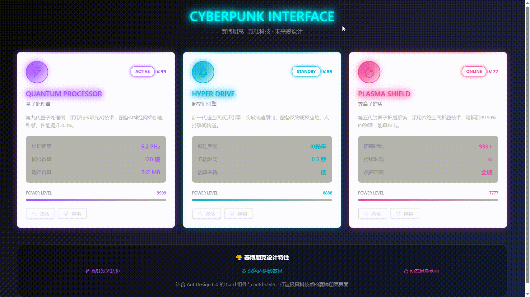
核心技術要點
1. 霓虹發光邊框
通過多層 box-shadow 實現外發光和內陰影的疊加效果:
box-shadow:
  0 0 20px rgba(168, 85, 247, 0.5),        /* 外發光 */
  inset 0 0 20px rgba(168, 85, 247, 0.1);  /* 內陰影 */
2. 動態霓虹燈條
使用偽元素和漸變動畫創建流動的霓虹燈效果:
&::before {
  content: "";
  background: linear-gradient(90deg, transparent, #a855f7, transparent);
  animation: neonFlow 3s ease-in-out infinite;
}
3. 霓虹文字效果
通過 text-shadow 的多層疊加模擬霓虹燈文字:
text-shadow:
  0 0 10px currentColor,
  0 0 20px currentColor,
  0 0 30px currentColor;
4. 毛玻璃數據面板
結合半透明背景和 backdrop-filter 實現毛玻璃效果:
background: rgba(0, 0, 0, 0.3);
backdrop-filter: blur(10px);
5. 交互動畫
hover 時同步觸發多個動畫效果:
- 卡片上浮:transform: translateY(-5px)
- 發光增強:box-shadow 強度提升
- 邊框顏色變化:border-color 過渡
樣式定製優勢
使用 Ant Design 6.0 + antd-style 實現賽博朋克風格的優勢:
1. CSS-in-JS 強大能力: 支持嵌套、偽元素、動畫等高級特性,無需額外 CSS 文件
2. 類型安全: TypeScript 提供完整的類型提示,減少樣式錯誤
3. 動態主題: 可以輕鬆切換不同顏色的霓虹主題(紫色、青色、粉色等)
4. 組件封裝: 樣式與組件邏輯共存,便於複用和維護
5. 性能優化: antd-style 自動處理樣式注入和緩存,性能優秀
這種設計風格通過強烈的視覺衝擊力和獨特的科技感,能夠有效吸引用户注意力,提升品牌記憶度,特別適合面向年輕用户羣體的產品。
八、升級建議與實踐策略
對於考慮升級到 Ant Design 6.0 的團隊,建議採取以下策略:
1.漸進式升級路徑
-
新項目直接使用:全新項目建議直接使用 6.0 版本,享受所有新特性
-
現有項目評估:評估項目依賴和定製程度,制定分階段升級計劃
-
組件逐步替換:可以先替換使用新功能的組件,再逐步遷移其他部分
2.兼容性注意事項
-
檢查廢棄 API:Ant Design 6.0 移除了之前版本已標記為廢棄的 API
-
樣式覆蓋檢查:如果項目中有深度定製樣式,需要檢查與新版本的兼容性
-
測試核心流程:升級後重點測試表單提交、數據展示等核心用户流程
九、總結
Ant Design 6.0 的組件功能更新聚焦於解決實際開發中的痛點,通過引入 Masonry 瀑布流佈局、Tooltip 平滑移動、InputNumber 撥輪模式、Drawer 拖拽調整、Modal 背景模糊以及 Card 深度定製等特性,顯著提升了開發效率和用户體驗。
這些更新體現了現代前端設計的幾個核心趨勢:
1. 交互流暢性: 如 Tooltip 的平滑過渡,減少界面跳躍感
2. 設備適配性: 如 InputNumber 的觸摸友好設計
3. 佈局靈活性: 如 Masonry 的動態佈局和 Drawer 的可調整尺寸
4. 視覺現代化: 如 Modal 的背景模糊效果,營造朦朧美學的高級質感
5. 樣式可控性: 通過 classNames 和 styles API 實現精準的組件定製
6. 風格多樣性: 結合 antd-style 可實現從企業風到賽博朋克等多樣化視覺風格
特別是與 antd-style 的深度集成,讓開發者能夠充分發揮 CSS-in-JS 的強大能力,從簡潔的企業級設計到炫酷的賽博朋克風格,都能輕鬆實現。這些改進讓 Ant Design 6.0 不僅保持了企業級應用的穩定性和專業性,還增加了更多現代化、人性化的交互細節和視覺創意空間,是構建下一代 Web 應用的理想選擇。
往期回顧
1.Java 設計模式:原理、框架應用與實戰全解析|得物技術
2.Go語言在高併發高可用系統中的實踐與解決方案|得物技術
3.從0到1搭建一個智能分析OBS埋點數據的AI Agent|得物技術
4.數據庫AI方向探索-MCP原理解析&DB方向實戰|得物技術
5.項目性能優化實踐:深入FMP算法原理探索|得物技術
文 /三七
關注得物技術,每週更新技術乾貨
要是覺得文章對你有幫助的話,歡迎評論轉發點贊~
未經得物技術許可嚴禁轉載,否則依法追究法律責任。
